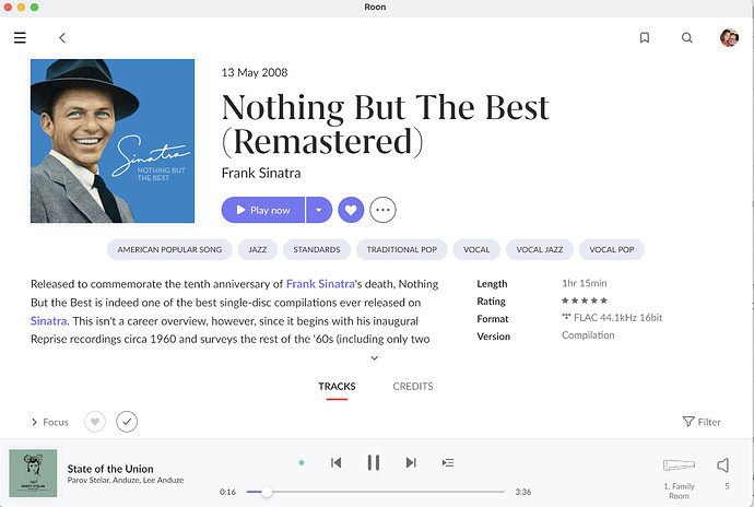
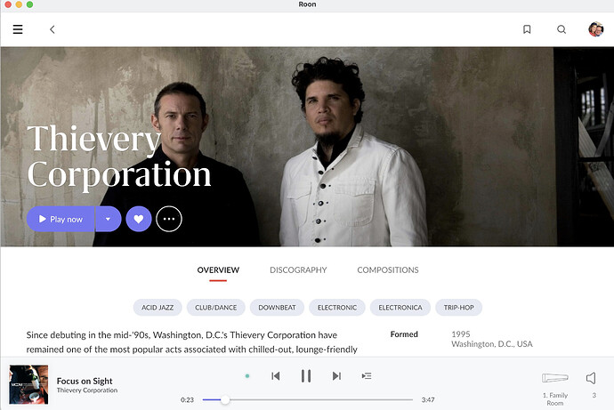
So many people talking about too much white space… it would be good for people to post screen shots and indicate device and monitor size.
I have seen some examples with a short, two-word title but if you used a medium or long album title it would take up most of the space.
Just post examples of Album and Artist pages. List specifics of what you would change.
I think the headings “Hello” and “My Albums” should go away for sure.
Would like to see wide screen display examples, I think the white space is much worse there.

