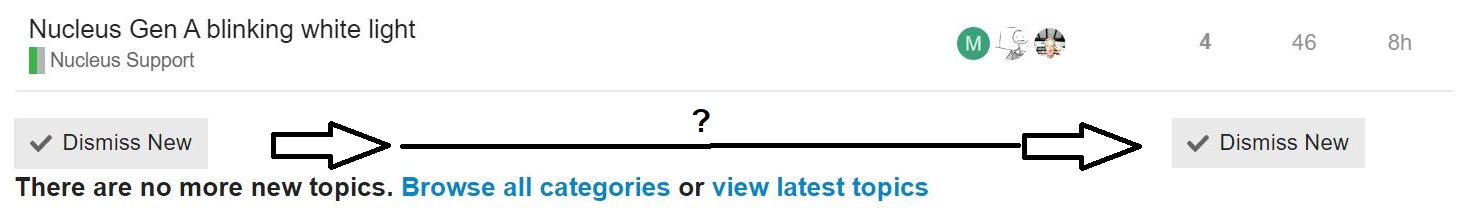
The "Dismiss New button is now on the left crowded between the last post and the “There are no more posts” notice. Why can’t it be more obvious and available where it was over on the right?
2 Likes
I preferred it on the right side.
My guess is that’s likely a general Discourse change rather than anything specifically Roon has done.
But hopefully someone with actual knowledge will enlighten us.
1 Like
Did not change on Audirvana
As @AceRimmer noted, I believe Discourse recently updated their software and this was one of the changes Discourse made to their platform.
1 Like
Another being that once again older iOS devices are not supported anymore.
Foo. It is another change made by such companies that seem to be for no good reason. Surely, it cannot just be for appearances sake…
Personally, I think having the button on the left underneath the thread titles makes far more sense when scanning down the list. But maybe that’s just me…
I agree to disagree (completely).
1 Like
If you would like to give feedback to Discourse, who made the change, you will find them here:
Thanks but I’ve made attempts with software developers in the past and it has never turned out to be worth the effort. I will just add the to my list of pet peeves which, in the end, are just noise.
Thank you for moving the “Dismiss New” button back to its proper place. ![]()