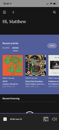
I don’t understand why this page was designed like this. What value are you adding for me as a user here? I know my name and that takes up 1/3 of the view on an iPhone 11 Pro. I see the top of the second area but it’s of no use at a glance because I have to scroll. What’s the point of a dashboard if there’s more focus around my own name than there is the actual data being presented? It’s one of the craziest design decisions I’ve seen in the history of Roon.
