1.8 design choices that I like, maybe not obvious

As I’m using the version I come across good design choices that are sometimes different from before, sometimes new, and maybe not obvious. I’ll illustrate in this thread.

Albums sometimes have a line with metadata below the image and intro, above the tracks:


It includes several dates, like released and added.

But sometimes that information is shown in a vertical list on the right:


I assume this is because the album has a review/cover text, the metadata had to be moved aside.
The release date is shown at the top in both cases, but no date is shown on the right, in particular not the added date which is relevant.

But the dates appear when I click on the expand arrow, previously this expanded only the review, but now it expands all the stuff that is cropped, including the metadata column on the right:

This is really quite reasonable, but it’s not obvious to us because previously that downarrow was limited to the review which was kind of outside the normal display.

2 Likes

Another reasonable change:
Scroll down in the review, and you still land on the track listing, because of course you should since the review is now opened in the regular presentation.

But we don’t expect that because in the past the review was a dead end, had to be closed to look at other stuff.

(The artists on the right are not Credits, those are below as usual, those are artists mentioned in the review, so you can jump to them.)

1 Like

I like this one a lot. Great for discovery . Although I don’t like the aesthetic choice of the circles for artists. I think the same square as albums is a more consistent approach.

2 Likes

In general I really like the update.

1 Like

And 2 other things not Immediately obvious to me were .

  1. clicking the title at the top of the page will bring you back to the top of the page.
  2. clicking anywhere in the review will either open it or collapse it one doesn’t have to click on the arrow (just avoid hyperlinks!)

.sjb

1 Like

That’s great, I hadn’t noticed that.
And of course it should, the review text opens up when clicked, just like an album cover does.
And in fact, both the artist picture and artist name open the artist page.

Much to discover.

1 Like

Another detail I hadn’t noticed.
Something like this has always been there, but I get the impression that it is richer now.

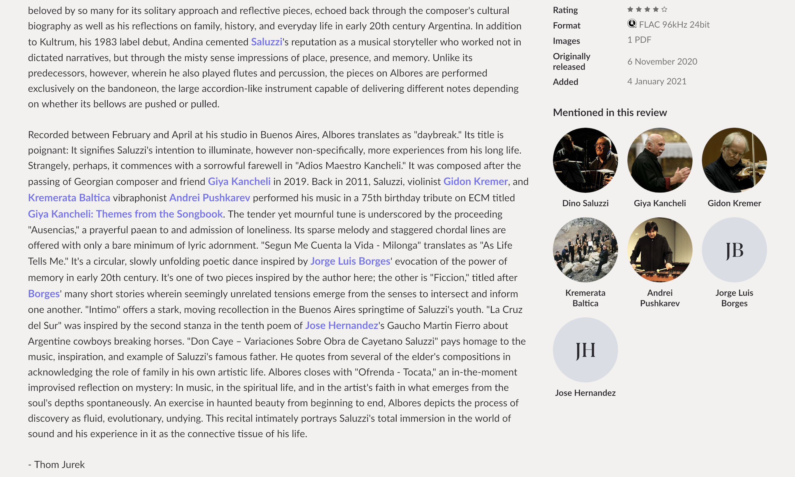
In a review, when there are references to artists and other albums, they become hot links. In 1.8 they are also listed in the column on the right.
This review of a Dino Saluzzi album refers to albums, artist and composers I know — but how did Jorge Luis-Borges show up here? He is a prose writer! I clicked the link, neither the album nor the musicians had anything obvious to do with him, but he was credited with Liner Notes. Similarly Jose Hernandez, credited with Translation. Some of the linked albums and artists are in my library, some are not, some are local, sone are streamed, no matter.

The album I’m listening to is linked to a whole world of culture out there — it’s remarkable.

And as always, with a link to an artist, you have all the related stuff from discography to upcoming concerts.