That was a design choice years a go that was supposed to evoke a Classical music magazine experience. Personally I always found it a bit yuk especially when switching between genres. But I guess you can get used to anything.
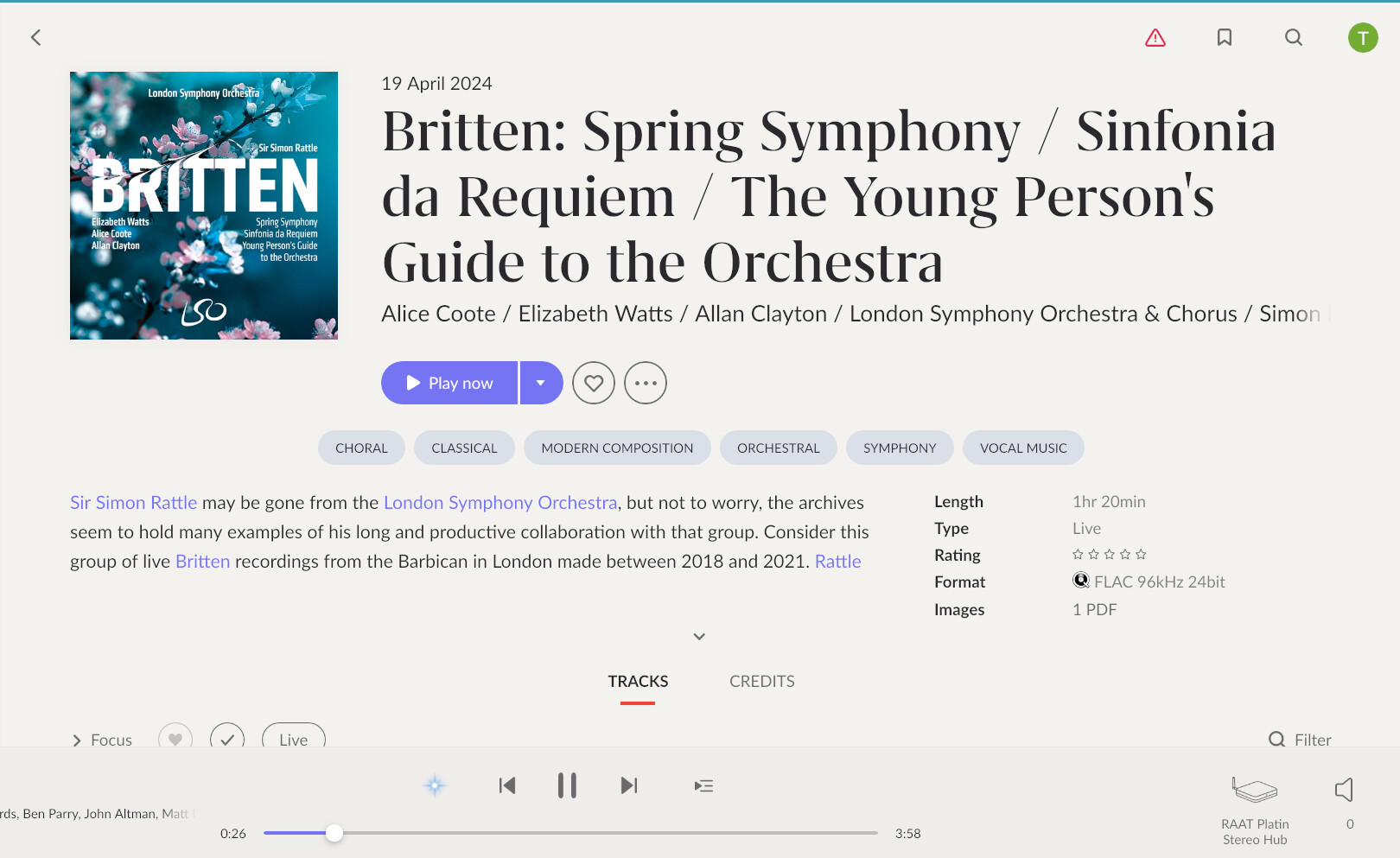
Same with the rather impractical font choices which don’t work for album banner heads with Classical which can often be very long and get split randomly across 3 lines. This is not even a particularly bad example from recent Qobuz recommendations but nothing really fits. Difficult to read and the lack of contrast with the off white / grey? background doesn’t help.
I don’t remember now when that GUI refresh was. Maybe it will soon be time for another.