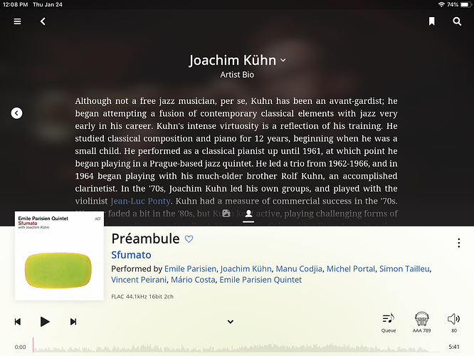
I talked about my dislike of excessive delineation of sections. Of course, the Now Playing page which was my go9d example is also a bad example when looking at text:
Why do we want white text on black background? Aside from the esthetics (and eye strain) of the negative colors — I chose the Light theme for a reason! — this serves to delineate the sections, the text from the bottom part. Heavy-handed.
Yes, if that was inverted, the white background album cover would blend in. Do we need to fix that? Don’t think so. I sometimes have the Economist lying on top of the New York Times, both white, doesn’t cause a problem. It’s true, in that situation the Economist casts a drop shadow which helps separate them visually, if ne essay we could do a minimal drop shadow.
