@Y’ALL ABOVE(especially the ‘naysayers’) I think you all forget where ROON Labs came from-- Meridian SOOLOOS. Do you remember how much THAT cost? I remember the cover (some probably now defunct) STEREO magazine that described it for the first time and how I drooled over what it could do and @TheComputerAudiophile(the founder) review of SOOLOOS many years ago.
It is OK to be critical but come on this is SOOLOOS made for everyone and on the cheap.
I love it compared to ver 1.7 and I love the DARK MODE.bobbmd
Is there a comparison somewhere of what was requested vs what was implemented for classical? Apart from the focus feature I did not see any improvements. Something is not improved because there‘s a claim about it. It is improved because issues and requests were tackled. I asked this question in another thread, still waiting for the annswer. It is still very cumbersome to navigate around box sets. Composition identication for streaming content was not improved, etc. I could go on.
2 Likes
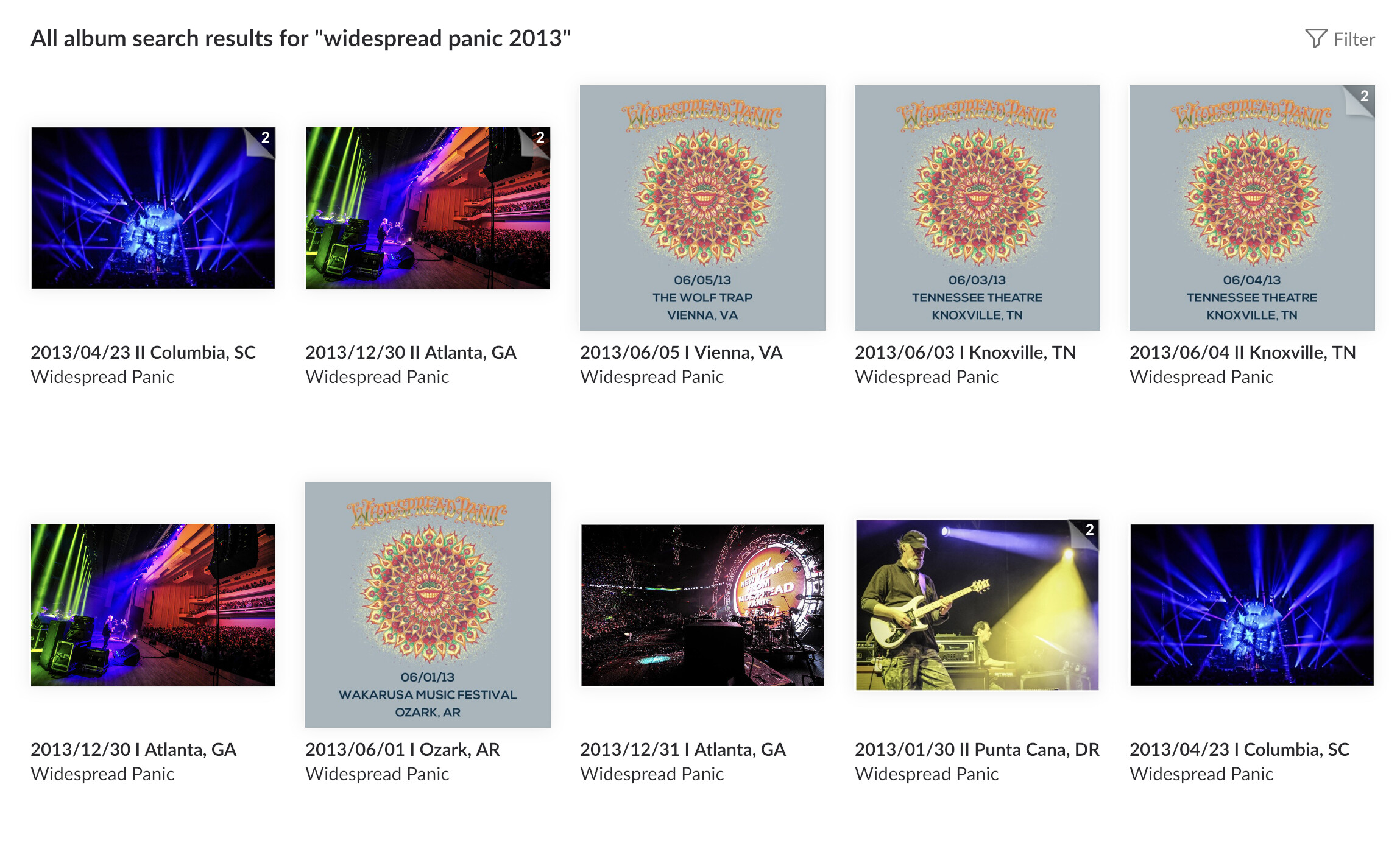
Navigating 500+ albums without a list view is agonizing on any device - it is downright tiresome on a touch screen. There is no way for me to quickly select an artist + year. I just tried a global search of “Widespread Panic 2013”, which does in fact return all live recordings I have from them in 2013, but the sort makes zero sense and there is no way for me to change the sort what was returned. Live concerts are generally split into two sets, notice the “I” and “II” after each date. The sort does not return the sets side by side. If I wanted to listen to the whole show, I’d need to go find the other related set somewhere buried in the search results. There’s also no focus within search results. The whole UX is just one poor, inconsistent decision after another. It really sucks because the whole ‘transport’ side of Roon is amazing and offers functionality I couldn’t otherwise achieve with a bunch of mixed brand HiFi systems throughout my house.
34% negative/very negative, unless you think the 9% of neutrals are doing a lot of complaining.
1 Like
As the poll starter, I can assure you that wasn’t the reason I set the close time at 72 hours.
Understood and no offence. What would you think about opening another poll and let in run for a longer period, say two weeks or even longer?
At first I thought your post was “shouty” from the headline, but you have been engaging well with replies, so thank you for keeping your thread on track. Here are my thoughts:
-
I think the magazine analogy is being overplayed. I don’t think Roon was trying to make a magazine, there is no editorial content beyond artist bio and album reviews. I wish thee was more content (not up in your face but at a secondary level, like a Google search into a curated set of well regarded music sources)
-
I am optimistic (but have no facts) that the reason vertical scrolling took so long was that they decided to do it, they should “do it right” and rearchitect significant parts of Roon behind the scenes. To use Valance more, to use the streaming data more, to re-design the internal data model. I hope that this is a release that lays the foundation for 2.0 to include a mobile solution, two way playlist syncing with Tidal and Qobuz, and other more advanced features. Remember, they called this 1.8, not 2.0. 1.7 (Valence) and 1.8 are stepping stones to 2.0
-
I think the core Roon product drivers have large physical libraries of music (again guessing) and I think some comments that they are moving away from owned music are misguided
Roon leadership is passionate about music, they have done this their whole lives! The best is yet to come!!
1 Like
Sure, but honestly anyone can start one - I don’t want to claim a monopoly on Roon popularity polls.
I don’t know what Roon’s schedule is to make their first release based on some of the feedback they’ve promised to take on board. They’re normally quite quick following a main version. That was the original reason I picked the rather arbitrary 72 hour timing. I did notice the votes slowed down considerably in the last 12 hours so pretty much everyone that was going to vote did so, I think.
1 Like
I worked 20+ years with Bob Noorda and Enzo Mari: am I qualified enough to say plenty of bad choices have been made in v1.8 UI?
though… what bothers me more is usability as many useful “tools” previously in v1.7 are now hidden/broken 
8 Likes
now that‘s something we‘ve been hearing for quite some years now. still waiting 
2 Likes
Thank you for your input and positive feedback!
I really hope your words hold true.
If so I still think the update has downsides in details (bugs, missing things, readability etc.) that I would never have expected from a dedicated Roon team to be released and announced in a way that we will be blown away, what is obviously not the case. There are likes yes but this is something different to me.
1 Like
Sure, understood. Would you drop me a PM how to do this?
There were always two “recommended for you” sections. One was to the right of the album the other was a subsection of “overview”. To my mind, with my library and my listening habits, they operated two very different algorithms. I found the one to the right of the album consistently successful and used it a lot. Not so much the old “overview” one which I ended up never using. Seemed to be a poor imitation of Qobuz so I just went straight to Qobuz instead.
I haven’t tried the new recommended box below the tracks to be honest. 1) because I can’t see it and I don’t like the vertical scrolling needed to get to it. 2) because I did scroll around initially and assumed it was the old overview algorithm moved to a different place. From the design accents that is exactly what it looks like. I’ll give it a go to see how I get on with the picks but to be honest even if it is the version of recommended I remember I probably won’t be using it much as moving it does matter to me. I always preferred Qobuz, Idagio and Bandcamp for recommendations anyway and will just to continue to use them. The old roon recommendation was useful precisely because it was to hand and I didn’t have to scroll around or open up another app and I liked to use it to inject some quick interest into my listening queue.
I also much preferred the old “in your library” on the side panel because although it was quite crude and was often just a long unstructured list that is exactly what I saw, what was in my library. It also served some basic local library management functions. For example, it was an extremely convenient place to highlight and merge the many alternative releases of favorite recordings I have on an artist by artist basis. This made at least one part of library management as painless as possible as I could do this in an intuitive way whilst listening along and tidy up an aspect of my library without giving it much thought.
The discography is fine as far as it goes but it just doesn’t fit this sort of use case. I think it has been underestimated just how reliant those with local libraries are on dozens of little pieces of functionality that seem to have been depreciated or moved not to a different click but to a different, longer, sequence of clicks.
There are also logic errors with focus on discographies emerging on several threads for use cases that may or may not be important to you. Personally I find the discography view very confusing, counter-intuitive and difficult to interpret. A blur really. I also don’t believe the focus logic issues will ever be fixed. Primarily because at the root of the issues seems to be the logic needed for sensible presentation and choice with very large streaming catalogues that are exponentially larger than even the largest local library. These are very long standing issues. For example, what to do with large search sets of thousands of releases for famous artists or compositions? At scale there seems to be a fundamental incompatibility between presentation and views on local and streaming libraries.
So yes. Ignoring the aesthetic and layout and usability issues (which are important to me) I am seeing a fundamentally different 1.8 roon to a 1.7 roon in several use cases. Many also seem to be seeing this basic difference between the needs of streaming and local libraries. A lot of the differences I think are just down to scale which has a bigger impact than perhaps any of us realised. How roon addresses these challenges remains to be seen. None of us can really predict. But 1.8 for me is a shot across the bows of a very different roon future and is certainly making me reassess my roon expectations and how I want to relate to roon.
7 Likes
I agree with this, I don’t think it is so clear cut to say artists get more in the old model. I think they get very little per stream, agreed, but if I had to only by physical CDs I would have dramatically slowed down music purchases. For some reason I don’t like to throw out physical CD even though i have ripped them to FLAC!
I am in favor of any and all models that give more money to artists!
1 Like
It’s an evolution rather than revolution, but a definate improvement on the previous version. If Roon acquires more customers – and I think they are – then they’re doing the right thing. Those with rigid ideas about Roon are likely to gget left behind.
Roon has said that they read the feedback on this forum. But I very much doubt that they think this community is representative of all Roon customers and prospective customers.
Thanks for your very detailed report on your findings!
So, may I ask, in a nutshell, what are your thoughts WHY this update has been released in the way it is?
Good post, i think this articulated it well:
I think the next 2-4 months will tell us a lot as they recalibrate after 1.8. Maybe the pushed the lever too far towards streaming and will pull back. The future is still being written!
I basically agree to your both feedbacks.
Please tell us what the improvements are from your point of view.
Why? Imagine you ran a focus group of young, potential new customers and you gave them 10 minutes in front of their phone/ipad with 1.7 and the new Amazon interface and then you asked your participants one question: Which would you be more likely to subscribe to? And then tell them they need to subscribe to Qobuz or Tidal to listen to any music and ask them the same question again.
Why? Because makeup and perfume can make an existing package more attractive.
But what do I know.
Cheers.
1 Like
So, what are you trying to tell us?