Impressions after 48 hours are this is a real mixed bag of an update.
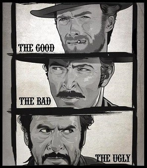
The Good: The new Roon Radio personalised listening feature is already excellent and will only get better over time as crowd-sourced feedback improves it.
The Bad: The new Search should be great, but isn’t at the moment - results are still very sketchy with duplications. Somehow we’ve also managed to lose functionality because it’s no longer easy to see at a glance which results are local and which are from Tidal/Qobuz. The visual design is incongruous with the rest of the UI.
The Ugly: The overall UI design decisions are pretty poor. There’s a real lack of cohesion. A lot of screen real-estate is wasted but also manages to feel cramped at the same time. An odd double-whammy of crapness.
In summary: a lot to look forward to in future updates 