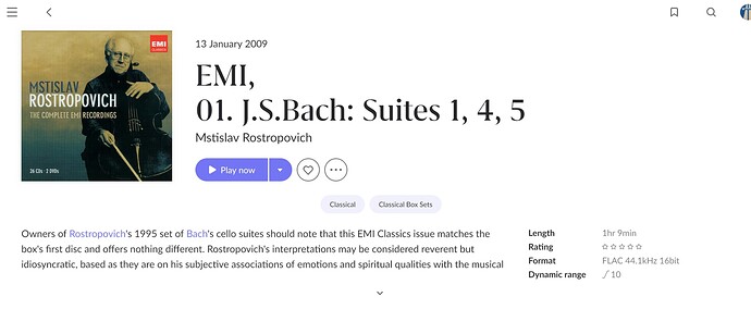
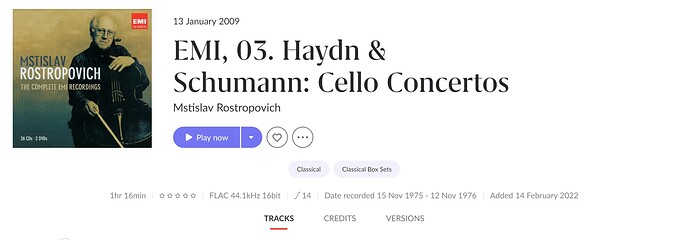
It still strikes me as odd that the layout changes between identified & unidentified albums.
To me, it would be much cleaner if the string of information containing dynamic range etc. stayed across the top, even when an album is identified. Then, the written blurb & linked artists could be underneath, split as they are now, with the text taking up the first two thirds of the width & the “other artists” on the right third.
One of the main pieces of information I add into my tags is the recording dates & if the album is identified, I have to click on the little arrow to reveal those dates.
I find that kinda messy when it could be so much neater with a slight adjustment.
To be fair, you could add a fourth heading to the TRACKS CREDITS VERSIONS line & have the text under one of those, that way it would all be super clean & minimal with easy access to the extra information for anyone who wants it, but that might just be going too far!! ![]()

