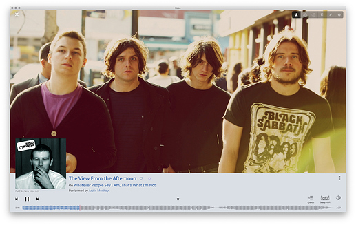
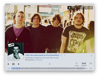
I’m somewhat amazed that I didn’t notice this earlier myself (still a bit overwhelmed by all the newness to me of Roon) but there is a hugely important bit of information missing from the Now Playing Bar: The recording date!!!
I have already posted a feature request to add the Composer to the Now Playing Bar. Someone reacted to that post with the remark that I could easily click on the Now Playing Bar to get to see the rest of the Now Playing screen, and he has a point in sofar that the Composer information is only one click away, although I still think it’s essential to have all relevant information available “at one glance” because it can very well be that I’m using the remainder of the Roon Remote screen space to browse though my collection in some way or other (Album view, Track view, Composition view…)
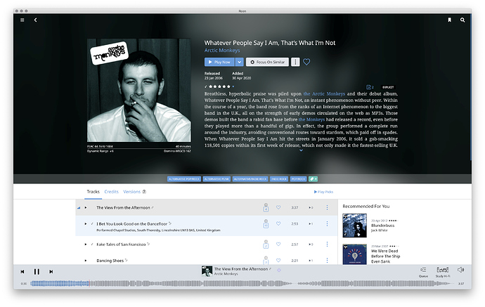
Anyway, my point here is that the recording date can only be found on the Album page. And I know that’s also just a click away (a click on the album cover suffices) but as I said I I’d like to be able to get this info at one glance.
I am listening to Roon Radio at the moment and it serves me a nice selection of my art songs. So I constantly go to the Roon Remote to see what and who it is I’m hearing. And then a quick glance at the Now Playing Bar should suffice to not only find out the name of the song and who sings it, but also when this particular performance wa recorded. Because then I can roughly calculate how old the singer was at the time, to name just one tiny detail. (Age is very defining factor in a singer’s voice quality)
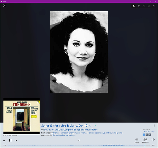
Finding out who sings is also a bit of a problem when more singers are active on one Lieder album, since only the amassed list of performers that perform on the album is shown in the Now Playng view:
In the above example one could argue that I’m hearing a male voice singing and so it cannot possibly be Cheryl Studer, but there are of course lots of situations where this is far less obvious! (and I don’t want to have to play Sherlock)


