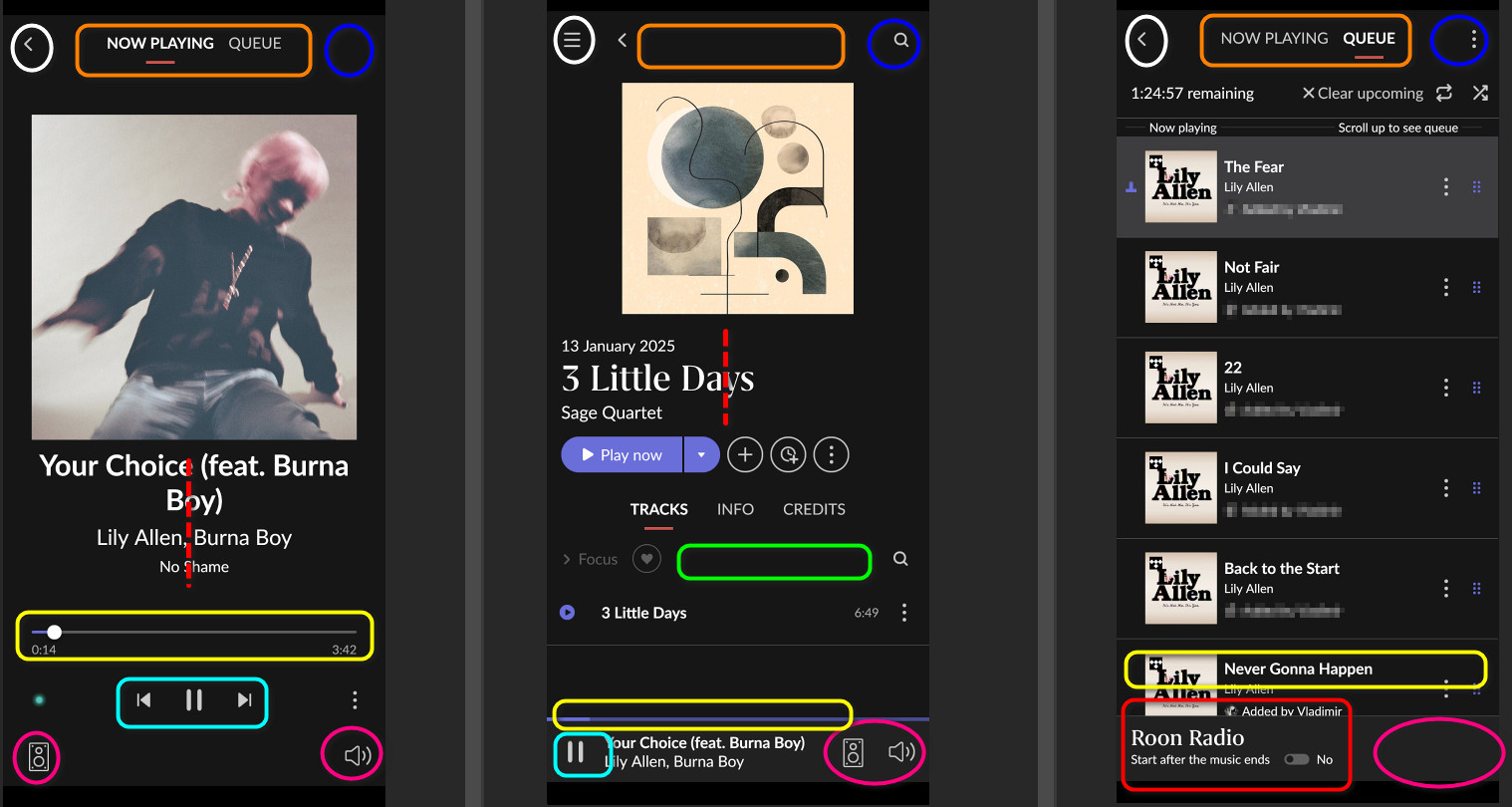
the UI of the android app for a smartphone was for me since day one a big flaw… and unfortunately still is. Didn’t use it on tablet … don’t know if there is something different, but in case you just want to use a smartphone as handy remote control is really frustrating because is just not coherent, doesn’t follow the UI logic of the main program and has, at least in mine opinion, some big flows that constantly makes you do more swipes than needed.
- main navigation functions are shown only on album screen or missing
- same functions are shown on different places on different screens
- missing proper swipe functionality (after all the main advantage of a smartphone/tablet compared to a traditional mouse/keyboard control!)
- much unused space
- not optimized for one hand/ thumb navigation
For me it is still a mystery how was decided, that when I look at my queue i wouldn’t want to switch to my library or to do a search ?! Or I am the only one here incapable of finding the logic?
Or why most used controls are at the bottom of the screen, except the “queue” … is contrary to the main program for desktop in the upper part of the screen.
I will allow me to share some ideas … hopefully someday we get really a enjoyable and usable app.