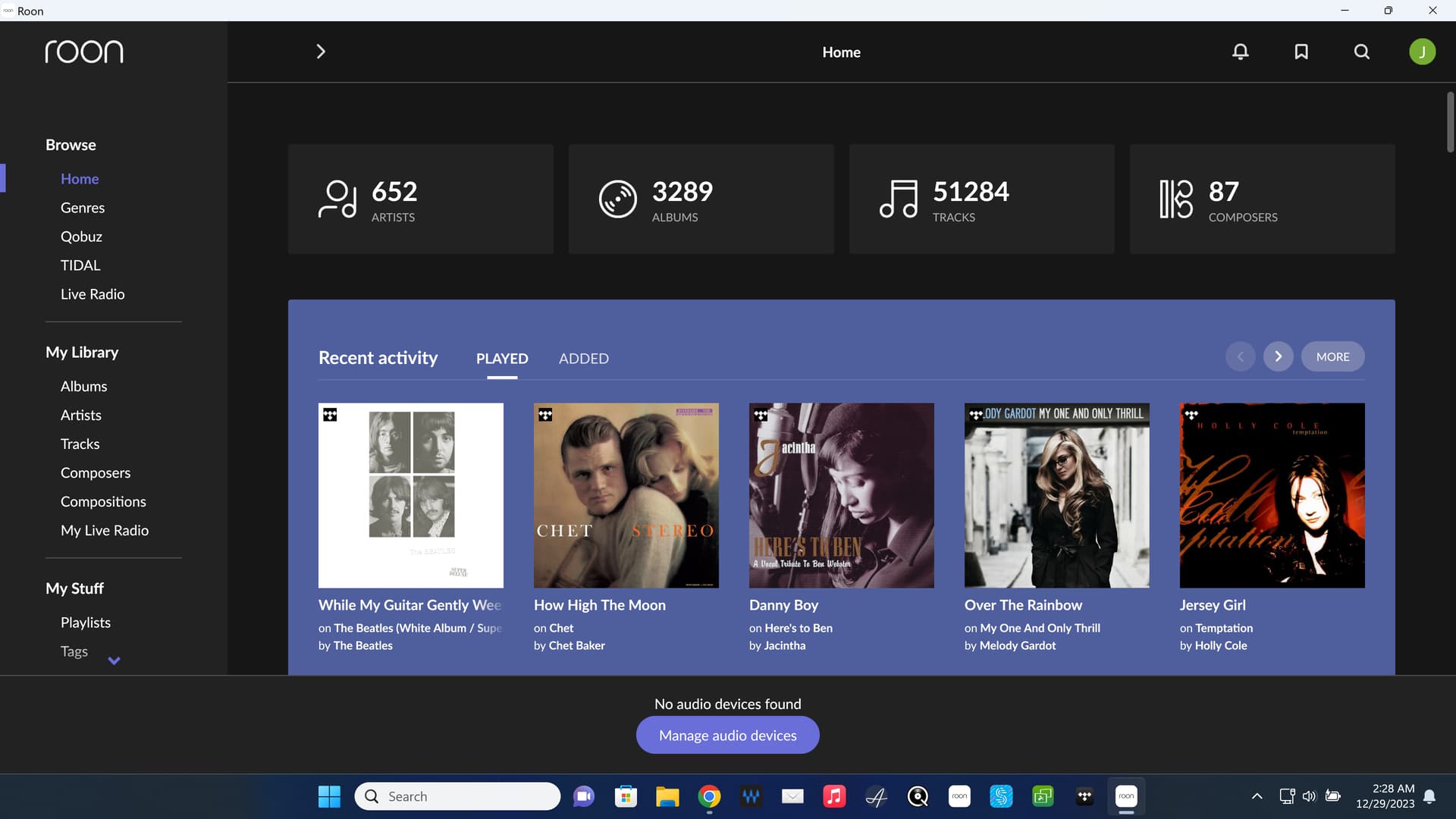
Is it not strange that, when starting the App, that “Now Playing” is not the prioritised window in the App? This main section shows the last search. The bottom little bar shows what is “now playing”, and it takes two taps, first on the bottom section, and then on the cover to get to the detail. I would suggest that any time one starts up the App, on whatever device, that it shows in full whatever is Now Playing for the last viewed zone for the App on that device.
Only as an option please because it may take me several taps to where I was before ![]()
Put it in as a feature suggestion
There have been others such as
1 Like
If you ask 10 different people, you’ll probably get 20 different opinions of how this should work.
EDIT: I almost always use my laptop so it’s easy enough to get to wherever I want to go.
Not on my Apple IPhone OS…not sure where your screenshot is from. I use iPads and iPhone with Roon App for much of my Roon usage. Per earlier suggestion, I like the idea that the user can have the option (after all we have SO many options in Settings) to choose what an ‘opening’ screen should look like when opening the Roon App. I know what I would like, but recognise that others may want something else (as is, or even a Home Screen)…
Sounds like we should have options to set the ‘opening’ screen (whether on Laptop, iPad, iPhone, or whatever) the way a user would wish (as is the case for a multitude of other user preference choices)
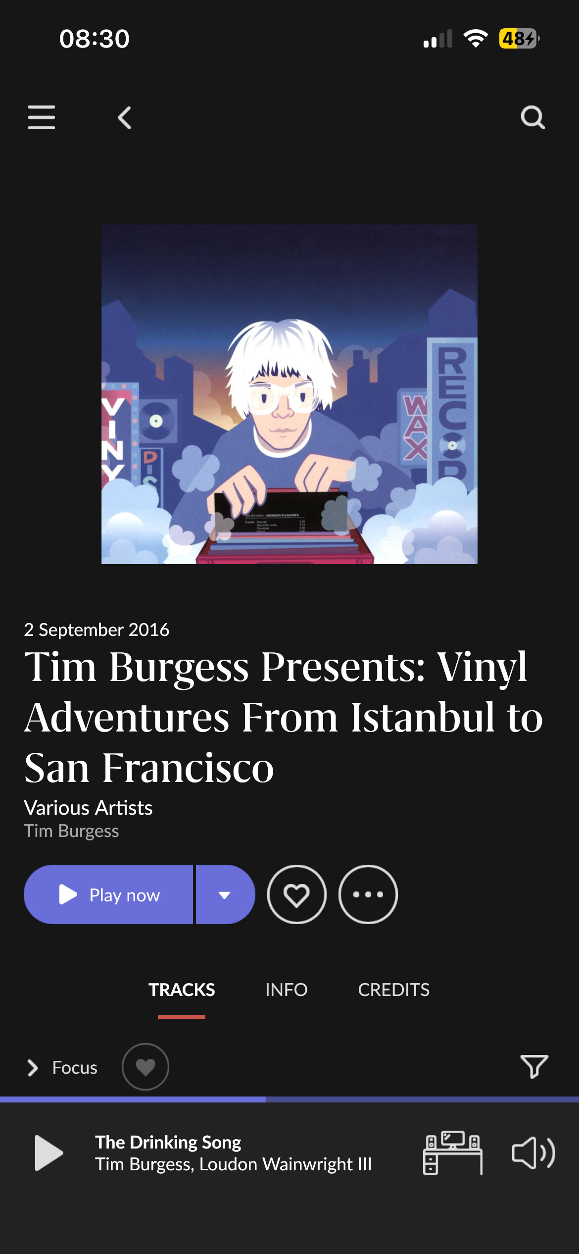
Screenshot was from iPad.
BTW, all Roon apps I use, Android, iPad and Windows, come up with the last screen remembered when started.
I don’t have an iPhone but find it hard to believe it’s different in this regard!?
Not being much against more customizations myself, I can easily see the scenario where many users would clobber their interface to oblivion with a myriad of options and then open support tickets to get back - and Roon would definitely need to offer a myriad of options to make everyone happy to not keep on posting about their pet peeve.
That’s why I believe it’s wasted energy to keep beating a dead horse…
![]()
1 Like
When I start Roon it always starts here. That’s because before shutting down, I always clear the queue and back out from where I am to here.
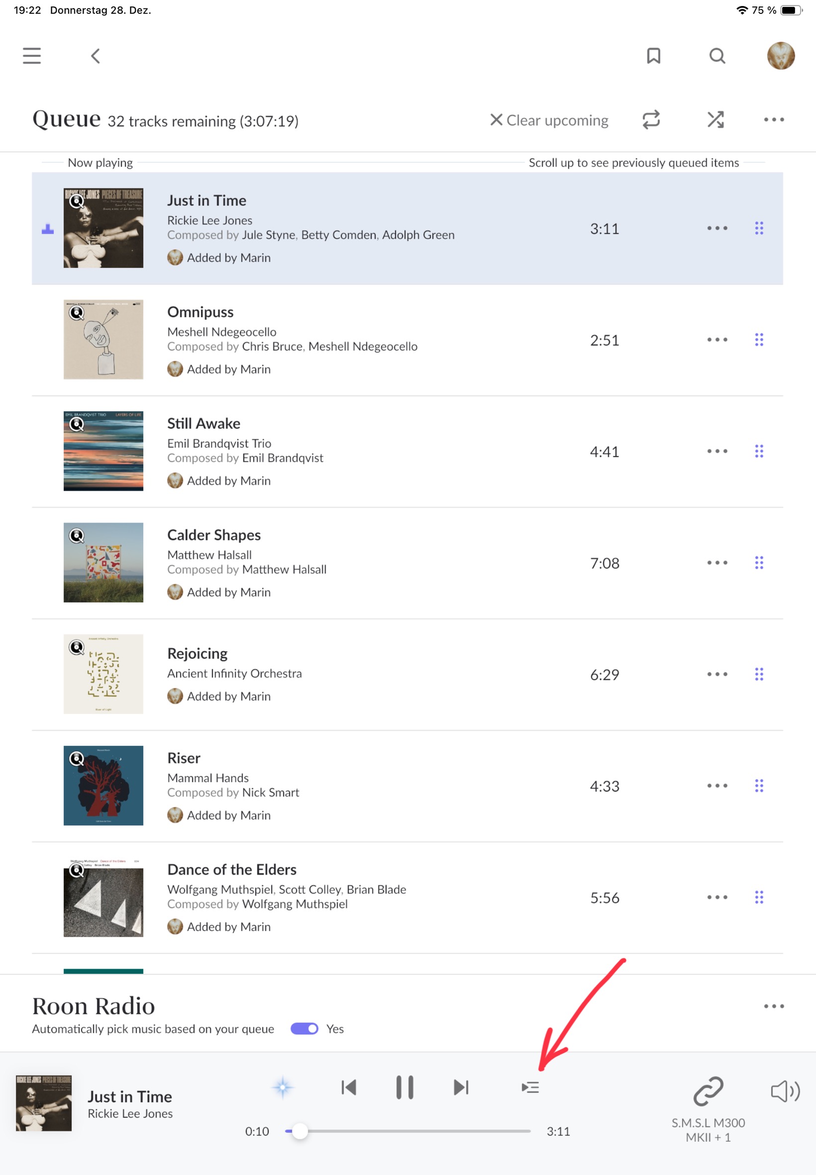
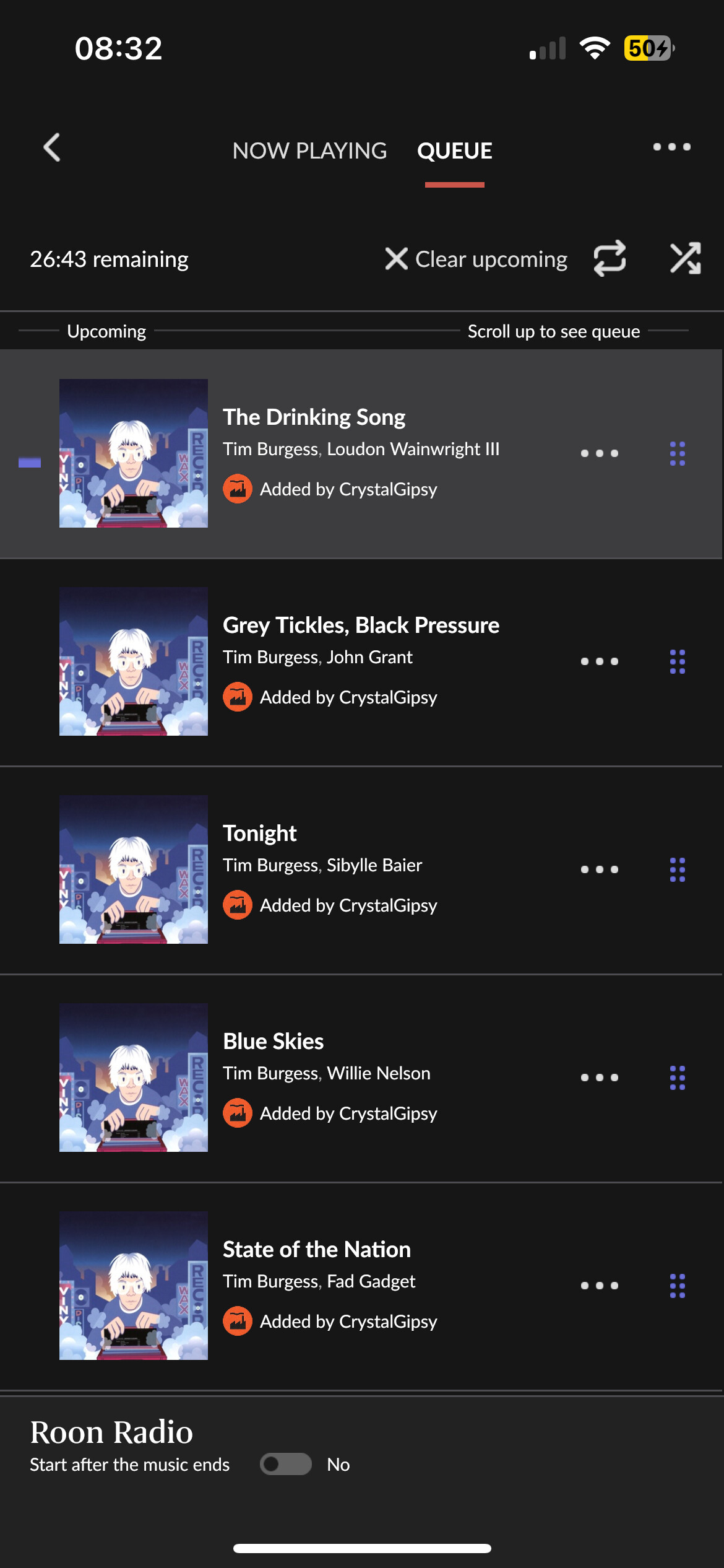
iPhone is completely different it’s a pain in the arse. It goes back to the page you are on but you have to click on play area then queue to get to the queue where you loose play controls.
So it’s not going to the page you were on?
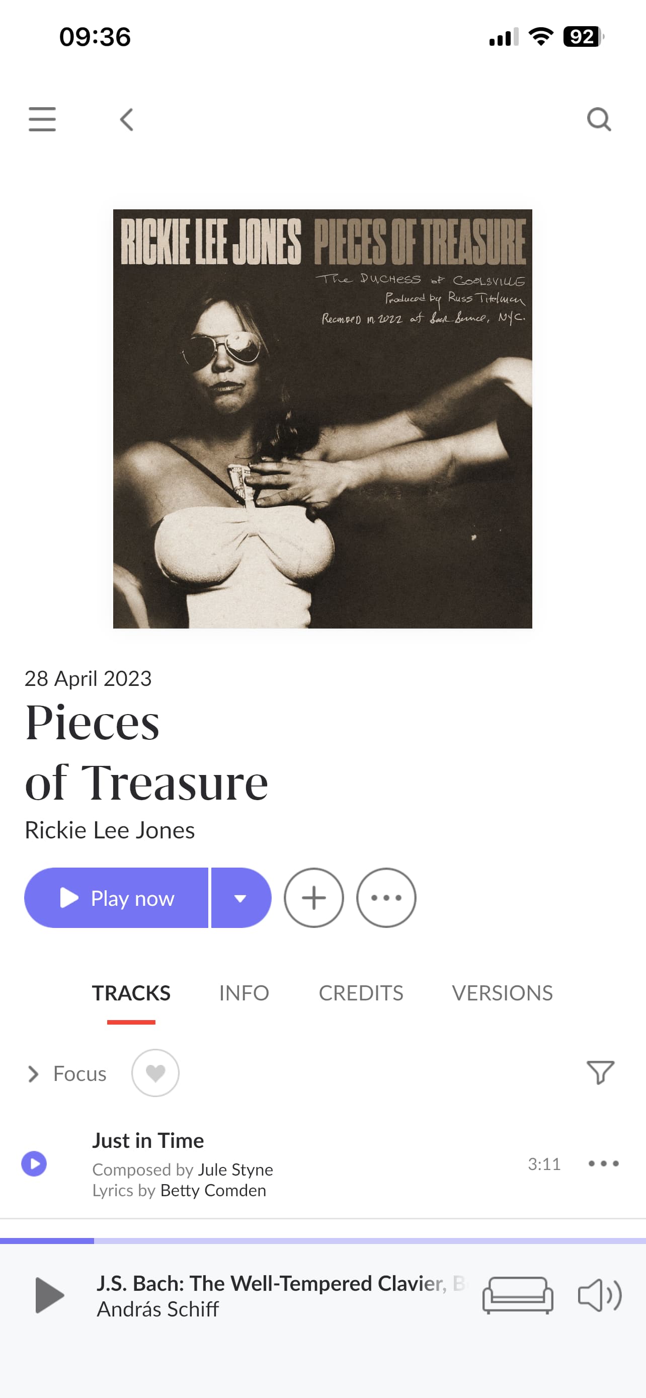
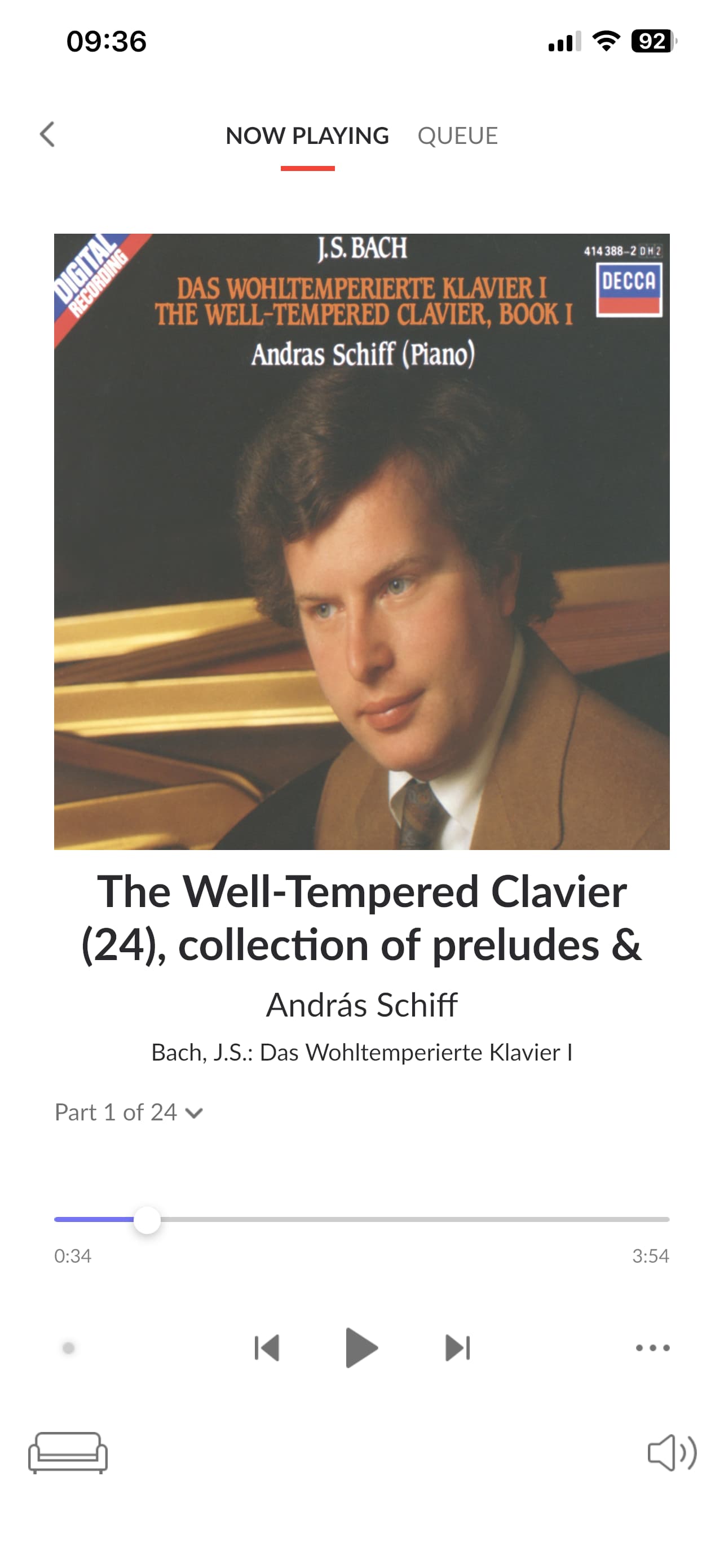
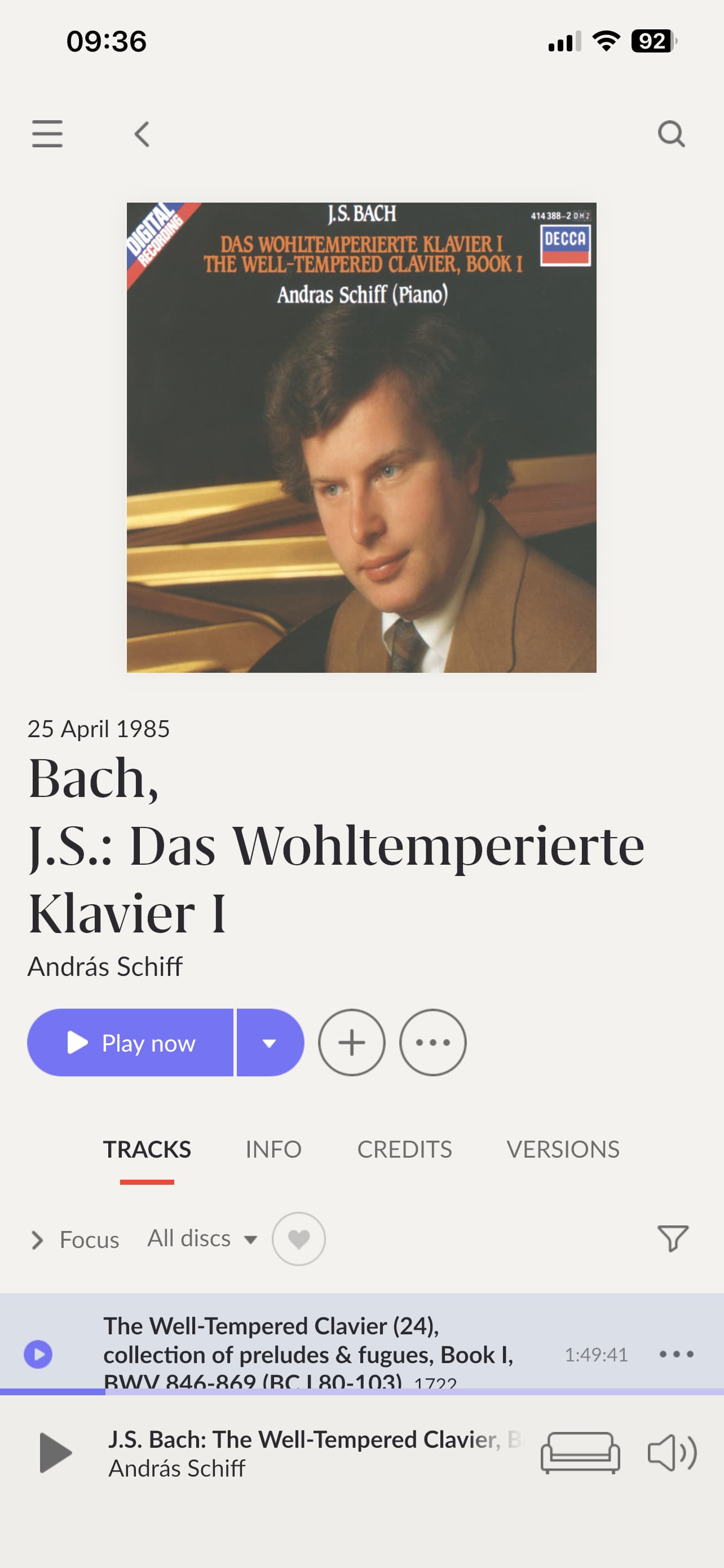
Glad that I have a more sympathetic view from CrystalGipsy :). Here is the sequence to get to an album which I wish to navigate…(so I was playing Bach, I may have searched for Rickie Lee Jones yesterday. Today I open Roon (from closed) on iPhone, and see Rickie Lee Jones. In my mind she should not be my ‘start page’. Either a Home page, or (preferably) the Bach album. I recognise other use laptops etc, but I am in a house with multiple zones and multiple users. iPhone is the most used for Roon.
I answered that did I not in what you quoted? ops case it isnt and getting to queue requires a number of presses.
It doesnt go back to what is actually playing which is what he would like, rather than go back to where you were.