What about artists currently not in the Valence database? Is the only option just continue using images manually uploaded to my local Roon database, no way to upload to Valence in such scenario?
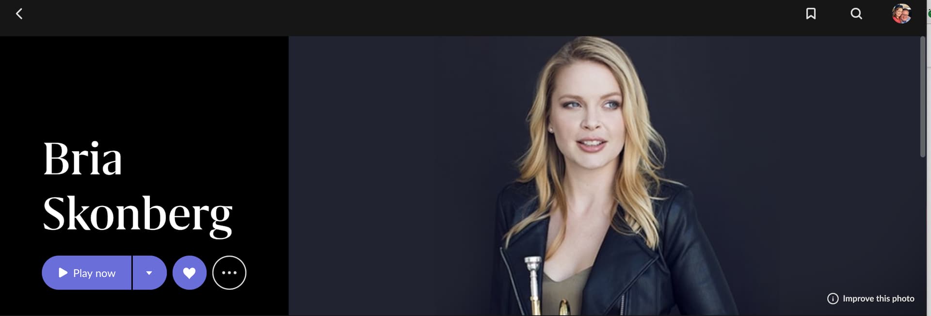
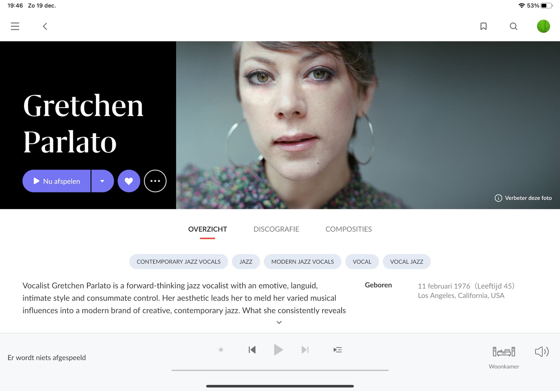
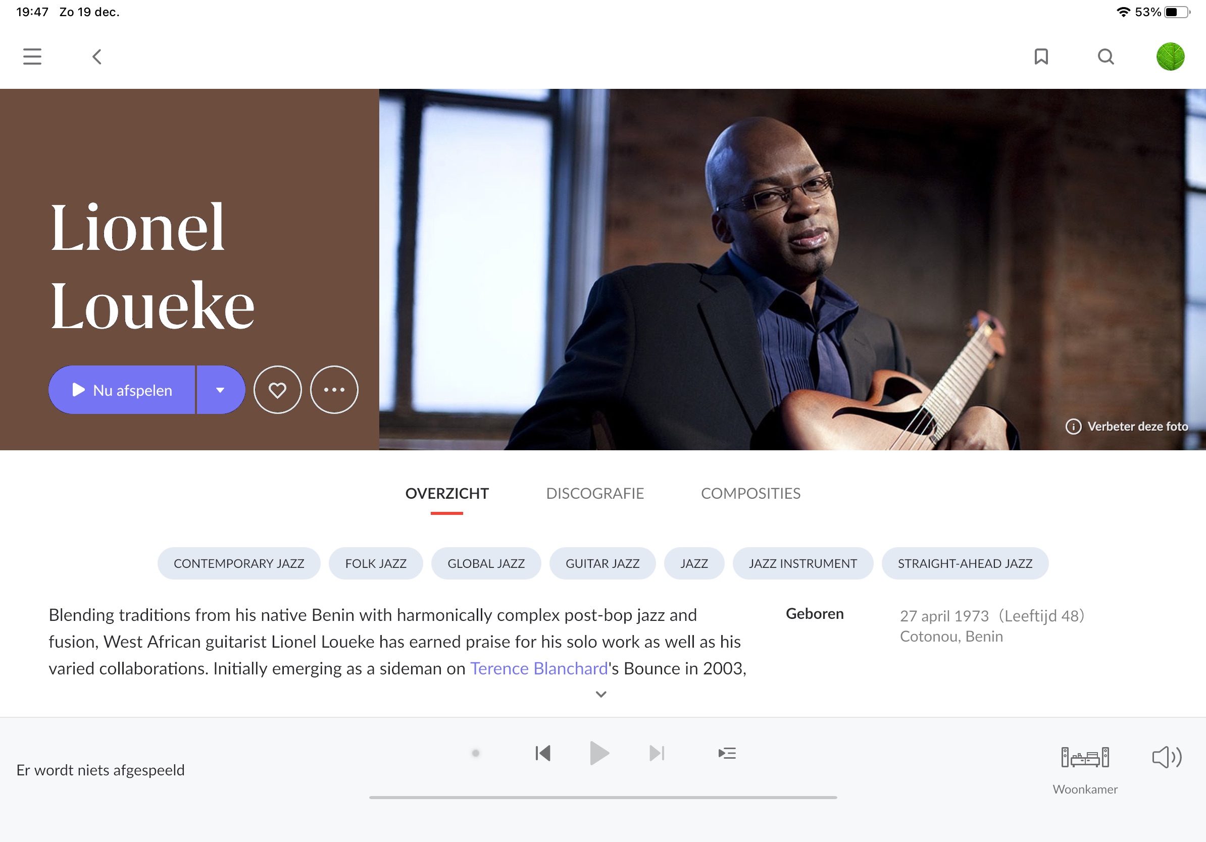
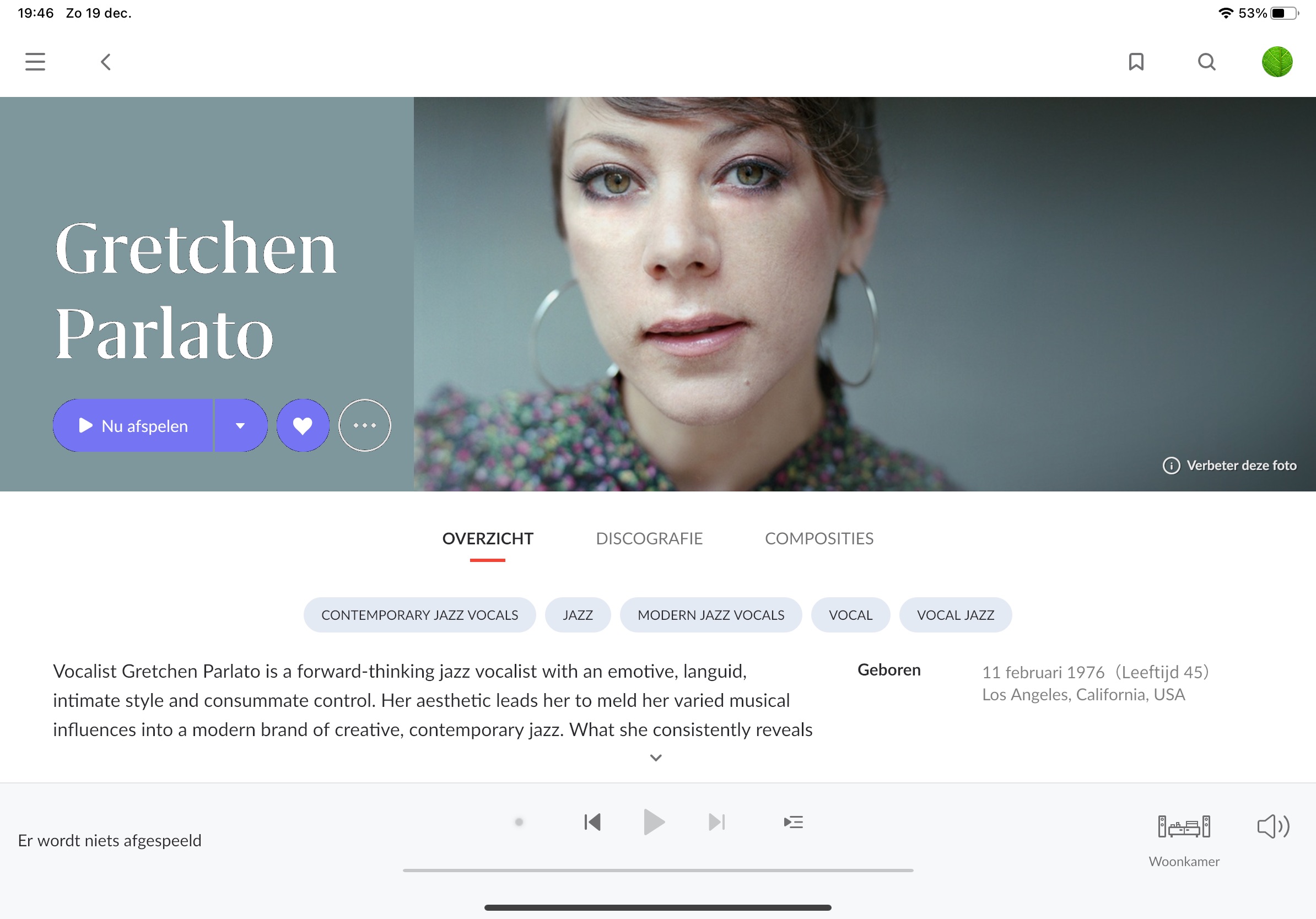
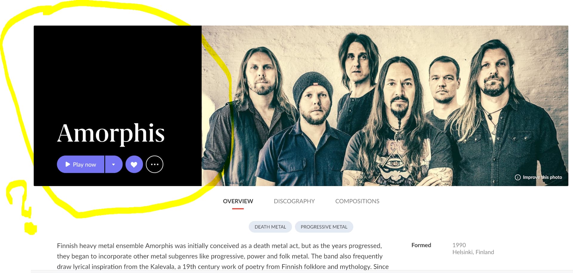
What about the black background towards the left in artist view? Is this as intended, or a bug?
Would rather prefer to use images that I’ve been carefully selecting and cropping for each artist in my library Since I have no idea who owns the images, would probably avoid publicly uploading to Valence in the end.
Btw, it is interesting that:
The “black background” issue is occuring even on my Android devices (phone + tablet).
The issue is occuring even for artists where the Valence image is selected instead of my locally uploaded image.
Thank you very much for answering! Have you seen the “black background” issue reported already in this forum, or should I create a new support thread for this?
Q1: you can upload images for artists currently not in the Valence database. First sign into Art Director, then in Roon go to an artist that you know is not in the database, and click on Add a photo. The Art Director web page will then open to the “Upload new image” page.
Important: you should only upload images that you either have the copyright for, or images that you know have Creative Commons rights for sharing commercially.
Q2: That black background is not being seen by everyone. I assume that it is a bug that affects some of us - probably triggered by the specific hardware/software environment in which the Roon display is running.
I hoped it was a bug…I even reported it during beta.
Especially on IPad it’s ugly and inconsistent as the banner looks fine when rotating the iPad.
Also strange that the box does not honor the light scheme roon is in…white in light mode and black in dark mode.
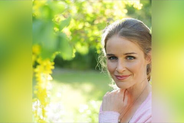
The white or black box should only show when the image would already break “theme”. For example, its awesome to see a black box when the left side of the image is black (or very dark).
if there are images where black or white is showing when the edge is not near black or near white, it means the photo is fooling our edge lightness detector, and i’d like to see those examples.
Ask 100 people their preference and you would probably get 100 different answers. I guess that begs the question, “Does Roon ever use outside Focus groups?” @danny
In the screen size you have when you see the black box, the designer felt that 16:7 would take up too much vertical real estate. Therefore, a design was created to allow for a shorter height. Maintaining aspect ratio ( which is it requirement ), that means the width is also shorter and that space needs to be filled by something. I saw tens of designs during development and these were the best.
As for why the images noted above are using the black colored area, those just need to be resolved. Maybe the thresholds are not set right, or maybe the algorithm needs improvement for detecting what is worthy of black or white. That will take some development investigation.
This blurred background design was the very first design that I suggested to our designers, and they actually implemented it. It looked horrible in reality. The blurred design only works if it’s truly edge to edge, and on a large percentage of our users desktops, the sidebar is open at all times, causing that blurred part to add a second hard edge that makes it look like it’s floating.
 Since I have no idea who owns the images, would probably avoid publicly uploading to Valence in the end.