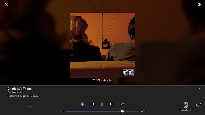
When in Roon’s now playing (?) view, the one that shows when you click the album art of the currently playing song in now playing that shows things like album art, artist pic, lyrics, etc., has really poor use of space on the PC app. See this screenshot.
Without that little down arrow to close the view being spaced like that, there is TONS of room to move the track info down and shrink the grey bar across the bottom. This screenshot is on a 4k TV at 300% scaling, but when the scaling is set to 100%, the little down arrow pushes the UI upwards a significant amount. If this arrow was moved, it would allow for a better use of screen space.
