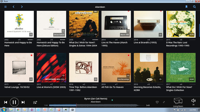
Curious why the devs decided to not implement this? I know I can right click on the album, move my mouse to the top of the page and then select play but I would think having one touch play for individual songs would also make sense for individual albums too?
It’s there, the little arrow on the left
My Bad, I misunderstood.
Hi @tboooe,
It’s not possible, I think Chris just misinterpreted your post.
I’ve changed this topic’s title from ‘… album list’ to ‘… album browser’ to help clarify.
ahhh dang…I was hoping I was wrong. Not having one touch play from the album list is a real bummer is that is how I normally navigate especially with albums and artists I know really well. Oh well…the dream continues.
At least you’ve gone from 3 clicks down to 2. After right clicking the Album, the Play button at the top of the screen starts Playback immediately without the pawmasher.
Cheers, Greg
Thanks @Greg, I hear ya…its an improvement though I feel like the devs just went half way. I would love to understand the reasoning why they decided not to implement this. I think browsing by album is what most people do. The implementation of this album one touch play feature in Sonos is really really convenient.
No this would be awful if I am browsing and looking for information on albums if I clicked on one it would satrt playing. No no no. Long press and then play ok but we have gone far enough already on this click on anything and it plays.
The Sonos implementation is very effective. The play button is on the lower left side of the album art work so playing an album really requires a deliberate action. I have never accidentally pressed play when attempting to select the album to view more detailed information.
This very thing happens to me frequently when I use the Tidal desktop application. I have to remember not to click in the center of the album thumbnail. Not such great interface design, IMO.
Different clicking in the centre of the album thumbnail without any indication of where to click, or not, and clicking in the corner on a specific icon?  - I agree the play album feature on Tidal is pretty poorly executed.
For me, yes, definitely, because my natural inclination is to click in the center of a thumbnail or icon.
Going from memory, I think that in Tidal Desktop, if you hover over an album thumbnail, a “play” triangle will appear, but I frequently don’t hover.
Unfortunately, hovering doesn’t work very well on phones and tablets… ![]()
Agreed…why not just a play icon in the lower left corner of the album art?
There comes a point where there’s just too much plastered over the album art, IMO. If we’re not careful, we’ll end up in a similar place to the Microsoft re-design of the original iPod packaging…
Agreed, we dont want a cluttered look but we also dont want an inefficient interface.
How about a compromise and moving the Play button from the top of the screen to close to the album art when after either right click or long press? Or put the one touch play button next to the album art?
Don’t think that would work. The Edit button is on the Bar as well and sometimes it’s necessary to select more than one Album (ie. Merge Albums). The Play Button might get in the way of multiple selects.
Cheers, Greg
Strikes me that the approach Plex uses for its web interface would work here: when the cursor is placed on a movie tile (album), an overlay appears with a Play symbol centered, an Edit pencil in the lower left, and ‘…’ in the lower right (more options). Not sure how that would translate to the Roon UI: right click and long press?
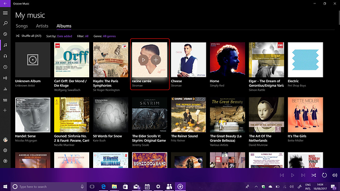
Here’s how Microsoft’s Groove does it… As you mouse over albums in the album browser, you get two pop-up icons overlaid on the coverart. One for Play Now and one for Add to Playlist… If you click elsewhere on the album cover, you’re taken to the details page for the album.
See the screenshot (I’ve highlighted the album where the mouse was with a red rectangle - this has been added to the screenshot)
I suppose that this could be transposed to a similar UI experience in Roon, with “Add to Queue” in place of Groove’s “Add to Playlist”.
The issue is - how well does this work on touchscreens? Groove seems to be using some sort of equivalent to a mouse roll-over when using a finger. It does pop-up the icons on a touchscreen, but there’s clearly a knack to using it properly. I’m too old for it. Resorting to long-press brings up a menu.

