I now I have been asking this many times before but I think it’s time now, more then it has been ever before, for custom fonts and colours.
This is not a request about taste. Weather I don’t like the colours or fonts has got nothing to do with it. I can live with things that could look better in my opinion but it is getting annoying when it gets in the way of usability.
Firtst the colours. Int the old version the blue letters on black background where very hard to read. Turns out purple on ligtblue background is even harder to read.
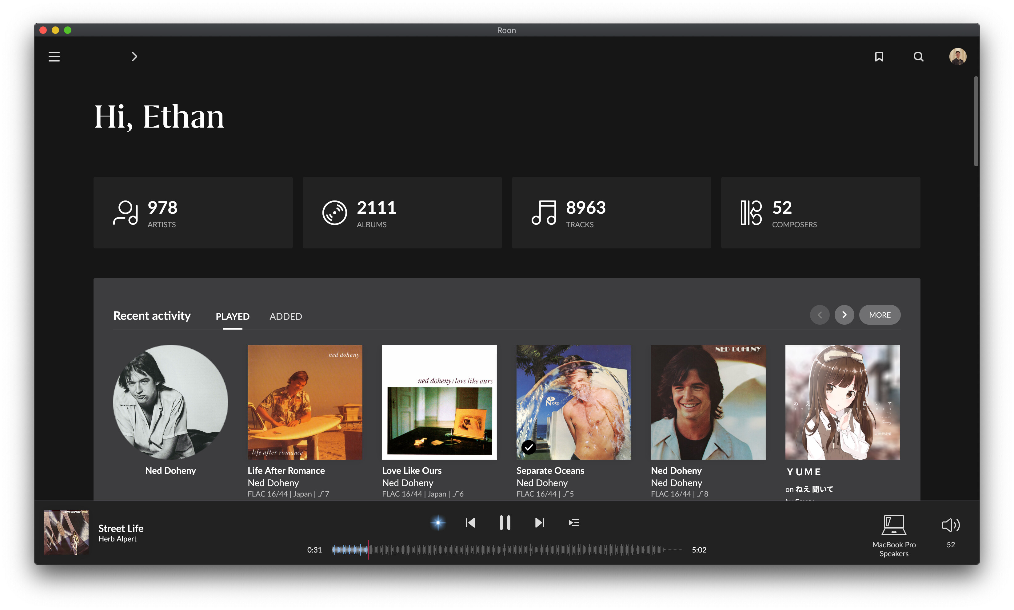
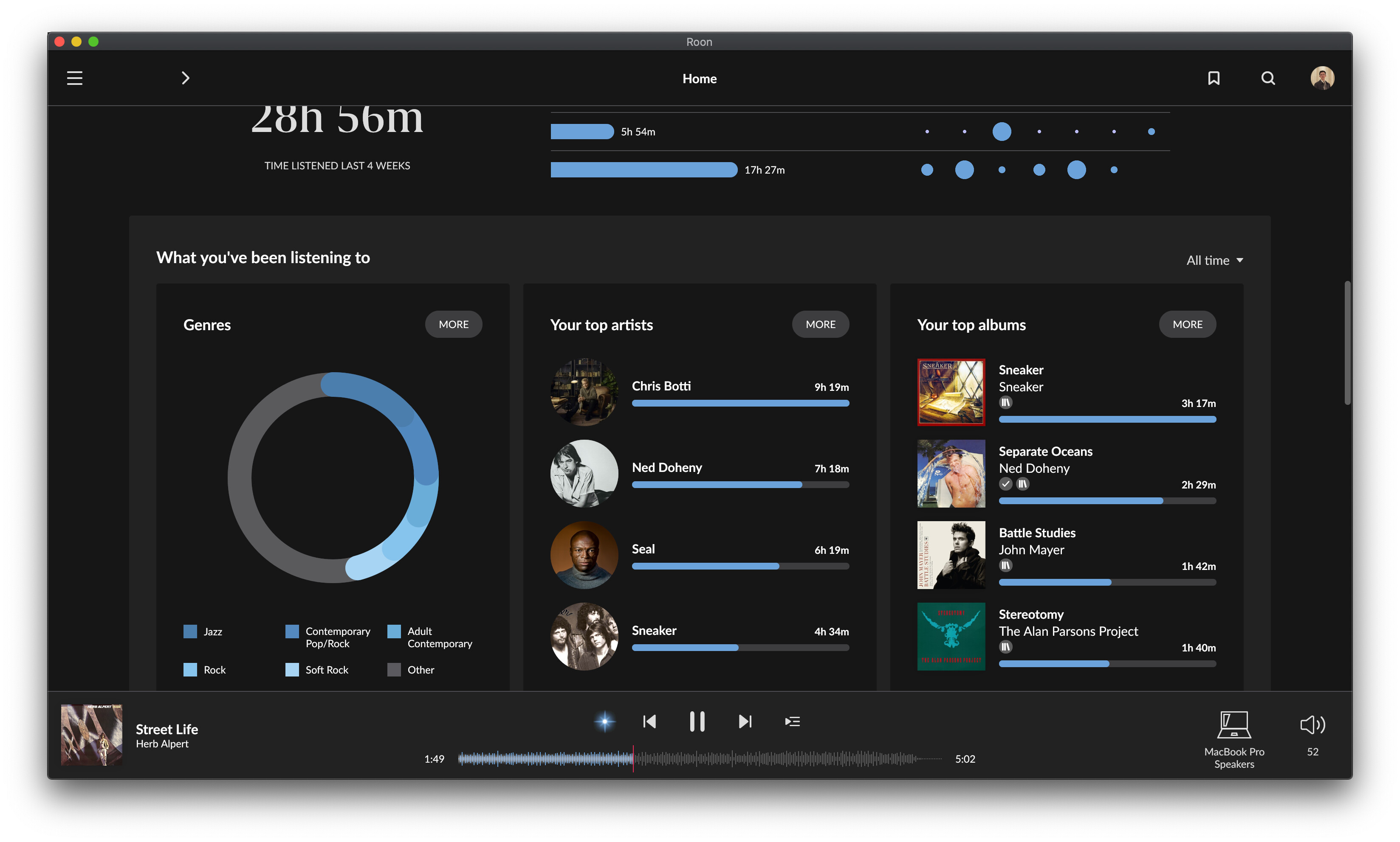
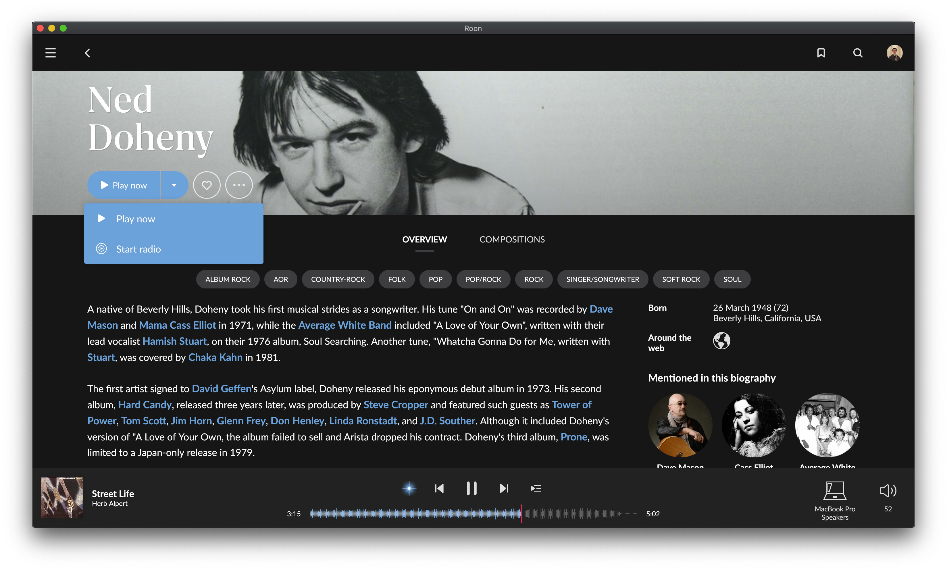
In the light interface there are fonts that are not rendered very well on either my macbook retina screen or my windows desktop screen. They are lightgrey against a light grey/blue background. Again, not very good for readability. The font size for the artist name in the footer next to the album cover is now so lightgrey it is only readable from a handheld device. On a desktop/laptop it is not very readable. On the other hand, the album title in the album view is so big I almost have to take a step backwards to read it. Very strange choices.
Again, this is not about taste, it’s not about liking it or not it is about usabilty. Please give us options for font sizes and colours. A good interface begins with readability. If that’s not good, nothing is good in the end. Most of my issues with Roon over the years all come down to this. I do like Roon and how it is handling metadata but please give us options to make it the best user experience for all of us.
Ok, what follows is - as with all my posts - my opinion. My opinions (as with all opinions) are not facts. Sorry - the tone of this forum (and the internet in general) it is worth pointing that out. Heck all posts should be predicated with it. Moderators - can I change my name on the forum to “mpd opines…”?
So, with that out the way, I think there is some sense to being able to modify aspects of the theme - like being able to change the accent colour. I’m not mad keen on pages of options and not mad keen on changing fonts and font sizes. As it is folks moan about the amount of white space in the UI - go change fonts around and break the UI and there will be tons more complaints. And roon shouldn’t be having to support our breaking of the theme. If they start putting options in the UI folks will expect them to (probably will expect them to anyway).
It would be good (I think) if the theme file lived on the server/core. A bit like we can upload convolution filters in the UI. That way all remotes - including mobile - could pick up the themes. One day if there is roon outside the home environment maybe the theme is stored centrally as part of our profile. Although then I am sure we will complain that we want different themes for each…and a different theme if it is weekday or weekend… and a different theme…
On the other thread folks mentioned JRiver. I bought a license of that - I think it was last year (can’t really remember - I ended up not using it). For me that was a masterclass in how not to build UI.
So yes, some options may be good. In a well constructed and constrained way. This path of turning roon into theming like linux desktops I’m not keen on.
Yes, that has allready helped quite a lot. Hopefully it gets picked up and we get an official third theme. The fonts look good on my phone and Ipad but don’t scale properly to full hd screens. I only hope they don’t think they have to be as big as the album title. Just one or two points up that makes a lot of difference. User scalable would be the ultimate offcoarse, same for colours and line spacing, one for touch and one for mouse operated devices! Anyways, the consistancy between devices has gone wrong, it has balanced to the phone interface. Maybe a little less consistancy and more optimized for different platform? I don’t want an iphone app on my desktop pc.