Could you let me know how to style the waveform? I’ve managed to sort out the rest of the page elements to my liking, but can’t seem to get the waveform to change colour.
Hi @DaveN,
it also took me some time to figure this out, but as far as I can remember, I added the following code to display_ui.html:
#waveformcontainer {
[...]
    transition: opacity 1s linear;
    filter:  invert(60%) sepia() hue-rotate(150deg) saturate(180%);
    -webkit-filter: invert(60%) sepia() hue-rotate(150deg) saturate(180%);
}
This may not be a “clean” solution, but it works for me.
For more details, see here:
1 Like
Thanks, I didn’t think to use ‘invert’ - that’s done the trick 
1 Like
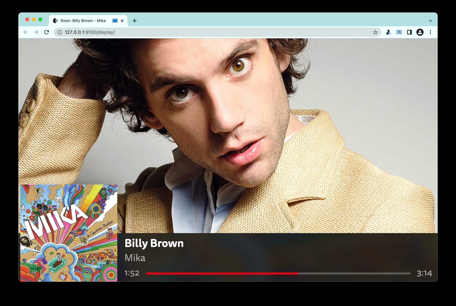
Thanks again. I started with your code, made a couple of tweaks, and ended up disabling the waveform - I’m only using a Nest Hub for the display so thought the progress bar looked better on the small screen.
And in case anyone’s wondering, I’m displaying the initial screen in chrome and casting to the Nest Hub, hence the web page image below.
1 Like
The waveform is one of the things I like most about the display. But in your case it’s probably more practical without it.
By the way, thanks to you I discovered an error in my code for the color of the progressbar for streamed songs, which I have since corrected.
1 Like
If you’re still interested I can help you! How are you currently using/connecting the roon display and what is your core?
This layout I like I found the display_ui.html on my mac. And can edit it whit atom. But where can I find the code for the 4k layout? And when I edit the file on my mac and display it on apple tv should that change the layout? I am running roonserver on top of ubuntuserver. In the server therr is no display_ui.html
I’d like to see something like this built-in to the app. Just basic customisations like lyrics/no lyrics, band photo/no band photo, changing the colour of the bottom bar. I think it looks a lot worse with the band photo than it does without. No idea if there’s an easy fix anyone can share to not show band artist images.
I like the design in Joe_Gratz’s original post but I have no idea if that’s possible to download or install anymore.
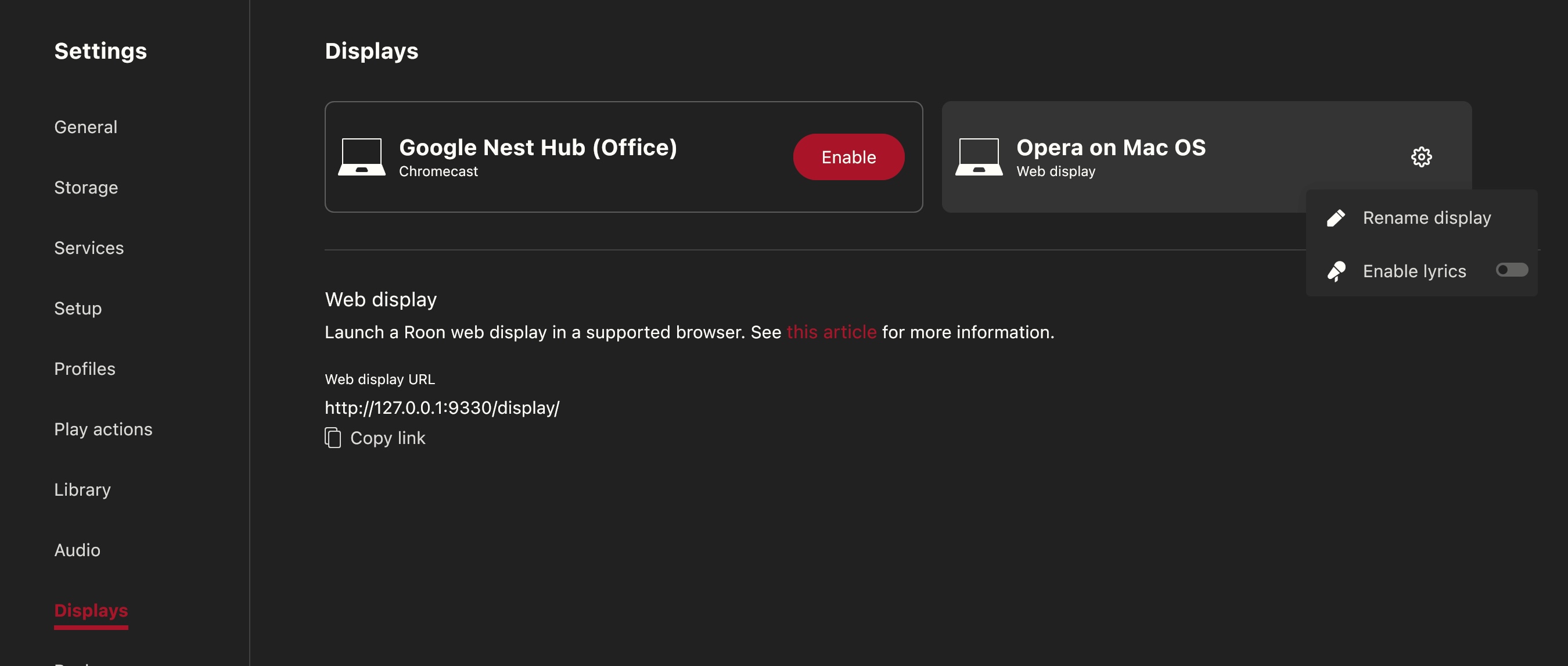
Lyrics can be turned on and off in settings (see below). Settings → Displays → Gear Icon.
The other changes you requested require hacking display_ui.html
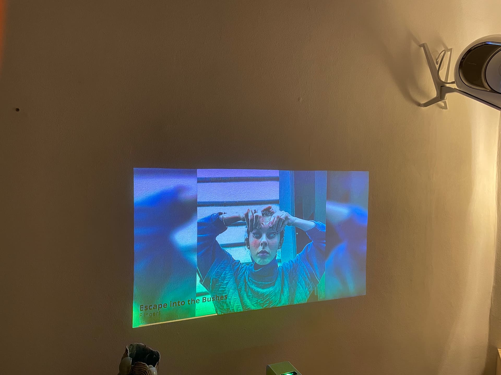
I did play a bit with code and that’s my results so far I like to see more album cover then artist picture since cover change more often. I use Sony short throw projector so I can go big screen.
I’m a bit lost in html so I can’t find out how to change sounds track font from black to white 
<style type="text/css">
#background-albumart {
    z-index: 0;
    width: 100%;
    height: 100%;
    top: 0;
    left: 0;
    position: fixed;
}

#background-albumart div.front,#background-albumart div.back {
    background-size: cover;
    background-repeat: no-repeat;
    background-position: center center;
    width: 100%;
    height: 100%;
    top: 0;
    left: 0;
    position: absolute;
    animation-name: fadein;
    animation-duration: 1s;
    transition: opacity 1s linear;
    will-change: opacity;
}

#background-artistart {
    display: block;
    z-index: 1;
    width: 100%;
    height: 70%;
    overflow: hidden;
}

#background-artistart div {
    background-size: cover;
    background-repeat: no-repeat;
    background-position: center center;
    width: 100%;
    height: 70%;
    position: absolute;
    top: 0;
    left: 0;
    transition: opacity 1s linear;
    will-change: opacity;
}

#background-gradient {
    background-size: 100% 100%;
    background-position: left bottom;
    height: 22vh;
    visibility: visible;
    opacity:0;
    animation-name: fadein;
    animation-duration: 1s;
    transition: opacity 1s linear;
    will-change: opacity;
}


}

#background-footer {
    background: linear-gradient(to right, rgba(255, 255, 255, 0.65), rgba(255, 255, 255, 0.4));
    height: 30%;
}

#background-split {
    display: flex;
    flex-direction: column;
    background-color: transparent;
    z-index: 2;
    width: 100%;
    height: 100%;
    top: 0;
    left: 0;
    position: fixed;
}

#lyricscontainer {
    opacity: 0;
    z-index: 3;
    width: 100%;
    height: 70%;
    position: fixed;
    top: 0;
    left: 0;
    overflow: hidden;
    transition: opacity 0.7s linear;
}

#background-lyrics {
    display: flex;
    flex-direction: column;
    background-color: rgba(0, 0, 0, 0.3);
    z-index: 1;
    width: 100%;
    height: 100%;
    position: absolute;
    top: 0;
    left: 0;
}

#lyricscountdown {
    display: flex;
    flex-direction: row;
    justify-content: center;
    opacity: 0;
    text-align: center;
    font-size: 4vw;
    font-family: "Noto Sans", "Noto Sans JP", "Noto Sans KR", "Noto Sans SC", "Noto Sans TC", sans-serif;
    font-weight: bold;
    transition: opacity 0.7s linear;
    will-change: opacity;
}

#lyricscountdown > * {
    margin: 1.4vw;
}

#lyricscountdown > span {
    color: white;
    opacity: 0.4;
    transition: opacity 0.2s linear;
    will-change: opacity;
}

#lyricscountdown > span.active {
    opacity: 1;
}

#lyricscountdown.reducedAnimation > span {
    transition: none;
}

#lyricscountdownicon {
    height: 2.5vw;
    width: 2.5vw;
    align-self: center;
    background-repeat: no-repeat;
    background-size: contain;
    background-position: center center;
}

#lyricsicon {
    opacity: 0;
    height: 2.8vh;
    width: 2.8vh;
    z-index: 3;
    position: absolute;
    right: 11.2vw;
    bottom: 32vh;
    background-repeat: no-repeat;
    background-size: contain;
    background-position: right bottom;
    transition: opacity 1s linear;
}

#lyricstextcontainer {
    background-color: transparent;
    z-index: 2;
    width: 100%;
    height: 100%;
    position: absolute;
    -webkit-mask-image: linear-gradient(-180deg, rgba(0,0,0,0.00) 5%, rgba(0,0,0,1) 45%, rgba(0,0,0,1) 55%, rgba(0,0,0,0.00) 85%);
    mask-image: linear-gradient(-180deg, rgba(0,0,0,0.00) 5%, rgba(0,0,0,1) 45%, rgba(0,0,0,1) 55%, rgba(0,0,0,0.00) 85%);
}

#lyricstextcontainer.reducedAlpha {
    -webkit-mask-image: none;
    mask-image: none;
}

.lyricstext {
    width: 80%;
    position: absolute;
    top: 70vh;
    left: 10vw;
    margin: 0px;
    padding: 0px;
    color: white;
    font-size: 3.3vw;
    font-family: "Noto Sans", "Noto Sans JP", "Noto Sans KR", "Noto Sans SC", "Noto Sans TC", sans-serif;
    line-height: 150%;
    font-weight: bold;
    text-align: center;
    user-select: none;
    -webkit-user-select: none;
    -moz-user-select: none;
    transition: transform 0.7s cubic-bezier(0.70, 0, 0.30, 1);
    will-change: transform;
}

.lyricstext > * {
    opacity: 0.4;
    padding: 0px;
    margin: 3.1vw 0px 3.1vw 0px;
    transition: transform 0.7s linear, opacity 0.7s linear;
    will-change: opacity;
    transform: scale(1); /* Edge won't smoothly transition back to original size without this */
}

#lyricstextcontainer.reducedAnimation .lyricstext > * {
    opacity: 0.1;
}

.lyricstext > .current {
    opacity: 1;
    transform: scale(1.125);
}

#lyricstextcontainer.reducedAnimation .lyricstext > .current {
    opacity: 1;
}

.lyricstext > .prevnext {
    opacity: 0.6;
}

#lyricstextcontainer.reducedAnimation .lyricstext > .prevnext {
    opacity: 0.4;
}


#albumart div {
    background-color: transparent;
    background-size: contain;
    background-repeat: no-repeat;
    background-position: center bottom;
    width: 100%;
    height: 100%;
    top: 0;
    left: 0;
    position: absolute;
    animation-name: fadein;
    animation-duration: 1s;
    filter: drop-shadow(0px 0px 2.7vh rgba(0, 0, 0, 0.2));
    transition: opacity 1s linear;
}

#albumart.reducedAlpha div {
    filter: none;
}

#infocontainer {
    position: absolute;
    z-index: 4;
    top: 84%;
    left: 2%;
    bottom: -1.7%;
    right: 2%;
}

#infoicon {w
    position: absolute;
    background-size: contain;
    background-repeat: no-repeat;
    background-position: center center;
    top: 8.3%;
    right: 0;
    height: 0vh;
    width: 0vh;
}

.linecontainer {
    display: block;
    overflow: hidden;
    width: 100%;
    position: absolute;
    left: 0;
}

.linecontainer span {
    font-family: "Noto Sans", "Noto Sans JP", "Noto Sans KR", "Noto Sans SC", "Noto Sans TC", sans-serif;
    font-weight: normal;
    white-space: nowrap;
    overflow: hidden;
    text-overflow: ellipsis;
    user-select: none;
    -webkit-user-select: none;
    -moz-user-select: none;
    display: block;
    position: absolute;
    top: 0;
    left: 0;
    width: 100%;
    transition: opacity 1s ease-out;
}

#line1container {
    height: 7vh;
    top: 2.5%;
    margin-right: 5vh;
}

#line2container {
    height: 5vh;
    top: 36%;
}

#line1container span {
    box-sizing: border-box;
    font-size: 5vh;
    font-weight: bold;
    padding-right: 5vh;
}

#line2container span {
    font-size: 3.5vh;
}

#progresstimecontainer {
    display: flex;
    flex-direction: row;
    position: absolute;
    top: 59%;
    left: 0;
    width: 100%;
}

.progresstime {
    font-family: "Noto Sans", "Noto Sans JP", "Noto Sans KR", "Noto Sans SC", "Noto Sans TC", sans-serif;
    font-weight: normal;
    flex-grow: 1;
    font-size: 1.6vh;
    user-select: none;
    -webkit-user-select: none;
    -moz-user-select: none;
}

#totaltime {
    text-align: right;
}

#progressbg {
    background-color: rgba(35, 33, 33, 0.3);
    position: absolute;
    left: 0px;
    bottom: 1.785vh;
    width: 100%;
    height: 0.83vh;
    border-radius: 0.28vh;
    overflow: hidden;
    opacity: 0;
    transition: opacity 1s linear;
}

#progressbar {
    background-color: #BE8901;
    width: 0%;
    height: 100%;
    transition: width 1s linear;
    will-change: width;
}

#waveformcontainer {
    position: absolute;
    left: 0px;
    bottom: 0.2vh;
    width: 100%;
    height: 4vh;
    opacity: 0;
    transition: opacity 1s linear;
}

#waveformprogresscontainer {
    position: absolute;
    overflow: hidden;
    top: 0px;
    left: 0px;
    width: 0%;
    height: 100%;
    transition: width 1s linear;
    will-change: width;
}

.waveform {
    position: absolute;
    top: 0px;
    left: 0px;
    width: 100%;
    height: 100%;
}

#waveformbg {
    z-index: 0;
}

#waveform {
    z-index: 1;
}

.front {
    z-index: 1;
    opacity: 1;
}

.back {
    z-index: 0;
    opacity: 0;
}

.dead {
    opacity: 0;
}

@keyframes fadein {
    from { opacity: 0; }
    to { opacity: 1; }
}

@keyframes fadeout {
    from { opacity: 1; }
    to { opacity: 0; }
}

</style>
<div id="background-albumart">
    <div class="back"></div>
    <div class="front"></div>
    <div id="background-dimming"></div>
</div>
<div id="background-artistart">
    <div class="back"></div>
    <div class="front"></div>
</div>
<div id="background-split">
    <div style="flex-grow: 1;"></div>
    <div id="background-gradient" class="visible"></div>
    <div id="background-footer"></div>
</div>

<div id="lyricscontainer">
    <div id="background-lyrics">
        <div style="flex-grow: 1;"></div>
        <div id="lyricscountdown">
            <span>3</span>
            <span>2</span>
            <span>1</span>
            <div id="lyricscountdownicon" class="lyricsicon"></div>
        </div>
        <div style="flex-grow: 1;"></div>
    </div>
    <div id="lyricstextcontainer" class="reducedAlphaAvailable reducedAnimationAvailable">
    </div>
</div>
<div id="infocontainer">
    <div class="linecontainer" id="line1container">
        <span class="back"></span>
        <span class="front"></span>
    </div>
    <div class="linecontainer" id="line2container">
        <span class="back"></span>
        <span class="front"></span>
    </div>
    <div id="infoicon"></div>
    <div id="progresstimecontainer" style="display: flex; flex-direction: row;">
        <p id="progresstime" class="progresstime"></p>
        <p id="totaltime" class="progresstime"></p>
    </div>
    <div id="progressbg">
        <div id="progressbar"></div>
    </div>
    <div id="waveformcontainer">
        <canvas id="waveformbg" class="waveform" width="716" height="32"></canvas>
        <div id="waveformprogresscontainer">
            <canvas id="waveform" class="waveform" width="716" height="32"></canvas>
        </div>
    </div>
</div>
<div id="lyricsicon" class="lyricsicon"></div>
<div id="albumart" class="reducedAlphaAvailable">
    <div class="back"></div>
    <div class="front"></div>
</div>`Preformatted text`
Is this one working for others? I didn’t succeed
Hi-
Trying to change the color of the waveform progress bar in Chromecast display. The default is purple.
I went into my Roon Core machine (Roon Server) and altered the webroot display ui file so that the color code of
#progressbar {
background-color:
was different, as that seemed to be the one with the purple color I didn’t like.
That color change made no difference in the display, as far as I can tell.
What am I doing wrong?
Possibly nothing, as that is the correct css to change. Try opening a display in a browser window and see if the change appears there. If it does, it’s probably a caching issue with the chromecast display.
Add the line
color: #FFFFFF;
to
.linecontainer span {
Thank you 
How did you guys display the album title? @nickharambee
Find my customization screenshots and file download in this post and have fun.
Im confused, so is this the whole display.html code or only showing differences between the orig and your changes? How do I implement your changes only?
I know this is a old thread but I’ve been experimenting. Do I just copy this into the existing file?
Just remember, that you will have to redo the file anytime Roon updates.