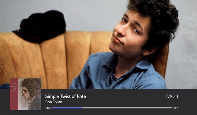
Hi-
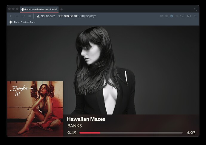
Using a chromecast for the web/screen display.
Trying to change one thing: the color of the progress bar on the timeline at the bottom of the screen. I don’t like the default purple.
I’ve tried several things that haven’t worked.
Can someone tell me what line I need to change to change the purple color of the progress indication to another color?
Try changing the background-color of #progressbar. That said, you may also need to change some of the other elements as I’ve hacked mine to output a solid line rather than the waveform …
Thanks, but hacking just that line doesn’t cause any change.
Wonder what else needs to be changed?
You need to add the following to #waveformcontainer
filter: hue-rotate(90deg);
-webkit-filter: hue-rotate(90deg);
Just play around with the number of degrees until you find a colour you like.
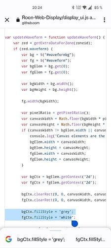
The only thing you need to change is in display_ui.js see at the very bottom in screenshot and enter your favorite colors (I’m using white and grey)
fillStyle-
That also didn’t cause any change.
Still have the standard purple.
added and changed the degrees to 45
no difference from what was before…
Using a chromecast for the web/screen display.
Too bad, sorry that doesn’t work for you.
![]()
I’m using Chrome Webbrowser to display info - see here - not a Chromecast, so that may be the culprit … anyone else got an idea?
You have to adjust the JavaScript and HTML to get the album title. It’s been a while but I recall it being fairly easy but I’ll have to take a look at the code again and get back to you. Shoot me a reply or PM if you’re still interested.
Here’s some info on it:
I use the 3 line support that’s already built in, you just have to code for it in both the display_ui.js and display_ui.html files. The code contains support for 1-3 lines. I believe line 1 is track, line 2 is artist, and line 3 is the album.
* @property {object}  now_playing.one_line - Display text for one-line displays

 * @property {string}  now_playing.one_line.line1

 * @property {object}  now_playing.two_line - Display text for two-line displays

 * @property {string}  now_playing.two_line.line1

 * @property {string}  [now_playing.two_line.line2]

 * @property {object}  now_playing.three_line - Display text for three-line displays

 * @property {string}  now_playing.three_line.line1

 * @property {string}  [now_playing.three_line.line2]

 * @property {string}  [now_playing.three_line.line3]
First, in the update_zones function in display_ui.js, you will need to define line 3 and change to the three_line object:
var line1 = zone.now_playing.three_line.line1 != undefined ? zone.now_playing.three_line.line1 : line1;
var line2 = zone.now_playing.three_line.line2 != undefined ? zone.now_playing.three_line.line2 : line2;
var line3 = zone.now_playing.three_line.line3 != undefined ? zone.now_playing.three_line.line3 : line3; <<< add this line, it is not there by default. line1 and line2 need to be changed to use the three_line object instead of two_line
Then search anywhere the variables line1 and line2 are used, I just copied one of those and changed it to line3, should be a few places to do this. In the HTML file I did virtually the same, I created an entry for a line3 container that matched what line2 already had. You will need to tweak the CSS to get it in position where you want it.
#line3container {
    height: 5vh;
    top: 58%;
}
#line3container span {
    box-sizing: border-box;
    font-size: 2vh;
    padding-left: 0.4vh;
    font-style: italic;
}
    <div class="linecontainer" id="line3container">
        <span class="back"></span>
        <span class="front"></span>
    </div>
I believe that is all I did but it has been a long time since I really looked at the code more than just a glance. I can send you my files if it will help.
This works with these modifications:
I LOVE the new options for the display that people developed. And I absolutely agree that album art should be front and center, rather than some random artist pictures.
I have followed the instructions to do this myself but ran into some problems. Any help is much appreciated.
I have located the display_ui.html file on my Mac. I have opened the file, replaced the code with the code provided here and restarted both my Roon core and the display (both web display and google chromecast). Unfortunately, I do not see any changes whatsoever. It just keeps showing the same old display.
So, either Roon does not notice that the file has been changed OR I am editing the wrong file. Possibly, the reason is that the Mac is not my core, but I am using ROCK on a NUC for that. However, on the ROCK itself, I can’t find the webroot directory, nor the display_ui.html file anywhere.
Can anyone help? Thanks a lot in advance!!
Why can’t they just make an option with a clean design to choose from :/. A lot of people have to tinker for years now, would be probably few hours for the devs…
Still no luck for me, I am using Rock via Apple TV Remote App. Seriously, I am using Apple Music more often lately in the living room, just because the display is just clean, without these random pics roon uses. Sad!
Not sure if this is the current thread on this since it hasn’t been updated in a while… but it opened my eyes for the possibility to change a few things. So I wanted to say Thanks to everyone who has shared key info in this thread.
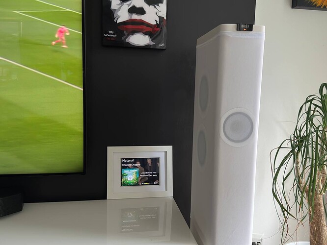
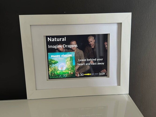
I’ve used an iPad and an photo frame and currently have this…
I posted this question in support - but I suspect my answer lies in this thread: Display options for an external wide display (1920x480) - Customised Web Output or Roon Application
I am trying to alter the Web Display for a 1920x480 monitor.
However, I started to fiddle with the Display_ui.html to just get a feel for it, but it doesnt appear to do anything?
I am running Roon Server and editing the file stored here. It has no effect at all. To check, I did a quick edit on the colocated index.html file and changed the title, and this worked - which makes me think it is using the server etc.
C:\Users\MYCOMPUTERNAME\AppData\Local\RoonServer\Application\200001311\webroot
Any ideas why changing this does nothing? Is it possible cached or not referring to the CSS file? I have even deleted it, and it has no effect:
Hello, I have a Zidoo Z9X and when I stream from Roon I would like to have a different design. Should I change in Roon Core or in the Zidoo? This is a beginners question but I need to start somewhere.
Is it really not possible to do this if your core is Roon ROCK? Surely there is a way…
Hej Thorbjorn,
I also own a Zidoo Z9X. But I do not understand your question. However you can contact me and we can find out more.
Henrik
Hi, Did you research this any further? I it would be great if an old iPad could wake up and come out of a locked state to display “What’s Playing” and then after a timeout return to locked/sleep state.
I have been trying to use ‘Guided Access’ mode, but the iPad wakes on other events and not at track start.
Alternatively did any look into writing a new iPad display in angular.js?
I submitted a feature request to cover what I believe is needed here Improved Roon Display to allow a dedicated screen device
Hi, @simon_pepper.
I’ve tried a variety of approaches to building “Now Playing” screens and have gone down the routes you describe here and in the post of yours that you linked. What I’m doing now may be of interest.
I use Home Assistant (HA) with the Roon integration and that’s a necessary component of my approach.
I wrote HA scripts which trigger when the zone I want to watch starts playing and also trigger when the same zone stops or pauses. When the zone starts, I take the steps necessary to get the display up and running. When the display stops or pauses, I schedule another script to turn the display off in a minute. The “start” script cancels the scheduled turn off script. It only actually turns off after a minute of not playing at all. This works quite well. These scripts are a little bit complex and I can share them if there’s interest.
I bought an inexpensive 24" 720p TV that runs Amazon’s FireTV OS. These are available in the US for about $65USD from Best Buy. You may be able to find something similar : https://www.bestbuy.com/site/insignia-24-class-f20-series-led-hd-smart-fire-tv/6491295.p?skuId=6491295
Because this TV is based on Android, you can install the Android Debug Bridge (ADB) add on in Home Assistant and use that to automate it.
I use an ADB app to turn off the TVs sleep settings. It no longer sleeps automatically.
I used an ADB command in the “start playing” script in HA to launch Amazon’s Silk Browser and navigate it to Roon’s Now Playing URL. I used additional commands to generate key presses that put the browser in full-screen mode.
This worked ok. It would have been a reasonable stopping point.
I also had a 3rd Gen Chromecast device sitting around (the TV doesn’t support Chromecast). The TV has a USB port intended only to power accessories. With the Chromecast device plugged into HDMI and powered by USB, the experience is better - no delay, no issues with full screen. This did require me to enable a feature on the TV that allows it to run Alexa scripts when the TV is asleep - this setting is required to keep the USB port powered during TV sleep. It’s just a side effect of that setting. I don’t actually use Alexa. This doesn’t mean that a microphone somewhere is always on. The TV doesn’t have a mic.
This is all a bit complicated but once it’s set up, it works perfectly. The TV is less than the cost of a Pi. Not including the HA setup, which I already had, total part cost was about $110USD.
I hope there’s something in this that gives you an idea or two.
