Thanks @Damian_Kurgan, but you misunderstood my question. I am working on a backup, but I can’t find which bits of Roon are affected by these colours. Put another way, I can’t find anything green or anything that seems to be affected by atom-selectable-blue.
Sorry. Selectable blue is when you click or select buttons → during user action.
“Blue” is in the Roon meaning what you see as purple…
1 Like
You guys are nuts but in a good sense  BTW, can this change of color be done in my iPad Air? That would be sick… If anybody knows how to do it, please post the process. Meanwhile tomorrow I’m going to do it in my iMac, MackBook Pro and ThinkCentre M90n Roon Server. Also, what would be the files that need to be changed in macOS?
Hi All,
I have been mucking about with a theme this afternoon and finally got it to were i want it just one last thing i am looking to change but not sure if can be done through this.
I am trying to change from the heavy black colour on the now playing screen where show lyrics, artist bio, album review etc… but not sure what I need to change in the colours theme or if can be changed from there any help would be excellent around this.
Thanks
As far know there is no chance to modify phone/iPad apps.
For Mac please check here:
I can make theme version for Mac but need an original file (have no Mac yet).
2 Likes
Hi Damian,
Here is Dark’s macOS Colors file. If you can do one blue and one green, that would be awesome
I’ve just finished my first theme. Almost entirely grayscale (other than the Signal Path indicators). Not sure if this counts as Zone 5 Gray, but I’d be happy to provide a copy if you’re interested.
1 Like
I suspect the green is used in the signalpath and DSP settings… but just guessing.
1 Like
Yep, you’re right. I’m not sure about the DSP page, but it certainly controls the colour of the high quality signal path indicator. I decided to leave it as green as the enhanced and lossless indicators can’t be changed. These appear to be images rather than colourable objects.
Hi David,
That looks exactly what I’m after. You can PM me if you don’t want to share on the thread.
Charles
Excellent. Let me know what you think when you’ve had a change to play around with it. Btw, the bit the says “not theme colors. these should not change” … I changed them, so don’t blame me if it breaks anything ![]()
Code below:
// ===================================================
// Theme Colors
// ===================================================
atom-background #181818
atom-background-fade #181818
atom-black-fade #181818
atom-separator-light #777777
atom-separator-heavy #A2A2A2
atom-classical-background #252525
atom-grey4 #ffffff
atom-grey4-hover #ffffff
atom-grey4-insensitive #10%ffffff
atom-grey4-marked #72%ffffff
atom-grey4-secondary #A8A8A8
atom-grey3 #FFFFFF
atom-grey3-hover #C2C2C2
atom-grey3-insensitive #20%C5C5C5
atom-grey3-marked #C5C5C5
atom-grey2 #4C4C4C
atom-grey2-hover #666666
atom-grey2-pressed #4D4D4D
atom-grey2-insensitive #3C3C3C
atom-grey1 #1E1E1E
atom-grey1-hover #2D2C2C
atom-grey1-insensitive #ACACAC
atom-grey1-marked #85%1E1E1E
atom-grey #3C3C3F
atom-grey-mapping #BBBBBB
atom-genre-mapping #ADADAD
atom-blue #929292
atom-blue-hover #3C3C3C
atom-blue-pressed #AAAAAA
atom-blue-insensitive #444444
atom-blue-mapping #555555
atom-onebox-blue #4C4C4C
atom-orange #777777
atom-orange-hover #333333
atom-orange-insensitive #CCCCCC
atom-orange-mapping #AAAAAA
atom-green #00E639
atom-green-hover #4CAFA3
atom-green-insensitive #295E57
atom-red #AAAAAA
atom-red-hover #BBBBBB
atom-red-insensitive #888888
atom-selectable-blue #333333
atom-selectable-blue-hover #444444
atom-selectable-blue-checked #555555
atom-selectable #333333
atom-selectable-hover #393939
atom-selectable-checked #1F1F1F
atom-selectable-insensitive #1F1F1F
atom-bluebg-noalpha #333333
atom-bluebg #333333
atom-bluebg-hover #404040
atom-bluebg-pressed #404040
atom-bluebg-insensitive #333333
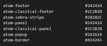
atom-footer #242424
atom-classical-footer #2B2B2B
atom-zebra-stripe #282828
atom-panel #242424
atom-classical-panel #2C2B2B
atom-popup #262626
atom-border #424242
atom-graph-1 #FAFAFA
atom-graph-2 #C0C0C0
atom-graph-3 #9A9A9A
atom-graph-4 #707070
atom-graph-5 #505050
atom-graph-6 #353535
// ===================================================
// not theme colors. these should not change
// ===================================================
atom-white #ffffff
atom-white-hover #ffffff
atom-white-insensitive #05%ffffff
atom-white-marked #72%ffffff
atom-white-button-hover #22%ffffff
atom-white-button #12%ffffff
atom-black #000000
atom-black-hover #2D2C2C
atom-black-insensitive #ACACAC
atom-black-marked #85%2C2C2C
atom-waveform #777777
atom-fade #1E1E1E
atom-highlight #999999
atom-yellow #CCCCCC
// ===================================================
// used by dynamiclist scrollbar in 3/2020, before changes in master. Question for brian2: are these colors correct for the new dynamiclist?
// ===================================================
atom-purple #999999
atom-purple-hover #777777
atom-purple-pressed #555555
// ===================================================
// brand colors
// ===================================================
dropbox-color #ffffff
facebook-color #555555
twitter-color #BBBBBB
// ===================================================
// BACKGROUND & DIM LAYERS
// ===================================================
feedbackpanel #000000
dimlayer #70%000000
As best I can tell, this can’t be changed. It has a value of #000000 (common to both themes) but changing any of these in the ‘colors’ file doesn’t make a difference. It looks like this one might be coded elsewhere.
Been working on my own - will have a look at what you’ve done and incorporate. Here’s the new mid gray theme I’m cooking up much more readable - just not sure what ‘atom’ maps to the artist hyperlinks in the text bodies - would like those to be a different, albeit subtle color.
5 Likes
There’s got to be a way to influence the colour in the top right, and make that into a correctly-mapped-red dot 
I’m pretty sure it’s ‘atom-blue’, which is a bit annoying as it’s a rather high level setting (i.e. lots of things change with that one). If this catches on maybe Roon will add a bit more granular control over the different aspects of the UI. As it stands, it’s difficult to code because many of ‘atoms’ maps to multiple objects in the interface.
Not sure why some albums (classical ones it seems) end up with a darker background, and some lighter gray. I’ll play a bit more but can certainly live with what I have now.
1 Like
It seems for both system are same files with this same construction
Please take Blue from my post for windows and paste in the mac location. I am working to complete green version.
Yep, that looks good. I may try to add some subtle variants to mine.
Because there is colour for each one 
atom-panel is for standard
atom-classical-panel is for classical
1 Like