I think a lot of the replies of the footer being ugly really comes purely from the colour choosen. The colour of the footer bothers me as well, a lot in fact but on the other hand I have no problem with it in the new now playing screen. Same content, same design, only a different colour and a succesfull integration with the rest of the screen. I know the whole UI is in progress but for now the colour of the footer is a really bad choice in the dark and in the light mode. The footer used to integrate perfectly with the black edges of my screen and such did not draw any attention to itself, now they try to integrate more with the rest of the screen but that makes no sence because of two different purposes. It’s colour and it’s size makes the whole screen look less clear. It could shrink at least 10%-15% in size I guess. Icons look like misaligned, they always where but the footer was clearly a different field with a different purpose as the rest of screen. Now you are trying to integrate both the icons look misplaced. I really like the new now playing screen for it’s functionality but yes I can imagine people can get lost by it. I’ll try to explain although explaining things like this is very hard for me because english is not my native language.
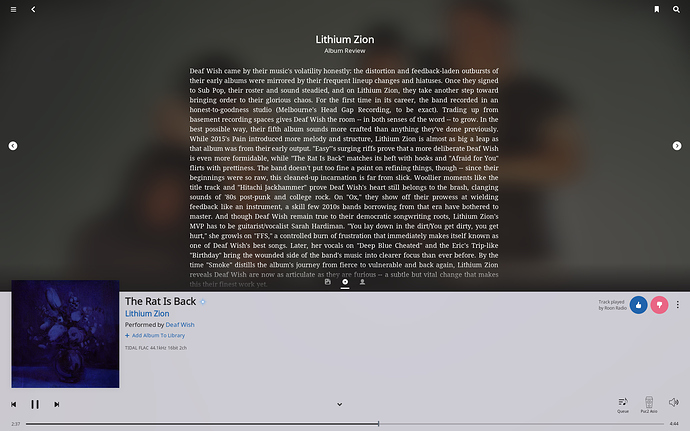
Roon is very easy to navigate, for a big part because all elements had there fixed place. Nothing is more daunting in learning software then stumbling on the same elements in different places and even more if they are serving a different purpose there. It used to be elegantly simple. There where a couple of views that where very clear. Artist bio’s are on the artist pages. Album reviews and credits on the album page. Ones you see any of these you know where you are in the software, you know your way around and it’s easy to flip back and forth. Now that elements and functions that also can be found elsewhere get combined on one page things can get complicated. Not rocket science but it’s easier to be mistaking at one point you where excatly. This combined with too many menu’s everywhere and my mother in law is no longer capable of using Roon, not that she was a genius with it anyways. I’ll try to explain with a picture.
Again, it’s all in the little things. First all other screens in Roon have a title in the header allthough not consistent in design it’s there. this one has no tilte. I think not many of us actually read the title consiously but now it’s not there it’s a extra element of unconsiously getting lost a bit.
When I see the filed above I see three icons for the three available views of the upperpart of the screen, but at the same time there are also two arrows left and right. that’s a double navigation, wich works confusing and the arrows stand out a lot drawing your attention too much. Combined with the icons in the header that where always there it looks like icons spread out everywhere, hence the feeling of too many options/choices/navigation. This can be fixed i.m.o by ditching the arrow navigation and make the header a constant colour throughout the whole interface so it’s clear that it’s something that has the same purpose everywhere you see it. Trying to integrate it into the current viewing screen only makes it confusing. Still little things but they do add up. If I look at the picture now I see not only an album review but I see clickable option in the upper corners, on the sides and on the bottom of this top view, in the bottom corners and the bottom left. that’s 8 places with options in one screen with completely different design elements, can’t get my eyes of them to be honoust. I’m not a design specialist but I know how my attention works.
Then there are the options in places where you don’t expect them to be.
Right next to the the thumbs buttons there is a three dot menu. In my logic these represent options that effect the behaviour of the Radio, hence why they are next to the thumbs button with the text that mentions radio. My logic does not expect option about the song playing being there, I expect option about radio. While were at function in places you do not expect them. Even after quite a long time I’m still searching for the transfer zone function sometimes because logically I expect it to be under the zone icon because it is after all an action wich has to do with zones and not with volume settings. Little logical things, not a big deal but it adds up.
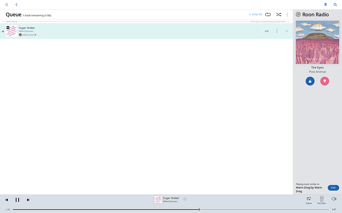
Now the que screen
I know this is just a partly update and it is in development but I’m just trying to get to know what people are so furious about.
Firts, let’s face it. It looks like four completely independant design teams going on in here, but work is in progress I know. The header, the footer, the radio tab, and the que screen have nothing in common regarding design elements. That makes it a mess. Again, too many three dot menu’s, function in places where you logically do not expect them. I have spent five minutes figuring out how to disable Tidal content in the Radio, that 4,5 minutes too long for an intuitive interface Logically I expect that in the Radio tab itself, not in a menu above the que list because they serve a different purpose and their designs have nothing in common at the moment. The header and footer could be more clearer in the function they serve. They are the most constant UI element throughout the whole interface and should be recognizable as such. Now they try to integrate with the rest of the screen the icons look misaligned and just a bit of a mess. No problem if they where clearly seperated. Colours, spacing, seperation are all a bit off at the moment. Again I know works is in progress just trying to understand why people don’t like it.
third there is the new search screen
As much as I do like the improved search results I’m not that fond of the way it is presented yet, maybe I’ll get a grip on it later. Well first my general critic about Roon for years now is the inefficient use of screen real estate but that’s not for now. There used to be a pretty strict line between music from my own library and Tidal. In the new search this seperation is not so clear again. I still want to see in a glance what content comes from myself and what content comes from the world outside. I love Tidal integration but there is no indication by the artists and small icons by the albums. It used to be more clearly seperated wich I liked. I can live with it though , it’s just the search function wich I don’t use that often anyway but I sure hope it’s not a sign of the redesign of the artist an album page where there is a nice and clear seperation between library and Tidal content now. This is important to keep the feeling I’m handling my library and I’m not busey getting lost in a streaming service with too much content available. But don’t get me wrong, I love Tidal integration and with the new radio is one big step ahead. Well enough for now, other then the trendy round pictures, please don’t follow that trend it’s childish. Specially the expanded artists view in thesearch results, ouch. Teenage stuff.
All in all I would not call it disastrous. Keep up the good work.

