Disastrous UI in 1.6

What has happened with this iPad app? This now has so much information, panels, scrubbers and it is so busy I can’t believe it. I don’t even know where I am in relation to the overall navigation.

Default to scrolling lyrics? Why? The scrubber at the bottom with dynamic range? Why? The forward backward arrows at top have lost all meaning.

Why give someone an option do do anything anywhere? This is not music editing software, but library management and it’s become untethered to its mission and has forgotten its central purpose and use case. It is not for developers but music listeners.

This has gone from an app with an Apple sensibility to a Windows one and that’s not a good thing - endlessly complex, inelegant, busy and does not match the task.

Regretting my lifetime purchase. Can’t beilive it’s gone this far south in one release.

Since there are now endless choices - can we get a ‘simple’ UI view for those of us who want to know where we are in the app and want to look at something the isn’t beeping, leveling, scrolling automatically or laying content panel on top of content panel on top of content panel?

8 Likes

First, the specifics:

Previous versions also had the waveform scrubber in the footer.

The arrows at the top haven’t changed. They are like your web browser back/fwd buttons.

Scrolling lyrics is new time code lyrics metadata … If we don’t have time code data, it doesnt sync but just shows the text.

Now, it seems you are clearly frustrated with what seems to you a total charge get in how the entire UI works. This is not the case, so can you help us understand the issue more clearly? Screenshots with comments about what feels wrote to you would be helpful.

The above comment unfortunately is not something we can take action on. I get that you are frustrated and needed to vent, but take a deep breath and help us figure out what you so clearly can see. Give us more to work with and we will do our best.

13 Likes

Thank you and I will send to you over the weekend, but to start

The arrows are a constant but your location within the app seems to be much more fluid, I can go across more screens/panels that I ever noticed before and I get lost. The app is missing a central, anchoring screen. Everything can be swiped changed, pulled up, etc. This seems most true on the now playing screen/panels/section

I honestly never noticed the level indicators in the old version’s scrubber, these either have more contrast, are bigger, etc. but it’s now what your eye goes to on that page and is distracting

If you counted the number of choices a user has on any one screen it is very large, this may have been growing over time and simply went over the edge for me on this release, but it is something to be wary of. Because something can be done doesn’t mean it should and the needs of a ‘power user’ for lack of a better term may not match real well with someone who was attracted to this in the first place for its simplicity and library + tidal + radio integration.

the DSP addition was brilliant, but I can no longer find it on my iPad remote, only on my Mac

It is a really hard thing to maintain a product’s simplicity over time, but in the end, simple experiences win

1 Like

Hi
I’m new here but I saw this post and was confused because the iPad app I find really great. YMMV I know.
The three horizontal lines top left always get back to the Overview screen? This is the base line from which to navigate and to get back to as far as I can tell?
I understand you are used to a previous version though!

2 Likes

On the iPad DSP is under the speaker icon.

For some reason, Roon has made the Radio sidebar and the footer 3x as big and just as ugly. All the while making the waveform scrubber smaller. WTF?

My suggestion - put a tab or something clickable at the bottom of the screen that will expose the footer when clicked. As it stands now, the footer takes up valuable screen real estate causing unnecessary scrolling.

Life goes on, I’ll survive. Just an ugly, ugly design effort. I’ve said in another post, hire a design specialist. There must be plenty of unemployed art majors out there.

I have spoken.:laughing:

3 Likes

The queue got moved to its own page, and took radio with it. Because the queue is no longer tied to a lame and minimal “now playing”, we were able to give the queue much more space. You can still see the now playing on the footer, but it’s not as big – this was done to give the queue much more vertical space.

The footer did grow in height, but only by about 10%.

The scrubber on the footer got wider to accommodate better resolution and was moved down. It was not made smaller.

The “now playing” is now a destination and meant to be more of a “screensaver” screen. Something you just leave up.

That’s why we put queue/radio on its own page. Much more vertical real estate, less scrolling!

1 Like

Sorry, have to agree to disagree about the aesthetics of the look.

That’s fine… not everyone will like UI changes.

But if there is an accessibility issue, I want to understand it. If there is confusion, I want to understand it. If there is an actual problem that is more than “you changed stuff and I’m lost”, I want to understand it.

7 Likes

Will you please, if possible, also understand that allowing a good level of customization may be a very good way to solve this mess (and the ones that will follow)? Just saying,. :slight_smile:

1 Like

click on the now playing track in the footer, then the 3 dots on the “now playing” screen. The first option is to customize it.

2 Likes

My UI feedback: nice having enough room to display WORK and PART on the Now Playing ribbon. So, please display WORK and PART, if present.

Artist lines are wider too. So, please display TRACK ARTISTs, if present. And, if Classical, the Composer(!)

Thx.

3 Likes

36 posts were merged into an existing topic: Bigger artwork for ‘Now Playing’

I think in general people should live with the UI a few weeks before complaining. Yes, it is different - but in my opinion a lot of the changes are great improvements and you will see these benefits after some weeks. Let the changes grow on you before flagging they don’t work.

12 Likes

I gave up on Roon a few weeks ago because there is little in to justify the price (from my point of view and for my needs) so I can’t click any 3 dots any more :slight_smile: I’m still hanging around just to see if there are any hopes (for me) that things will go in my direction, but doesn’t look that way (which is sad because for the most of it I like your product). So my comment was only about the direction that Roon seams to move and not about a specific issue (and maybe out of the subject of this discussion).

1 Like

How can anyone give up on Roon, and what alternatives do we have? None :slight_smile:

UI can always improve, and it will. But regardless of change done, someone will always dislike it. Continue to give feedback, the Roon team is active here and suggestions are reviewed. Not all will be done, but that is impossible

2 Likes

Alternatives (in the order I use them): vinyl, reel to reel, cd (the one that makes rainbows in the sunlight not the one that labels the Tidal albums :slight_smile: ), internet radio, good old fashion FM tuner.

1 Like

those are fine alternatives, but if I did that, I’d be stuck listening to the same, albiet a large number of, albums. It would bore me.

I’m listening to “Willie Dixon’s Gone” by George Thorogood right now that Roon Radio just picked for me. I’ve never heard it, never owned it, and I would never have picked it. I am loving this track.

10 Likes

But none of these got RAAT. I also would like to see changes and improvements in Roon. It is not perfect, but for my 8-10 hours/day in Roon I’m very happy. Quality, features and stability is far beyond any other audio playback system. I think the Roon team is doing fantastic work, and I have been in the software industry for 20+ years.

7 Likes

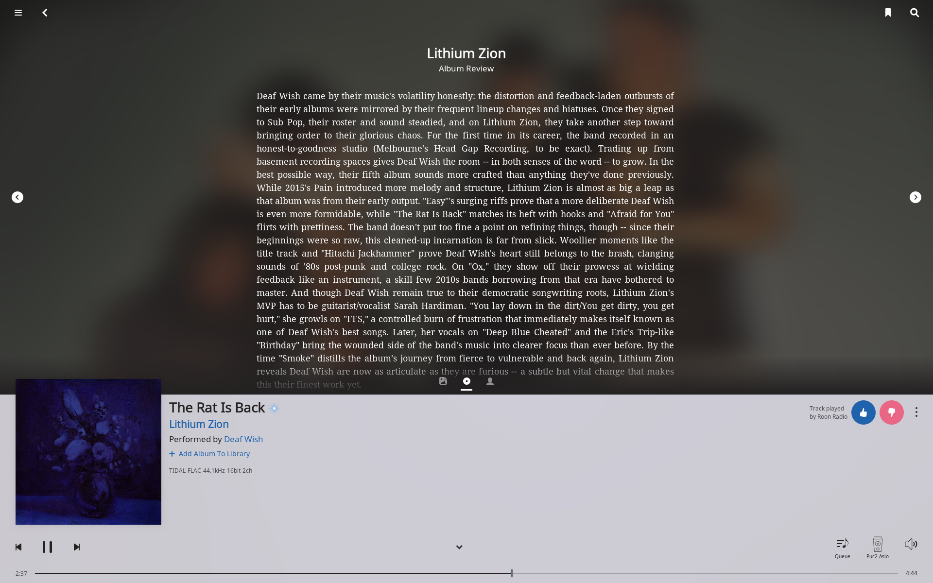
I think a lot of the replies of the footer being ugly really comes purely from the colour choosen. The colour of the footer bothers me as well, a lot in fact but on the other hand I have no problem with it in the new now playing screen. Same content, same design, only a different colour and a succesfull integration with the rest of the screen. I know the whole UI is in progress but for now the colour of the footer is a really bad choice in the dark and in the light mode. The footer used to integrate perfectly with the black edges of my screen and such did not draw any attention to itself, now they try to integrate more with the rest of the screen but that makes no sence because of two different purposes. It’s colour and it’s size makes the whole screen look less clear. It could shrink at least 10%-15% in size I guess. Icons look like misaligned, they always where but the footer was clearly a different field with a different purpose as the rest of screen. Now you are trying to integrate both the icons look misplaced. I really like the new now playing screen for it’s functionality but yes I can imagine people can get lost by it. I’ll try to explain although explaining things like this is very hard for me because english is not my native language.

Roon is very easy to navigate, for a big part because all elements had there fixed place. Nothing is more daunting in learning software then stumbling on the same elements in different places and even more if they are serving a different purpose there. It used to be elegantly simple. There where a couple of views that where very clear. Artist bio’s are on the artist pages. Album reviews and credits on the album page. Ones you see any of these you know where you are in the software, you know your way around and it’s easy to flip back and forth. Now that elements and functions that also can be found elsewhere get combined on one page things can get complicated. Not rocket science but it’s easier to be mistaking at one point you where excatly. This combined with too many menu’s everywhere and my mother in law is no longer capable of using Roon, not that she was a genius with it anyways. I’ll try to explain with a picture.

Again, it’s all in the little things. First all other screens in Roon have a title in the header allthough not consistent in design it’s there. this one has no tilte. I think not many of us actually read the title consiously but now it’s not there it’s a extra element of unconsiously getting lost a bit.
When I see the filed above I see three icons for the three available views of the upperpart of the screen, but at the same time there are also two arrows left and right. that’s a double navigation, wich works confusing and the arrows stand out a lot drawing your attention too much. Combined with the icons in the header that where always there it looks like icons spread out everywhere, hence the feeling of too many options/choices/navigation. This can be fixed i.m.o by ditching the arrow navigation and make the header a constant colour throughout the whole interface so it’s clear that it’s something that has the same purpose everywhere you see it. Trying to integrate it into the current viewing screen only makes it confusing. Still little things but they do add up. If I look at the picture now I see not only an album review but I see clickable option in the upper corners, on the sides and on the bottom of this top view, in the bottom corners and the bottom left. that’s 8 places with options in one screen with completely different design elements, can’t get my eyes of them to be honoust. I’m not a design specialist but I know how my attention works.

Then there are the options in places where you don’t expect them to be.
Right next to the the thumbs buttons there is a three dot menu. In my logic these represent options that effect the behaviour of the Radio, hence why they are next to the thumbs button with the text that mentions radio. My logic does not expect option about the song playing being there, I expect option about radio. While were at function in places you do not expect them. Even after quite a long time I’m still searching for the transfer zone function sometimes because logically I expect it to be under the zone icon because it is after all an action wich has to do with zones and not with volume settings. Little logical things, not a big deal but it adds up.
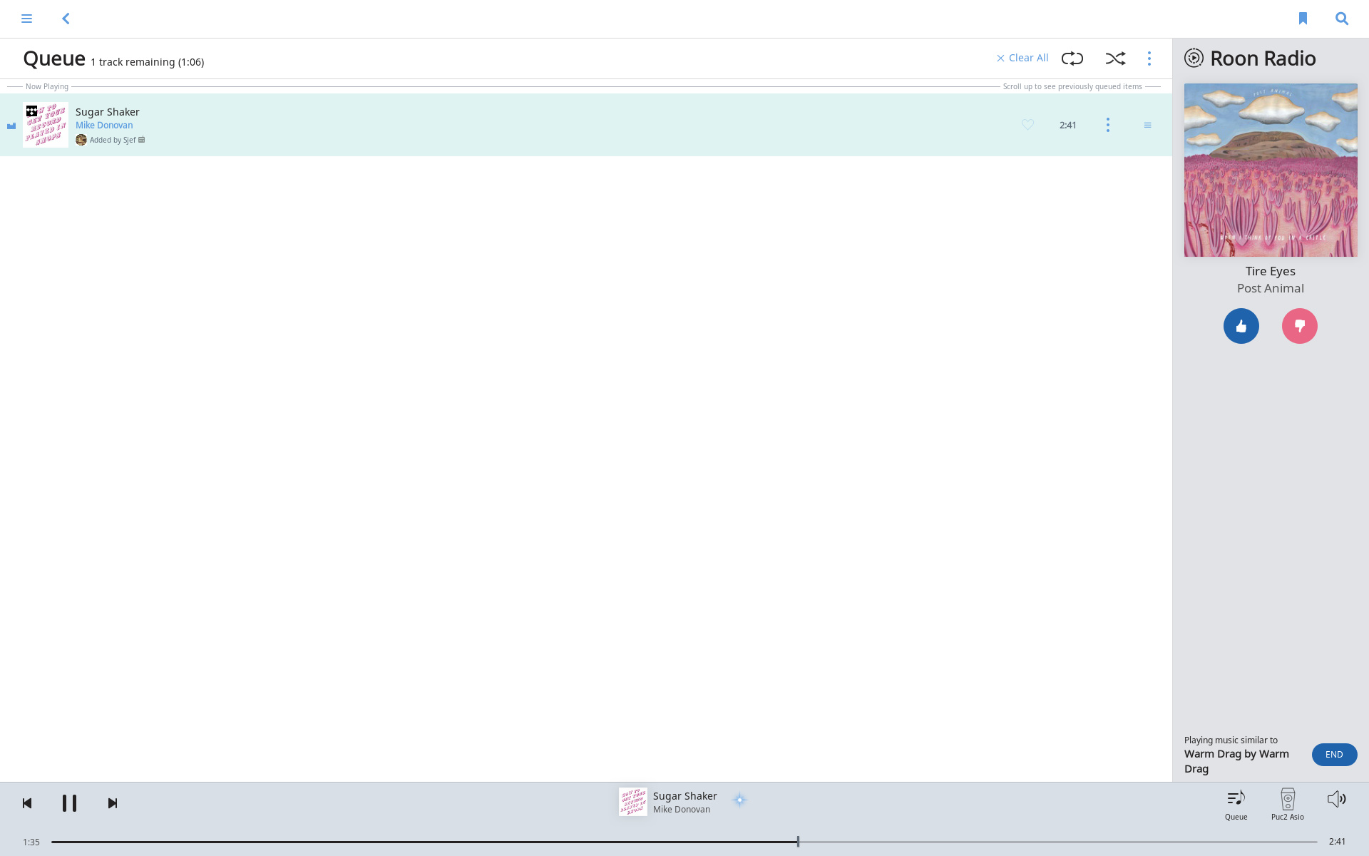
Now the que screen

I know this is just a partly update and it is in development but I’m just trying to get to know what people are so furious about.
Firts, let’s face it. It looks like four completely independant design teams going on in here, but work is in progress I know. The header, the footer, the radio tab, and the que screen have nothing in common regarding design elements. That makes it a mess. Again, too many three dot menu’s, function in places where you logically do not expect them. I have spent five minutes figuring out how to disable Tidal content in the Radio, that 4,5 minutes too long for an intuitive interface Logically I expect that in the Radio tab itself, not in a menu above the que list because they serve a different purpose and their designs have nothing in common at the moment. The header and footer could be more clearer in the function they serve. They are the most constant UI element throughout the whole interface and should be recognizable as such. Now they try to integrate with the rest of the screen the icons look misaligned and just a bit of a mess. No problem if they where clearly seperated. Colours, spacing, seperation are all a bit off at the moment. Again I know works is in progress just trying to understand why people don’t like it.

third there is the new search screen
As much as I do like the improved search results I’m not that fond of the way it is presented yet, maybe I’ll get a grip on it later. Well first my general critic about Roon for years now is the inefficient use of screen real estate but that’s not for now. There used to be a pretty strict line between music from my own library and Tidal. In the new search this seperation is not so clear again. I still want to see in a glance what content comes from myself and what content comes from the world outside. I love Tidal integration but there is no indication by the artists and small icons by the albums. It used to be more clearly seperated wich I liked. I can live with it though , it’s just the search function wich I don’t use that often anyway but I sure hope it’s not a sign of the redesign of the artist an album page where there is a nice and clear seperation between library and Tidal content now. This is important to keep the feeling I’m handling my library and I’m not busey getting lost in a streaming service with too much content available. But don’t get me wrong, I love Tidal integration and with the new radio is one big step ahead. Well enough for now, other then the trendy round pictures, please don’t follow that trend it’s childish. Specially the expanded artists view in thesearch results, ouch. Teenage stuff.

All in all I would not call it disastrous. Keep up the good work.

21 Likes