Is there any way to change the font sizes and colors for people with low vision?
I use a mac, and invert colors a lot to help me see better, but the larger text setting on the mac cuts off the bottom of the roon interface, I would be nice to be able to enlarge the fonts
inside of roon, it would also be nice to be able to change the color scheme of the buttons
for example, the play now button is a light color with white letters, very hard for a low vision
person to see.
there have been more request about customizing fonts and colours for people with lower vision but like this request all with no response. No one seems to recognize the problem or no one seems to care.
“Theme – these are very expensive to implement… we have a dark and light theme… it’s not going to grow past that” - Danny
I noticed you said this is a previous post and I am confused why you would take on such a huge task for a small amount of your user base when feature requests like mobile sync are on the table?
I wholehardedly agree that the light blue hyperlinks are almost impossible to read. I do NOT have compromised vision, either. How about navy blue or dark red. This does not need to be complcated. I will guess that a LOT of users are having issues. Change a few lines of CSS and make your app more user friendly!
Even better!
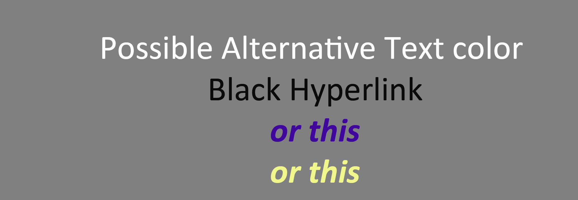
I would be happy with preselected colors that contrast nicely with the mostly grey background.
Making the background a solid color would help even more. The embedded images may represent the coolest latest trends but I value readability over coolness.
I concur. I don’t enjoy touching my nose to the screen to see if that is a blue text link or black text.Not all artists mentioned in text have blue links. I enjoy sitting back in my chair and reading the notes that accompany each album. I did find out how to make the text larger than the default which is sufficient but the blue text links are still a problem. I don’t mind doing a little html coding to change a color variable if only the option existed…
Years later, still zero progress on readability, I highly doubt any one in the Roon team even has the slightest clue about how unreadable the Roon interface is. It is exactly these kind of things why I still have a love-hate relationship with Roon.