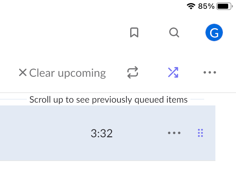
Folks, please, please, please, change the colour of the shuffle icon in light mode to something darker. I’m 72 years old and my eyesight isn’t that great.
At normal screen size on my iPad the difference between on and off is barely discernible. Please make it easier for us visually challenged subscribers. It’s not a lot to ask.
Agreed. The loop and shuffle icons are incredibly hard to see, and I use them all the time (with frustration and difficulty due to the terrible interface design).