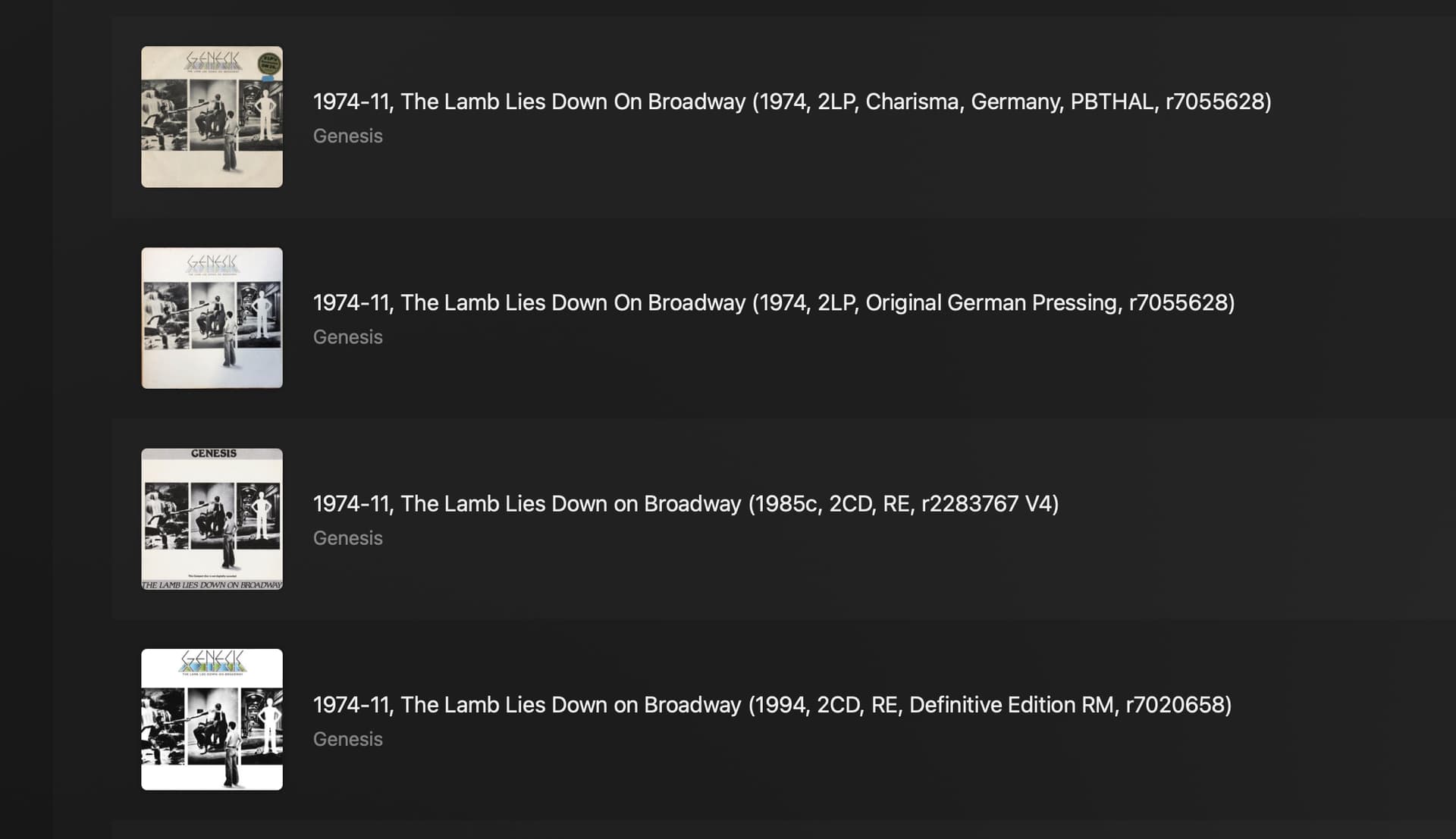
Maybe this will be of no interest to most users but I’ve started using Plex (for their Plexamp as ARC doesn’t work for me) and one of the things I truly love about their main interface is the “detail” view.
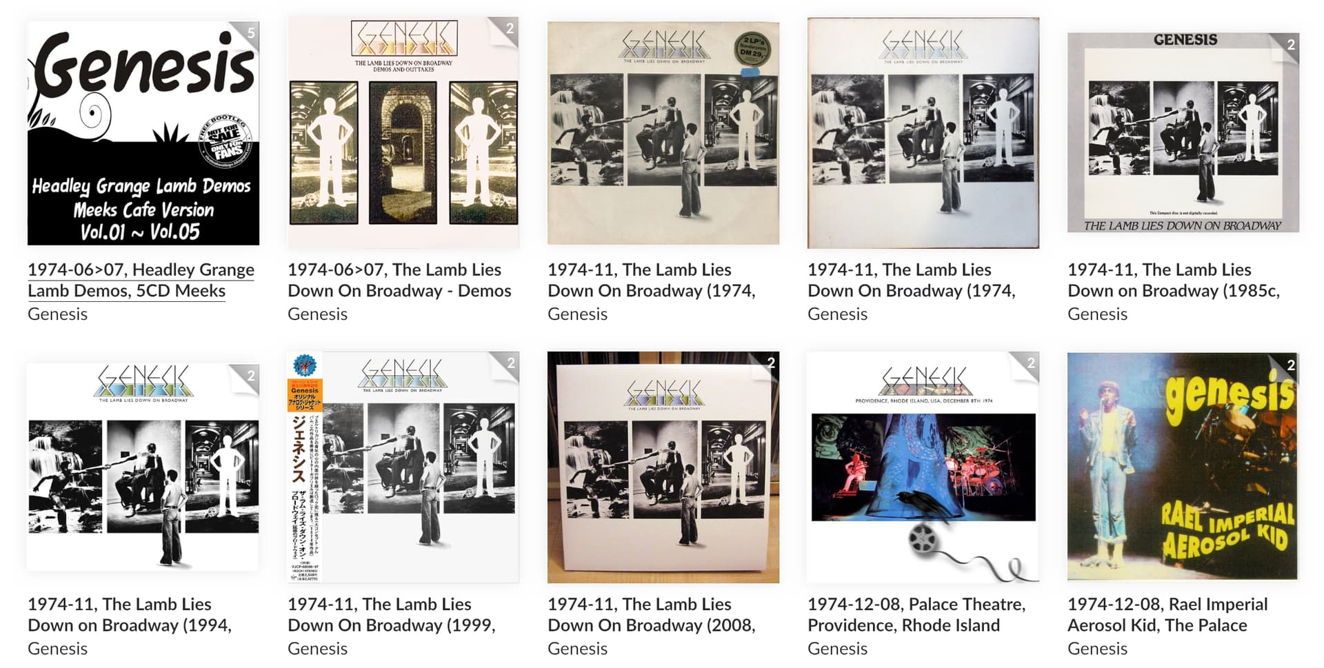
I name my albums in quite an idiosyncratic way so being able to see the full album title is really helpful in seeing which version’s which, as that information comes after the album title & gets truncated in a grid view.
It works well on the phone, too. When I turn it on its side I get the same view & there’s the alphabet down the side to take me closer to where in need to be.
[Of course, with a collection the size of mine, going to “C” doesn’t really help much as I still have a lot of scrolling to do to get to the particular area of “C” that I’m after. I could really do with a button the invokes an alphanumeric panel so I can type a few characters, the way I can in the main Roon app, to get closer to where I need to be. (I’d like that in the Roon mobile app & of course I’d love it in ARC too if the bloody thing worked!)]
On the basis that most people don’t organise their music the way I do I suspect that a “list” or “detail” view might not be a much sought after feature, but there you have it.
It would be a wonderful thing for me.
Unfortunately, Plex forces each of the album covers into a strict square so the shapes get truncated, which is horrible as what I see on screen no longer replicates the physical items.
I’m glad Roon doesn’t do that.