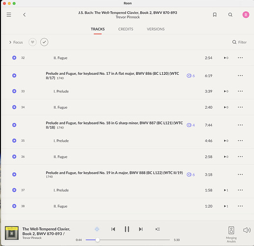
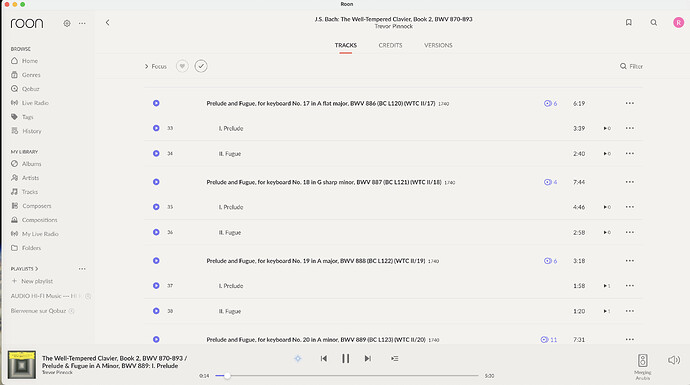
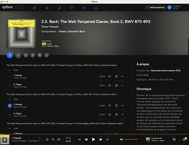
Below please find examples of different player window sizes in Roon and Qobuz native. The album has a long name and it’s impossible to identify the track playing without making the player window ENORMOUS. Qobuz native, however, handles this differently. 1) the track name comes on the first line in BOLD. 2) the album name is on the second line and scrolls right to left, constantly and if necessary. This strikes me as a better solution. So this is a feature request ![]()
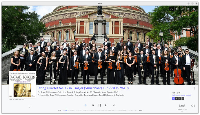
The currently playing track is also highlighted next to the track in the list, see below, and you can always use the Now Playing screen for full details – click on the cover in the bottom-left corner.

Thanks. Yes the nicest is to see the track in the list. Since many of the classical albums can have upwards of 60 tracks on them, it can be a bit of a job to find the currently playing track. I’d love a setting which, when toggled, kept the currently playing track in the middle of the visible (on screen) part of the list. (Allowing you to scroll away from that point, of course, but then pinging back after a delay.) At times where one is busy doing something else in Roon then it’s nice to just to be able to look at the playbar. Btw. is it just me or does the Roon app list scroll in the opposite direction? Gets me every time.
