New to roon and so far I’m really enjoying it so far, it’s an incredibly rich platform and living inside it truly breathes new life into my music library alongside using Qoboz.
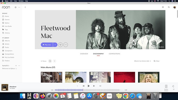
My issue is the incredibly poor discography overview on the artist page. What does ‘main albums’ even mean, because it surely does not mean studio releases. Let’s use Fleetwood Mac as an example:
Having 57 releases listed under the heading ‘main albums’ is an absolute minefield and makes it needlessly confusing. For a piece of software that touts itself as the creme de la creme for music discovery, I don’t think it’s good enough.
Mixed in are clearly artist compilations and greatest hits, etc, alongside Llve albums. An absolute insane way to visually demonstrate an artist’s discography. I’ve seen a lot of people argue a similar case and a big rebuttal to that is, “it would get too long or look too cluttered to have individual breakdowns of different types of releases, especially if there’s only 1 or 2 albums there.” What a strange response.
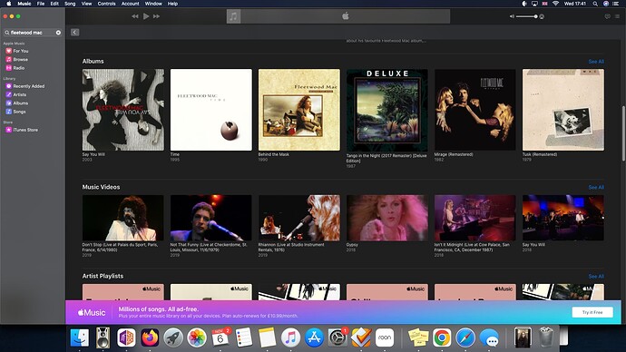
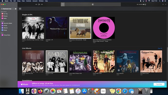
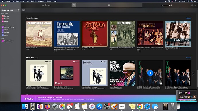
Look at Fleetwood Mac in Apple Music:
This is unequivocally the best way to display an artist’s discography: clean, easy to discern different releases, a seperate tab for live and compilations.
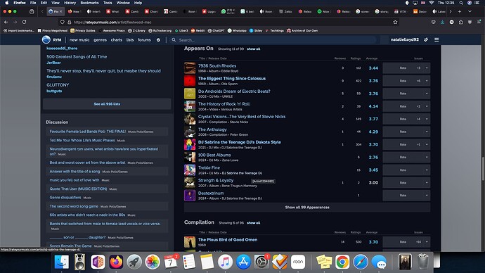
And another thing! The fact that roon have two tabs, one for ‘appears on’ and one for ‘compilations’ is wild to me, especially as the compilation tab seem to largely be Various Artists comps - so surely they should be grouped under one tab together? Compilations should be exclusively artist compilations, greatest hits, retrospectives, things of that nature. Rate Your Music does a near perfect job of displaying the info this way:
I’m so new to the app that I’m unsure if this will be annoying enough for me long-term to consider moving back to Plexamp, but for now it’s a huge gripe that I think is easily fixable to improve user experience.
Can we please sort this out?
