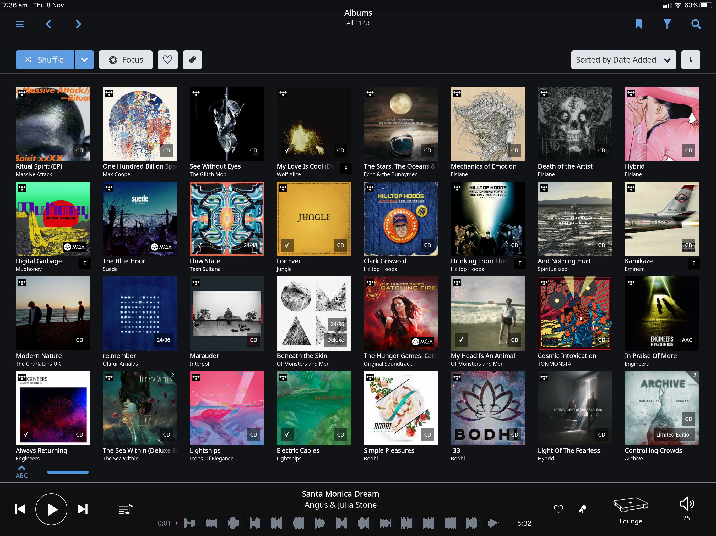
I tend to use my 15" MacBook Pro with screen resolution 2880 x 1800 as my primary control device since I always felt that the album view on a standard iPad showed too few albums at a time for my taste. When the new iPad Pro 12,9" were announced I ordered one and hoped that it would show at least as many albums at a time as the MBP does since the screen resolution is 2732 x 2048, but was quite disappointed when I realised that it only shows four rows and seven columns of albums compared to the MBP that shows two columns more when in the “Allow for more covers and photos”-mode.
Any thoughts on this? Is it only me who have good eyes?
I know a larger revamp of the UI is on its way and I sure hope it will provide more flexibility on how much information it will present at a time!
Really strange indeed. As you can see there is some black unused space around the active Roon-UI containing the swipe-up bar that replaces the home-button and on top date/time and battery etc is not shown at all.
Maybe someone from Roon @support can comment on changes between iPad Pro 1st and 2nd gen?
But the black bars are much wider than the radius of the rounded corner. Anyway, Roon doesn’t have any active content that would be covered by the rounded corners so I see no reason for the bars at all.
Looking at Roon on my iPhone X, the swipe-up bar is hidden and the whole screen with its rounded corners and the “cut-out” on top is part of the design, so it looks as if Roon just have done a quick-port to the new iPads…
The rotation issue is related to the way Roon is rendered on the new models at the moment. The 12,9” offers just enought horizontal points (1024) in portrait mode to render Roon – with the extra bars on the new models it slips under the threshold.
Can’t speak for Roon obviously, but going by past experience display issues with new iOS devices are usually resolved by an update shortly (few weeks) after release.
Well, the actual resolution/horisontal points in portrait mode is not 1024 but 2048, so why can’t Roon utilize that? On my 15" MBP and my iMac 27" the resolution is fully utilized.
It’s the same actually on your MBP/iMac. The MBP has a physical resolution of 2880 x 1800 pixels, which out of the box is rendered /2 to 1440 x 900 points. (Note that while interfaces are designed in points (1 pt = 4 px: 2 hor, 2 ver), the actual graphics are rendered using the individual pixels (that’s why Retina / HiDef screens have the sharpness they have).
iOS devices are either pts x 2 or pts x 3 (Plus sized iPhones). All iPads are pts x 2 (or px /2). While Macs can scale their rendering (said MBP can also display 1680 x 1050 and 1920 x 1200 pts on the same 2880 x 1800 px), iPads cannot: their number of available points is always pixels / 2.
Given the high resolution of today’s devices I still think there would be room for some additional flexibility when it comes to the album/cover area. Maybe an "Allow for even more covers and photos”-option!?