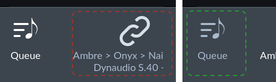
Being a bit bored again I took another sharp look at the Now Playing bar and screen (on MacOS, Roon 1.6). The icons for the zone or device currently selected have a different colour property assigned than the rest of the icons (queue, volume) and the icon description, most obvious with the Dark theme while hovering above the entry:
The zone icon gets its colour from matter-grey4 – which brings me to the suggestion mentioned in the post title - maybe for the QA and UX teams.
As an experiment, check how this one colour gets used throughout the application. It’s probably pretty easy to change matter-grey4 to some “red debug value”, and maybe best viewed with the Light theme. I personally found it quite surprising that the same colour is used in varying (!)
- descriptive (as a kind of label or as part of the information architecture),
- decorative (when the intention may have been just to make it look nice) as well as
- functional ways (like “hiding” an action, indicating a certain state of the app or providing a hover effect or other navigational indication).
Maybe this experiment gives a few small hints why some feel there are inconsistencies in the UI impacting the UX.