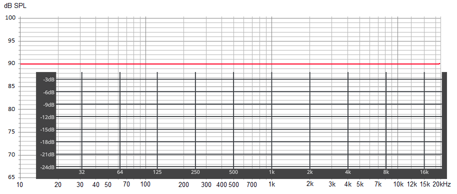
With the lines/indicators left to right evenly spaced. However just about every other graph showing frequency response, or EQ tools such as EQ-APO or sonarworks uses this format:
Is it possible to add the option for us to have the graph displayed in this manner? As it makes it quite hard to at-a-glance see if our filters are in the right place when the graph is displayed differently to…everything else
What exactly will change on the graph (besides the additional vertical lines)? All frequency doubles (octaves) are evenly spaced – even in your provided example, which is wrong btw. with the 15k instead of 16k.
Its not a case of which is better or worse. Its just that some people (including myself) much prefer the format I linked, and it would be great to have the option of using that instead
Sorry for the noise but for me, your start post just seemed to imply that Roon is doing something wrong in this place. I understand now that it is just about having an option to display another set of ticks.