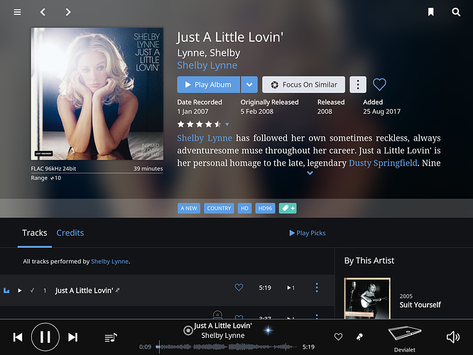
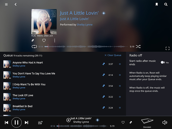
The screen shows too much info making it cluttered. Like lyrics make info available using icons. When clicked on such a icon the information will be shown in a popup just like lyrics.
Which screen are you referring to?
Hi Carl,
Thanks for your quick response.
Below a example. This screen by default shows a lot of information resulting in hardly seeing track info which is what you go back to, artist and album info is more a one time thing.
Next screen of the same album shows more track info and lyrics are available by clicking the microphone icon. I would like one screen with all information, lyrics, artist info, album info, more albums by the same artist available as clickable icons like the microphone/lyrics icon.
To the developers - please don’t do this. That would seriously change the Roon experience, for the worse.
Make it an option selectable through settings to satisfy both parties
My preference is the screen as is. It is very functional for me. If you just want to look only at the album cover, tap the album cover on your tablet to enlarge it.

