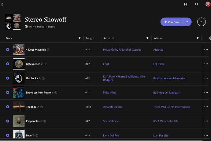
You’re right that I should have mentioned the platform I’m talking about. Edited my entry to make it clear that the search functionality is missing on the mobile app and possible on the desktop app (albeit somewhat awkwardly).
It is OK to decide what functionality goes to which platform, and I would generally agree that it makes sense not to cram every little feature into the mobile app, which could get cluttered very quickly.
However, I think that if they’re going to allow doing something, they should also allow UNdoing it. And generally speaking, it should be as easy to do as it is to undo.
This is just simple usability. Systems should be designed in a way that prevents errors as much as possible, and allows user to EASILY recover from them if they do occur
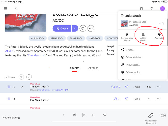
Now, if you look at the “Add to playlist” menu in the mobile app, you’ll see that the playlists are just sitting there, one below the other, waiting to be tapped. And as soon as you tap one, you’re done. The track has been added to the playlist, and the whole menu closes.
And what happens if you clicked the wrong playlist by mistake? You now have to:
- Navigate to the playlists page
- Find the right playlist
- Scroll ALL THE WAY to the bottom of the list
- Click the three dots icon
- Click “remove from playlist”
- Click " Yes" in the dialog box
That’s one hell of a “recovery” for a simple mistake. And if you don’t realize your mistake at the moment you’ve made it, it’s even more complicated, because the track may no longer be the last one in the playlist.
I happened to be a UX designer with 17 years of experience. I’ve spent hundreds of hours doing usability tests. These are exactly the kind of scenarios that drive users crazy.
If you’re going to give users the option to do something, you should ALWAYS also think about what they need to do to UNDO it.
Now, it just so happens that there’s an app called YouTube that has a VERY similar use case, where users can add and remove “things” to their playlists. And it just so happens that this app has over a BILLION active users, so there’s a very good chance that many many Room users already know how to add/remove things in YT. And it just so happens that YT’s solution to this use case is about 10 times better than Roon’s.
So even though I’m normally against copying stuff, I think that in this case it just makes way too much sense. The solution, at least in terms of UX design, is (probably literally) under the Roon developers’ noses.
And since the functionality to both add and remove tracks to/from playlists already exists, I imagine (although could be wrong of course) that there’s not a lot of technical difficulty in just changing the user interface.
And this also has some additional benefits, too. It will allow user to see, at a glance, what playlists this track was already added to (something that I don’t think is currently possible unless going to the playlist again). It will also allow adding and removing from several playlists at once, instead of opening the menu again and again as you need to right now.

