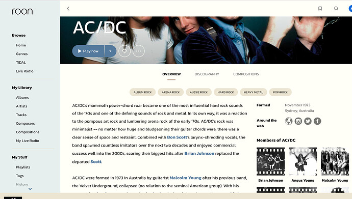
Except the common rule is sans-serif for the titles and serif for bodies of text. The other way round, as in Roon, is pretty rare.
@phantomtides - Thanks for pointing out those pages. I completely missed the mixed typefaces. I appreciate you pointing this out.
Take care,
Vince
I do hope that Team Roon is reading this and can glean something out of this discussion. I saw some other threads regarding 1.8 that made me cringe. I dig the give and take on this subject.
Cheers,
Vince
So that is probably “traditional” to use serif in mixed font use cases, but by no means typical. Look at this article, which I find quite instructive. Many examples of both, both look “normal” to me, and I agree that serifs while “in the old days” were associated with readability are definitely not always. I’m no expert, maybe they could have picked a different font face, but I think the idea is strong and with a little tweaking based on feedback they’ve gotten will look really nice to some, and everyone else will get used to it.
I certainly wouldn’t pretend to be a specialist, but I’ve done some typography in my time. The article you link to is actually quite good, but I would urge you to look at it again. Especially the “left/wrong vs right/correct” examples, as they pretty much make my point. There is not one “correct” example with a serif title and a sans-serif body. The closest you get is one example with a serif title, a sans-serif subtitle, and back to serif for the body.
I completely agree there are MANY things you can do with font. If you know what you’re doing that is. I don’t think the typefaces for 1.8 are horrible, my eyes don’t bleed, but even with my light background, I can tell this was not done by someone with the correct knowledge.
