I’ve got a reasonably expansive setup (ROCK on Nuc, various Macs, Raspberry Pi, iPad, iPhone, couple of endpoints) and I was up and running in ~ 10 min in my ecosystem and enjoying exploring all the new updates.
I voted “Somewhat Positive”, but my major concern is related to how the focus have shifted more to the “streaming services” and “looks” instead of “Personal library” and “functionality”. Should be balanced.
Peace,
Tony
I think the poll could use expansion?
There seems to be three issues ,
Technical - stuff broken, bugs, not working
Cosmetics- don’t like colour schemes, positioning of buttons etc
Functional- things having gone missing, badly placed eg Discovery
A simple like/dislike isn’t specific enough to give Roon guidance
There will always be people who don’t like change , broken is another thing
Just my 2 p
You could do a poll about the poll.
You know what - you’re not missing much. You’ll go there once and say, hmm or meh, and that’s pretty much that. I’d rather they just give us back rating stars.
I think Roon want to make a more magazine like experience, but the problem is, magazine’s come out weekly or monthly, churning out massive content, and Roon are not publishers. I have a feeling this ‘content’ that Roon has built is going to get stale real quick and just be in the way of our collections (like the essays that introduce genres - maybe you’ll read one once but even that’s a bit cringe inducing). I wish they would just stick to being the best music collection DAM out there, though perhaps that got too boring for them.
I enjoy most of the new look, but I am disappointed that some issues from 1.7 were not fixed (some of which are just Remote issues, not Core)
- Gestures still don’t work on iOS (or back buttons from mice on macOS)
- The lack of animation is annoying on iOS especially on sudden UI changes (your eyes/brain can follow changes through animations much easier). It comes free with any iOS app, unless you want something special… so why not have this?
- I can’t believe no one noticed (and fixed) the UI from jumping when switching “tabs” (say Tracks → Info → Credits). It’s enough to have already scrolled the screen just a bit to see how it resets the scroll position when changing a tab
- My biggest gripe though is that my favourite artists are still not picked-up from Tidal/Qobuz. I fav artists, not albums, usually so it’s really annoying not to have access to my list in Roon… up to the point of it being a deal-breaker. I’ve talked to a few people and most of them fav albums. That’s ok, but at the same time there are other people who fav artists. You can’t just cater to a single type of user, especially when it’s not even a rocket-science kind of feature.
Rating stars are still there? I was looking at them yesterday
Not on thumbnail views they aren’t, which is where they were most useful.
This is generally how things go, negativity-wise
What was different about this was juicing everyone up for a month or so before release. Consequently there was a huge load on the Roon services, which made things worse than needed. And of course many people found they weren’t getting the pony they thought they’d get for Christmas.
Ordinarily, releases just drop and get picked up more organically.
Yeah… for all we know, this may have been a good business decision. they may have picked up a metric crap-ton of new subscribers in this process due to the PR, and this storm in a teapot will end before too long. If that’s the case, they’ll be sitting pretty and we should ideally get more velocity on changes going forward. I’m happy to take that chance - and frankly, that’s the chance I took when I bought lifetime.
Could this have been handled better with a long-term fairly open beta? Yep, in my mind yes. But I’m not in the drivers seat, I just enjoy the music.
Excellent post above by Mike O’Neill.
I’ve had no technical glitches, but the “modern, fresh” new look makes it less functional for me.
Function over form everytime for me. GUI changes should have been incremental. The whole 1.8 thing regrettably looks and feels incredibly poor to me. Feels more like a student bedroom project than a professional piece of coding.
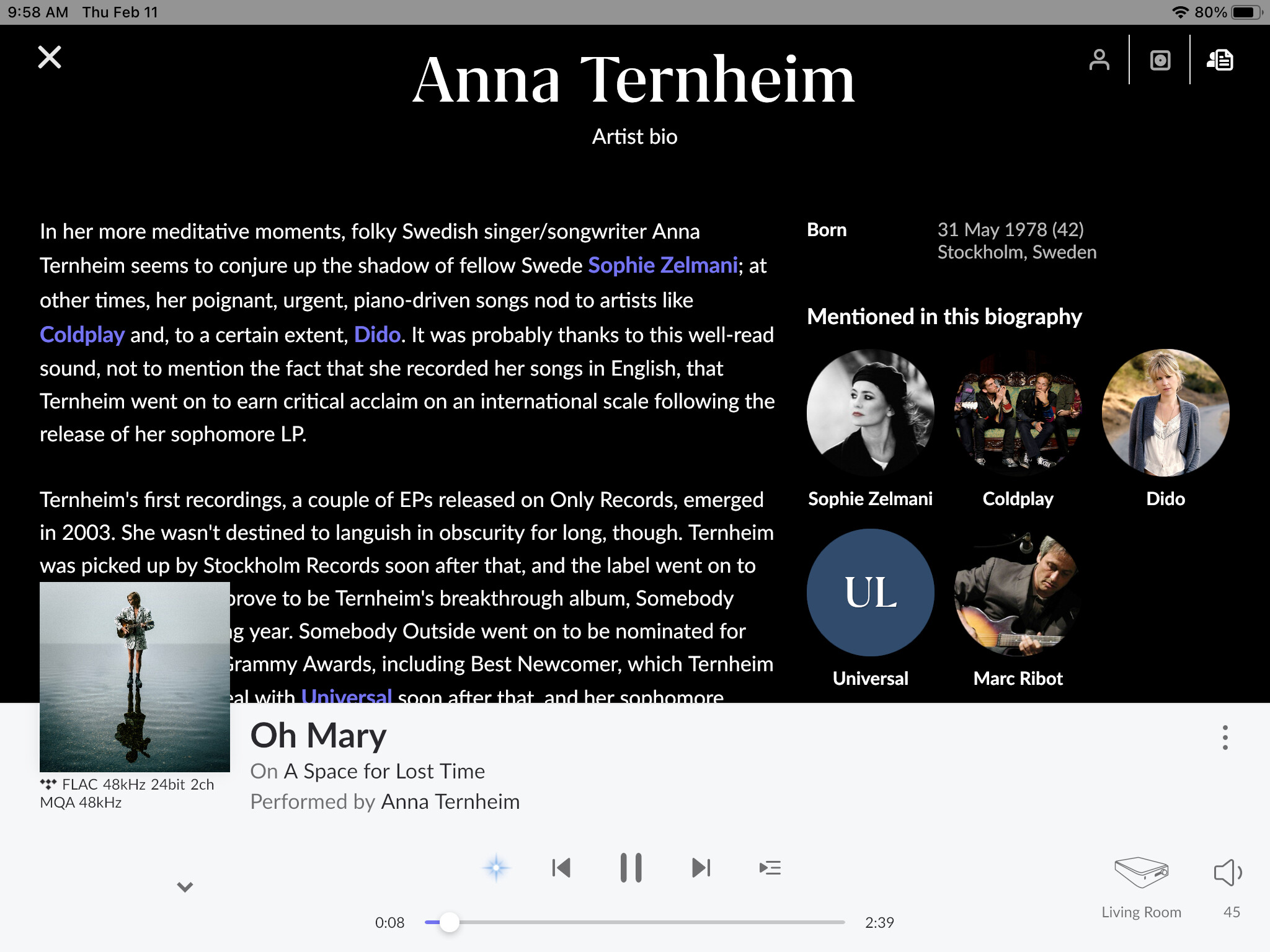
Some things that annoy: no longer have something that indicates if the album I’m listening to is already in my library; artist bio text bounces up/down/sideways making it unreadable; recommended for you below the artist write up, are these similar or just random recommendations. Screen space is a mess, huge text, open space, album art creeping into text - example
Add images
That’s exactly my point that I’ve posted elsewhere - IMO this has just become a bolt-on for streaming service subscribers with little regard for users, like me, with personal audio libraries. It’s poor and I went lifetime. Oh well, you live & learn.
Can’t comment on artist bio jumping around – i don’t see that happening at all – but you can clearly see this album is not in your library as it’s a tidal album because you see the tidal logo below your album. If you don’t see tidal or qobuz, it’s in your library.
Find me that student, I’ll hire them and all they consider to be their peers in an instant.
Examples of anything you feel as poor UI designs? A picture is worth a thousand words!
Given all the fuss on here with topics like 1.8 is a massive failure it’s somewhat surprising only 12% are very negative about this release. I guess that as usual it’s the dissatisfied who are the most vocal.
What are they complaining about anyway? Reading hundred posts, most are about font sizes too small, purple not good on dark mode. Others are complaining about something they could not find in 1.8, even they are there, right in front of their eyes.
That is a good point, I mean I could just enable Tidal on Roon just to look at it but I don’t really use Tidal much, I just have it as a backup when I am not listening to my own records.