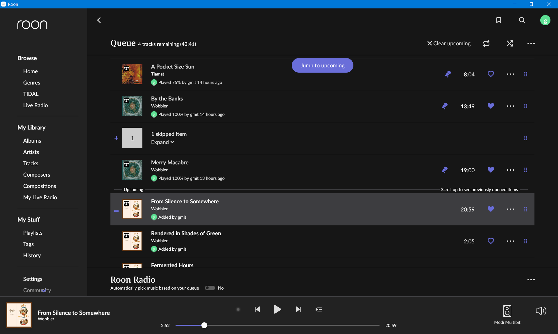
Queue is one of the most used screens, it was strange and become even worse in 1.8 - so much space is wasted.
- three lines of text per queue item with artist font being extremely small, but 2/3 of the item is completely empty!
- on my 1920x1200 monitor, only 6 items from the queue fits the maximized Roon window. Only 6! The area above queue is also quite empty. And now in 1.8 there is also a whole line for Roon Radio switch - why?! Wasn’t there space to put a simple switch? I don’t even use radio!
- previously, queue button was large, which was ok as it was frequently pressed. Now it’s a small button next to media control buttons. Why?! Isn’t there enough space for a proper, large button?
- to make things more bizarre, Jump to upcoming button is floating above the list. Why?! Isn’t there enough space for a proper button?
- why is a single skipped item represented as an expandable row? It doesn’t make sense.
I’m sure you’ll defend him/her, but your UI guy/lady simply doesn’t know anything about UI design…