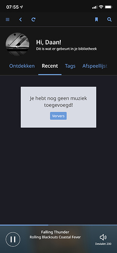
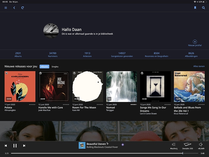
Back before Recent Activity, when you were at the recent additions section and you clicked “View All” you were taken to the Albums view sorted by most recent and if you have “allow for more covers and photos” set, you get 36 covers on a page (four rows of nine albums across). Now, in the Recent Activity section if you set it to Added and then click on View All, you get taken to a Recent Activity page that unlike other such pages in Roon scrolls vertically instead of horizontally and also displays only 5 covers across instead of nine.
Now, I personally think that everything in Roon should scroll vertically instead of horizontally, and if the new Recent Activity behavior is a harbinger of things to come, then great. But it is weirdly inconsistent with the rest of the way Roon works and is confusing at best. Indeed if my window size were set differently, I might have thought that all I was getting was a display of 10 covers since I tried and failed to scroll the page horizontally.
But the bigger issue, for me, is (1) not having the smaller size cover, and (2) the fact that this screen tops out at 100 albums. I might well be looking for something recent that is more than 100 albums old. I much preferred the old behavior where I’d be taken to the complete Album view automatically sorted by most recent.


