I love Roon for its functionality and playback device integration.
I design commercial apps for a living and my impression has always been that the Roon UI is designed by engineers, with little input from a skilled graphic artist. An experienced visual designer can ensure a cohesive application of a design language which mitigates the inconsistencies that have always been prevalent in Roon. In some cases it feels like different parts of the interface were designed by different people - another symptom of the above.
This latest release, which I really do like because of the Search enhancements, shows a bizarre lack of digital design acumen in places like the Now Playing screen (though I appreciate the functional changes made there). This is evident from the many comments to that effect, though most can’t precisely describe the why.
Roon will get there… in the meantime, I am really digging the new Qobuz and Search features.
5 Likes
mjw
(Here I am with a brain the size of a planet and they ask me to pick up a piece of paper. Call that job satisfaction? I don't.)
765
Out of curiosity what track or album was used to seed Radio?
FWIW I just tried for the first time on my Google Pixel XL (firat gen) phone - and loving the UI! The darker mottled black/gray play bar that then goes all black to match the background when it goes to the Now Playing screen - with just the album art.
I also like the screen switching tabs along the top in the phone app (the blue Now Playing, Queu, Roon Radio, and History). I know this was done because of lack of real estate, but to me it works really well. Very much like the tabs in Lightroom, all of which have keyboard commands to switch between them: Library (G for grid view, E for enlarged single image view, C for compare - how cool would that be to see multiple lps at once and quickly play bewteen them) and Develop (D), Slideshow, Book, Print, Web etc. They call them modules.
So just like the Android phone app, maybe some separate screens - a Now Playing screen that is just that with some basic controls and ability to hide/unhide text, and a PIP size/type radio screen that can be hid/unhid; and a Radio screen, for those radio fanatics (it really is unique and great now in 1.6) that is all about what’s next with a PIP size of what’s currently playing.
I’ve always wanted a fixed main menu option in Roon - with a 12.9 ipad or my 27” screen in the office, I don’t want to always have to drop down a menu to get to where I need to go. Clicks add up over time and really not necessary with the right screens. Along the top for the majors would make sense, and separate out Settings, Support etc to a drop down as current. But even a lock open on the menu as is would be appreciated
Hi All,
I finally had a couple of days with 1.6. Awesome work. ROON has already allowed me to explore music I never would have gotten to listen to by allowing me to endlessly browse. The new ROON Radio, now reaching outside my own collection, just pushed music discovery into overdrive. I’ve tagged so much new stuff to listen to it’ll keep me busy for infinity, And to think that this algorithms will only get better.
Great work.
Cheers,
Jay
And I never would have thought that someday I’d say the Android Phone verson of an app is beautiful and the iPad version butt ugly! But there you go - like others have been saying this is obviously design by committee - a piece here and a piece there to fulfill functional but not aesthetic criteria - or perhaps the various versions were designed by different parties? If so, bring the Android person over to the iOS team!
Anyway, for now I’m using my phone and a bit more relieved that the main design could be/will be something much better someday.
This makes perfect sense. Thank you for the explanation.
It might be too early, and too presumptuous, to ask for a fix at this time, but I’ll at least mention the problem: a linked Tidal account with no payment method added (no subscription, but yes login) enables the “intelligent” Roon Radio feature. Roon will try to play Tidal tracks (and Tidal content is shown when navigating Roon), but, because there is no subscription, playback will fail. Sometimes, playback stops altogether, and hitting the play button gives the message “track currently unavailable from Tidal.” Sometimes, Roon will skip through tracks until it tries to play a local track. The stopped playback is difficult to live with; the skipped tracks behavior is nice, because I can check out those tracks later, however I want (YouTube), by looking at the previously played part of the queue. I hope this is addressed by Roon to allow for continuous playback, and I understand that it would be beyond Roon’s control if Tidal stopped giving such unpaid accounts the access that currently allows the “intelligent” Roon Radio to work with such accounts.
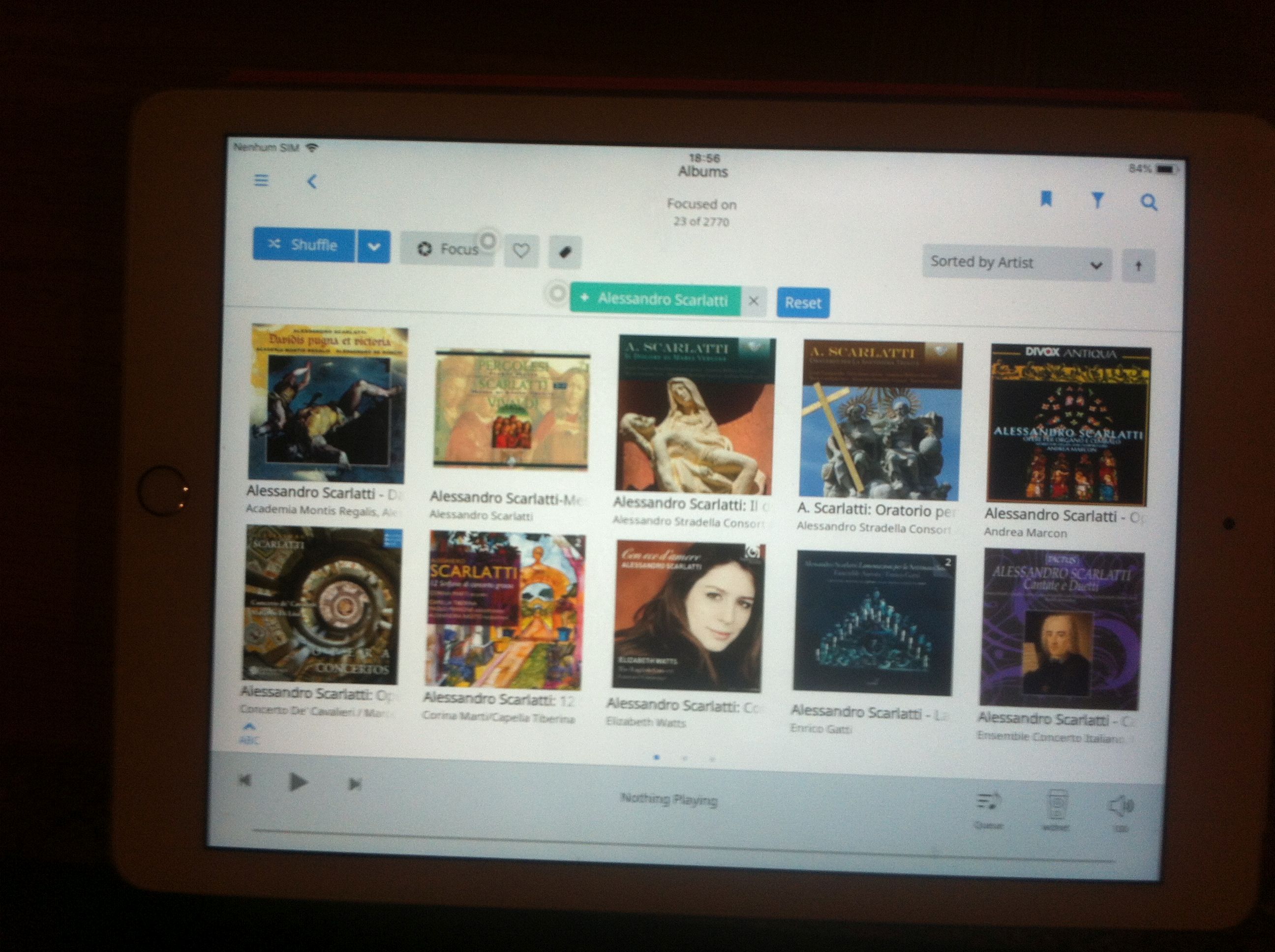
pic 1 is when i choose a tag, only 4 covers .
pic 2 is when I clik VIEW ALL and select for ex. VIEW ALL ALBUNS , then it shows 8 covers as in 1.5 .
this is not a major issue , just have to clik one more time to get 8 covers , at 1.5 ver when I choose tag it shows at once 8 covers.
A lot of bitching in here Personally I like the new release, especially the Qobuz and improved Roon Radio. If a button is the wrong shade of gray isn’t that important to me!
You’re right, ultimately, but $20 a month for Tidal ($25 for Qobuz) brings the price of using Roon up from $12/month to at least $32/month. There seems to be an element of unfairness there, but that element also seems to fade in the hypothetical where Tidal removes “browsing” access (as opposed to being able to play the tracks) to its catalog for logins with no subscriptions. If Roon Radio just can’t work well without such access, then it’s my bullet to bite, I guess. However, consider these two factors: 1) folks here are complaining that Roon Radio will play Tidal versions of tracks in their local libraries; 2) Tidal has a history of removing music from its catalog. The equities in play seem muddled by those factors. The world is leaving me behind, in my old age, I suppose…
Bill_Janssen
(Wigwam wool socks now on asymmetrical isolation feet!)
780
One can draw an infinite number of lines through a single point, but they’re not all going to be what you want. Better to provide multiple examples to allow for effective induction of implied principles.
mjw
(Here I am with a brain the size of a planet and they ask me to pick up a piece of paper. Call that job satisfaction? I don't.)
781
I don’t think this release has the abilities of a haruspex.
mjw
(Here I am with a brain the size of a planet and they ask me to pick up a piece of paper. Call that job satisfaction? I don't.)
782
You may have to wait a few days for new artwork to download.
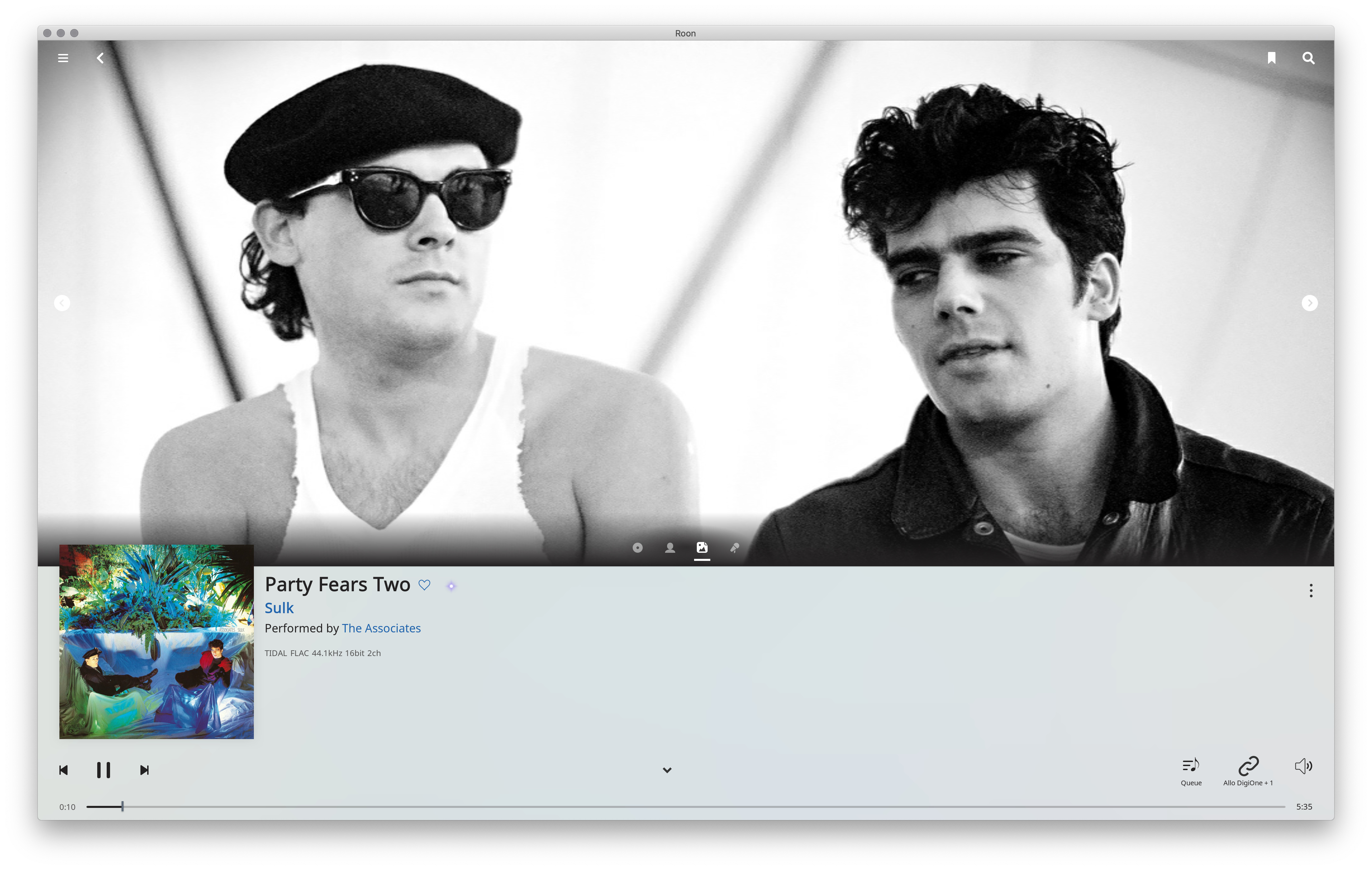
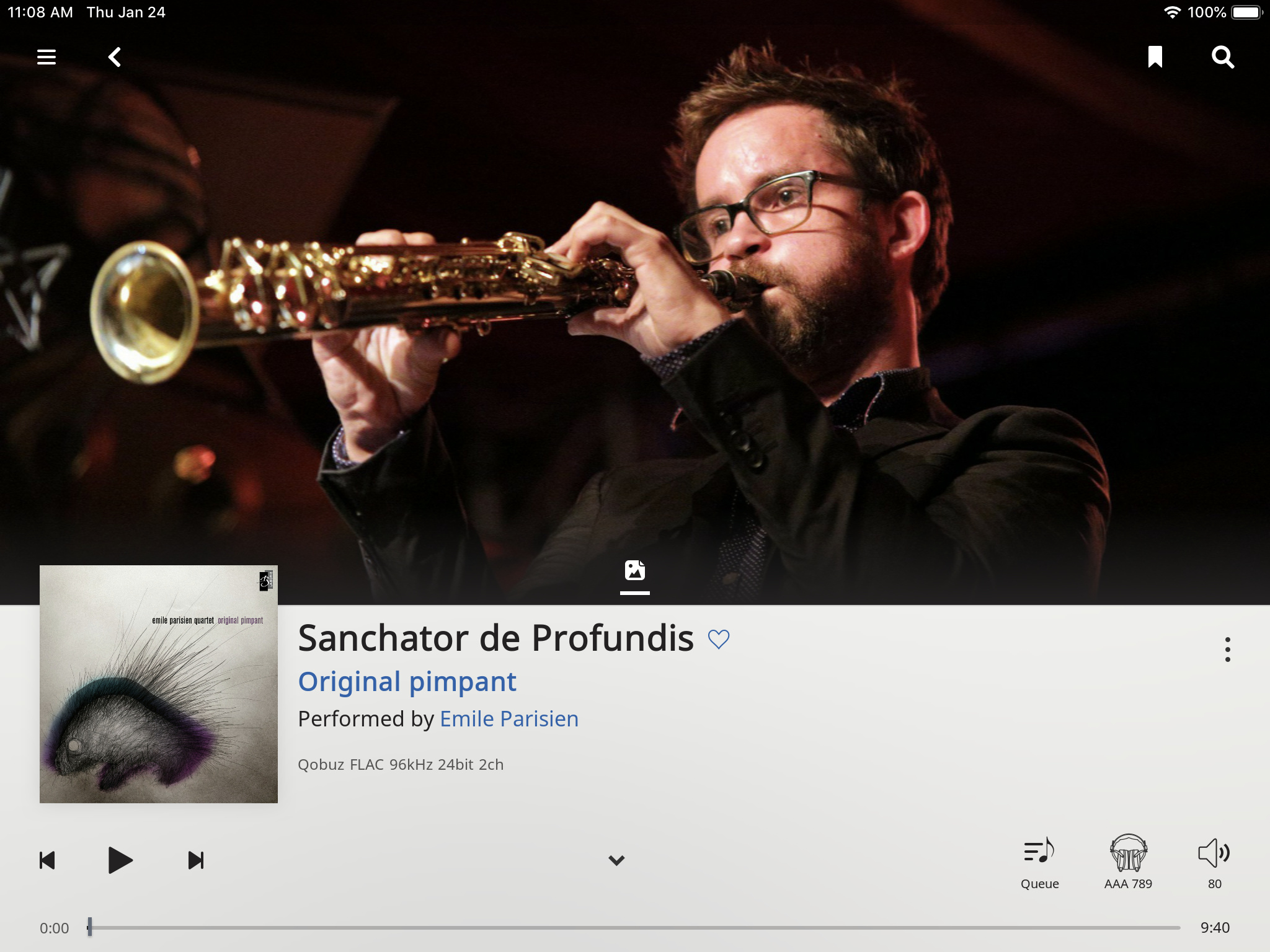
I like the uniform white, with no delineation of areas, like the footer bar vs. the rest of the page. This is modern design — “modern” in that it came out of Switzerland in the 30s. Early computer design was Victorian, with centered headings and labels, and lots of frames and lines delineating areas. Look at any modern magazine, or a photo book, or something like that: minimal lines, no stupid drop shadows, text for the album is left-aligned.
Look at the left margin: the hamburger menu, the album cover, the play controls and the time line are all left aligned, this creates a virtual left edge that doesn’t require a line. And similarly on the right edge, search button, three dots, volume button and time line are right-aligned, creating a virtual edge with no line.
No borders on the pictures either — when was the last time you saw borders on photos in a magazine?
I like the album picture breaking out of the grid. Adds a little tension.
It’s actually not white but light gray. I can imagine some reasons for that, less glaring, but I disagree with it. Newspapers and magazines are white, my iPad is mostly white — this page is white! Doesn’t matter much on this page which is all uniform, but when you collapse the page and get back to the footer on an album page, you get the area delineation again. All white everywhere would be better.
I absolutely didn’t like the old black play bar. Black over white is such a harsh contrast. You don’t see black section demarcations on magazine pages, the page footer is just a white bottom area with a page number. Similarly, the main menu is black - yeww!
I similarly prefer a few things like DSP now getting a full page, instead of being a pop-up dialog box. Such pop-ups are terrible, they break the flow, don’t fit in normal navigation, especially when modal (or system-modal — WTF?). We still have a few: the zone selector, which does not go away when I hit play but does go away when I touch elsewhere, and the volume button brings up its own dialog box but doesn’t bring down the zone selector and their lifetimes are stacked, and if I have both zone selector and volume box open and hit the Play control arrow the volume box goes away but I have to hit Play again to make it happen but if the zone selector is up the Play control works directly… Random stuff.
And the cleanliness of the Now Playing page is missing elsewhere. As @brian said, such cleanup is incremental. But I can’t wait. All white, no sections!!!
 And to think that this algorithms will only get better.
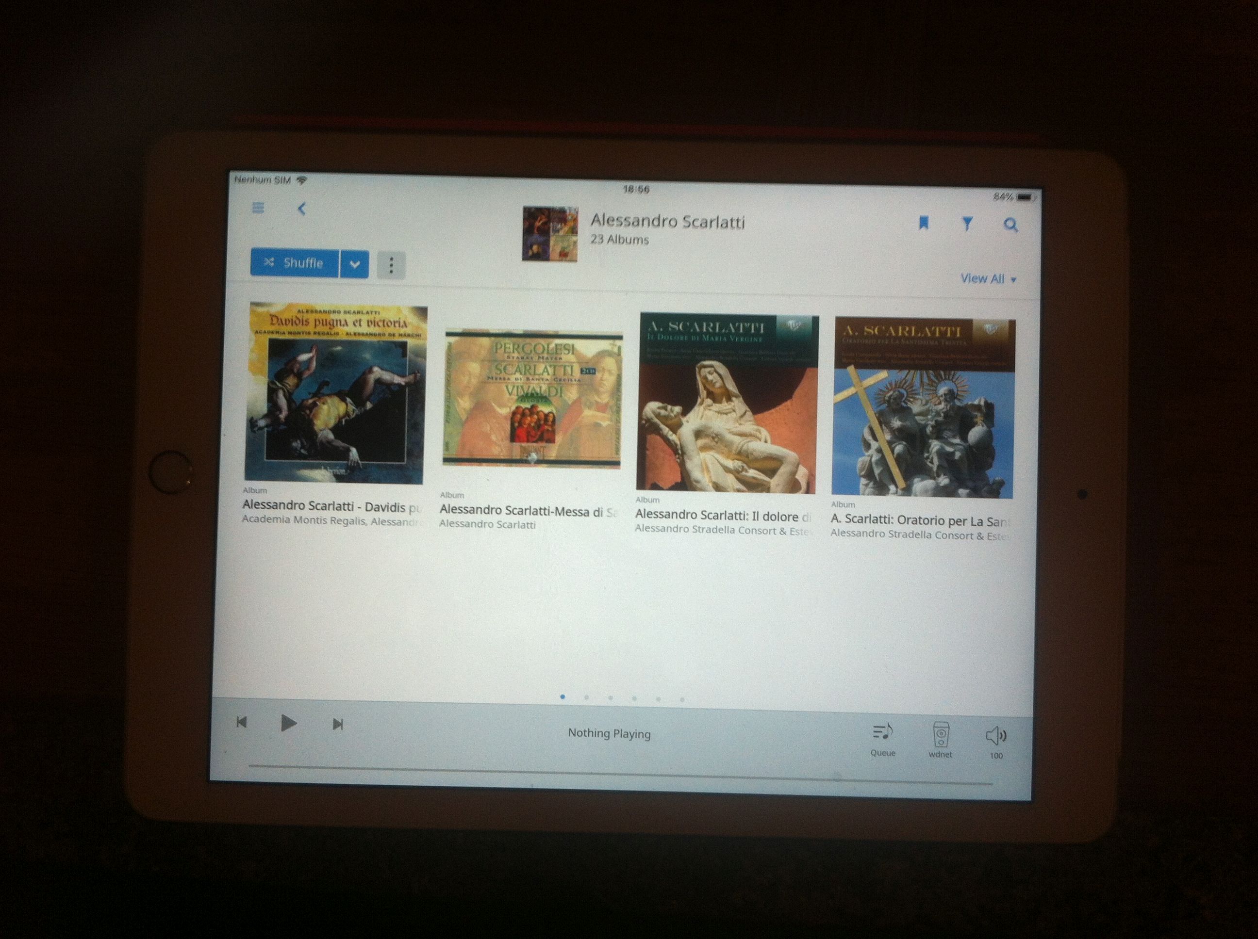
 Personally I like the new release, especially the Qobuz and improved Roon Radio. If a button is the wrong shade of gray isn’t that important to me!