It’s likely the whiskey or wine causing any perceived differences for some!
“A new software release? Let’s settle in, celebrate a little, and give it a whirl!”
@brian: I’d like to say thank you for being so transparent and patient! Even when some of us seem to end up in rants that are (imho) not warranted at all. So thanks!
4 Likes
I thought that in 1.5, the contents of the Lyrics box on the Album page would change with the track change? In 1.6, the contents remain as those of the track that was playing when the box is opened…
First feedback from my side…
Everything seems to work so far and the upgrade itself worked like a charm. I will start to test a Qobuz subscription in february. The integration of my existing account and the synchronisation with my purchases worked fine.
After the first few hours I have the feeling that the new 1.6 remote app on Android is slower than it was before. I don’t know if this has to do with the additional traffic going to/coming from Qobuz .
As of now I don’t like the design of the new “Now Playing” Screen screen. The possibility to scroll between artist picture, bio, album detail, etc. is nice though.
One issue I discovered: If I play an album by more than one album artist/performer only the picture of one artist is shown. For example the album “Raising Sands” by Robert Plant and Alison Krauss only showed me the picture of Robert Plant. This is something I would like to see changed.
First, I’ve enjoyed the new Roon Radio including streaming services. I have Tidal and Qobuz (for the moment). That said …
From what I recall Sooloos’ Swim function was more adventurous in its choices from local library than Roon Radio is (for local library) in that it didn’t get stuck in a small selection of artists and albums as much. Is that my imagination? Would it be possible to approach Sooloos Swim levels of local library “randomness”?
I know I complain a lot about the search function, but I’m not complaining about the new radio function.
I applaud the choice you made for the radio function. I have only tried it out for about half an hour to date and already I found two new artists to explore. Very happy with this.
So now about that search function, Brian… 
The Roon 1.6 iPhone app got rid of the clear all queue.
It is still there in the desktop apps but not on the phone app. Please replace this feature.
[Mod Edit: clarification - iOS changed to iPhone
My feedback after 48 hours of exploration:
-
Qobuz integration is HUGE. I just got onto the Beta trial for US. For my musical tastes, Qobuz seems to have 90-95% of the catalog depth that Tidal brings. Qobuz’s hi-res catalog seems to be proportional to Tidal’s MQA list, maybe 5% of all albums, with a lot of overlap: if it’s in MQA on Tidal, it’s almost certainly on hi-res in Qobuz. I’ve been generally a fan of the sound of MQA versus streamed 16/44 on Tidal. But after deep A/B/A comparison on half a dozen albums last night, I have to give the edge to Qobuz hi-res over MQA. Head-to-head, MQA is a little more brittle, a little less meaty, a little more tipped-up in the highs – which first comes across as aliveness, but over time feels like hash or noise.
-
Radio’s ability to pull from Tidal and Qobuz is a game-changer. I don’t always love the sound of the songs it picks, but I am very impressed with the depth and breadth of recommendations, often for bands I’ve never heard of.
-
Search is improved. Thanks.
-
The UI changes are piecemeal garbage. I like clean lines and lack of clutter. Dark Mode is wrecked by the new mud-gray footer (I see what you are trying to do by blending colors from the album art; it just looks terrible.) Now Playing gives me a pixellated zoom-in of some band member’s acne instead of album art? How the hell did that get decided?
-
I hope you guys feel really good about 1-3 even as you resolve to work on #4. Thanks for all you do. I love Roon (and will love it even more when it looks a wee bit better.)
10 Likes
Impressions after 48 hours are this is a real mixed bag of an update.
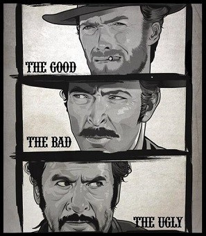
The Good: The new Roon Radio personalised listening feature is already excellent and will only get better over time as crowd-sourced feedback improves it.
The Bad: The new Search should be great, but isn’t at the moment - results are still very sketchy with duplications. Somehow we’ve also managed to lose functionality because it’s no longer easy to see at a glance which results are local and which are from Tidal/Qobuz (works with albums, not artists). The visual design is incongruous with the rest of the UI.
The Ugly: The overall UI design decisions are pretty poor. There’s a real lack of cohesion. A lot of screen real-estate is wasted but also manages to feel cramped at the same time. An odd double-whammy of crapness.
In summary: a lot to look forward to in future updates 
3 Likes
Roon really needs to consider the many posts that are of the same nature and accept, rather than rationalize -
3 Likes
Yes. It’s really great. Many THX for that. 
Yes again. It just looks terrible. I wand “my” black footer back ! 
2 Likes
On 1.6 I have on Tags 1 layer with 4 album covers to choose from.
On 1.5 I had 2 layers with 8 covers , can I have same 2 layers on 1.6 version or not
pls let me know
Well, except that the comments don’t all agree on the same thing either. See my thread about the philosophies of configurability versus a simple single presentation.
It’s obvious I favor the former – I don’t see how Roon can please everyone all the time and so I want to be able to configure to my wants, but I also understand that creates a more complex product under the hood and could mean that Roon takes twice (? more?) as long to implement cool new stuff than it would if the product was more streamlined.
It’s a real challenge. People can bash the design – and I for one am totally scratching my head as to how there is no large album cover for Now Playing – but users must also understand that aesthetics are inherently subjective.
1 Like
I think the current criticism stems from the observation that each individual section looks like it has been “designed” (I use that advisedly) by a crack team of badgers.
There is no overall flow or DNA to put your finger on. You can praise or criticise an individual view and have a completely opposite feeling about another part of the UI.
I’m nostalgic for the days when all I wanted was scrolling consistency 
1 Like
Aesthetics were also the main selling point of Roon. “Roon turns this… …into this.” It still on their main page, but not a top priority anymore, at leas as far as I can (subjectively) see how things are evolving.
1 Like
I think you may have misunderstood how this works. If you want a “dance party mix” let Radio create this from a good example of the genre–either track or album. Mix tapes and various artists collection such as NOW That’s What I Call Music! are not going to be good seeds.
Personally, I think new Radio is brilliant. I’ve had a big grin since I started using it!
I’m a lifer so no new version of the software is going to chase me away. I have been using it for a few days. I don’t subscribe to any form of radio service so I have nothing to add about those changes. I do appreciate the efforts of Brian and his team to make the interface better. I only noticed a few things that I wish were different-
-
I had to edit some of the album metadata files to get my hand selected album art to display again. I believe this has happened before with some updates in the past. It would be nice if a global option was available (or better yet a default) to use the artwork from the files rather than whatever Roon thinks the correct artwork should be. Some of my CD rips are from special versions (like Mobile Fidelity) of albums and I want to display the correct artwork.
-
The lyrics don’t scroll when playing music through devices in the airplay zone. The scrolling seems to work fine in my other zone which is a Bryston BDP-3. To me, the lyric scrolling merely a “parlor trick”, so no big deal with me.
Keep up the good work Roon Team-You asked for feedback, so my advice is to focus on enhanced functionality rather than lipstick and makeup on future versions.
Best
Jeff C
I agree that Roon launched with the claim that aesthetics would be primary in philosophy. Nor would I defend any element of the design as being my favorite (but I also have not just terrible taste but no taste whatsoever).
My observation there was simply to point out that users may hate the design but not agree on how to fix it, and so it is really not an issue of pointing the finger or allocating blame, as much as it simply is expressing one’s taste and then working with Roon to see if something can be done to accommodate it while avoiding crossing someone else’s aesthetic.