Good catch ! I had the wrong Tidal account info in sonos. Roon Radio is working properly now. Thank you.
1 Like
A few notes:
-
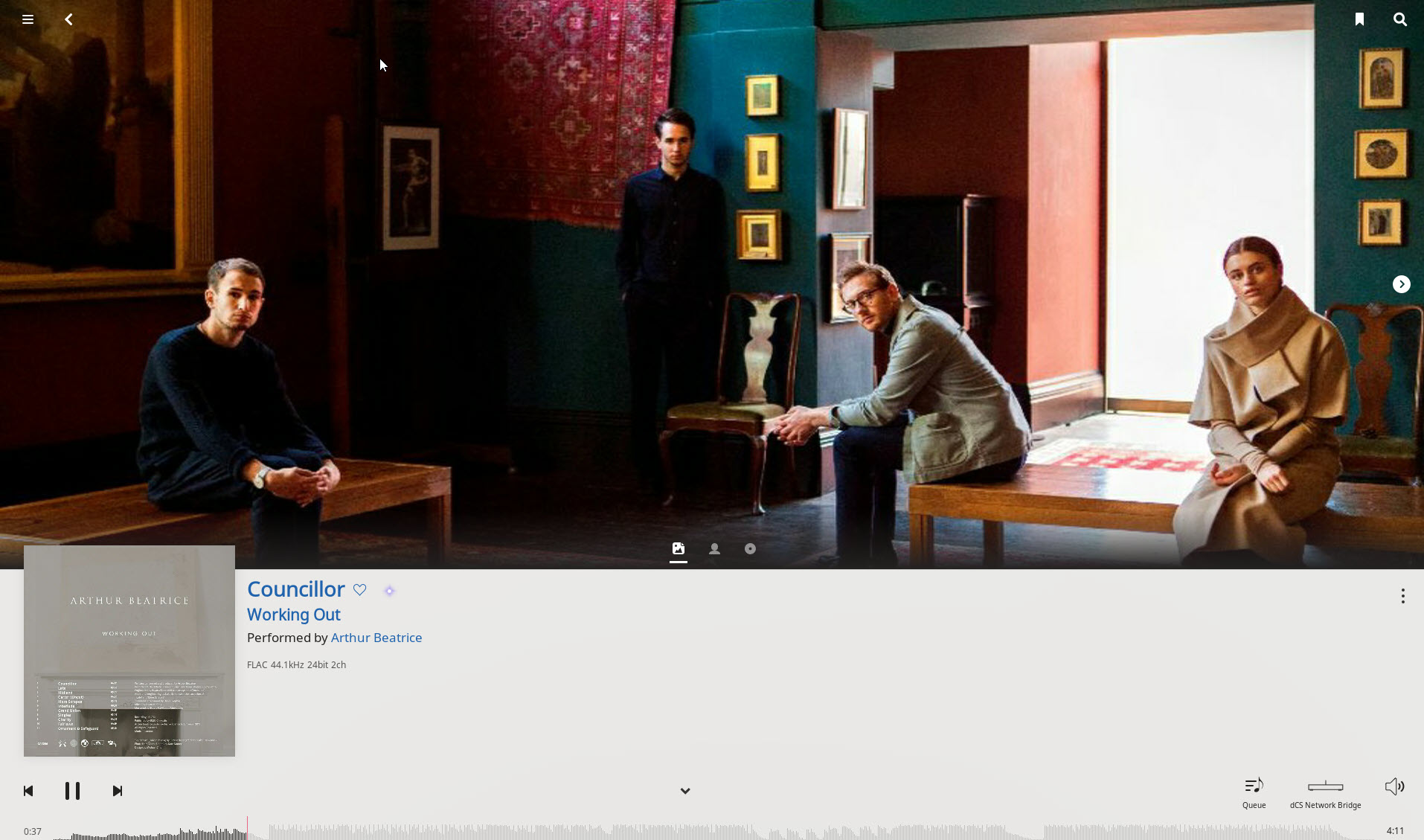
The now playing footer needs to be expanded a bit to show more relevant info about the song such as format, sample rate, DR, etc
[A] It expands at a touch, and shrinks back at a touch. Seems a reasonable way to manage the information vs. clutter balance. -
The now playing footer should include ability to see the lyrics, album review, track credits directly in a pop up box, why does clicking the microphone icon just take me to the main now playing screen?
[A] It does. The full Now Playing page is in effect a pop up, you can get at a lot of 8nformation, and then collapse it to get back. -
From the now playing footer I should be able to go directly to the artist or album instead of first having to expand to the main now playing screen
[A] We always want to be able to get directly to everything, but then you would have three different clickpoints with different behavior on this narrow area (which many people want to make smaller): artist, album, Now Playing page. Seems challenging. I think of expanding the footer to the full Now Playing page as a universal (temporary) entry portal to all kinds of information, seems a good, decluttering idea. -
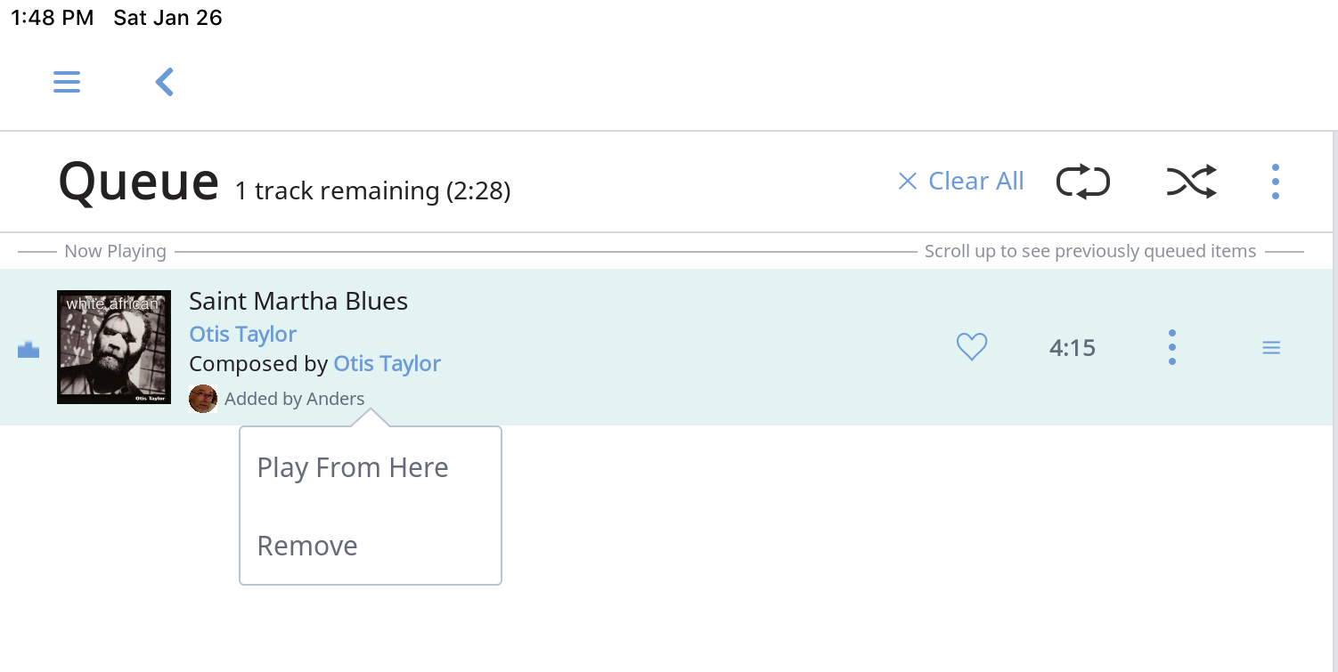
From the queue list I should be able to remove a song with a single click instead of first opening the 3 dot menu
Touch the track:
-
All the same functions to see information about the artist, album, track credits should be available from the queue list. Using the same icons that are on the main now playing screen will make the user experience more consistent. By removing the track credits from the queue list will make it less busy looking with too much text.
[A] As above, cluttering up this page is problematic, but there is a pop up instantly available for this purpose — the Now Playing bar. Why do you have a resistance to the dynamic expansion/collapse of the Now Playing bar/page?
4 Likes
I’ve changed my thought on this…actually having the thumbs down on the right is brilliant…
Its the button I use most and having it on the far right of the screen makes for easiest access
Thanks Mike, good to know.
I really like 1.6, especially the now playing screen and radio upgrade. Roon radio is now what I thought it should be!
When the option for album art is added to the now playing screen, the grey bar at the bottom is changed and and the peq is sorted (all these fixes appear to be imminent) , my (minor) gripes are all sorted!
I am rather surprised by the harsh response this update has attracted. The Roon team seem to have implemented many features that were loudly shouted for in previous feature requests. Maybe with a larger user base there are more opinions out there. But to my mind, a few early minor UI annoyances in 1.6 does not detract from the ever improving Roon experience. Qobuz and Radio has been done, and with mobile and improved classical to come, Roon is just getting better and better.
7 Likes
I think this is actually a compliment to Roon devs. It indicates how important this app is to folks. If there weren’t strong opinions, it might mean we don’t care as much.
1 Like
Still not able to see my favourites on the Android app. This is a real bummer. I’m not a streaming person ( tidal/qobuz) and this update leaves me cold.
I’m not exactly thrilled that a lot of covert art has reverted back to the default after the 1.6 update.
Ugh…
1 Like
I like this update.
1 Like
I really like the Qobuz catalogue, and the possibility to choose genres in new the releases screen. But integration in Roon means mixing local media with Qobuz, in other words making mixed playlists from both sources. Currently, the differences are so big (up to 10 dB) that it renders playlists useless.
I understand that Roon is not in a position to chase Qobuz, but before volume data is a fact, I can not speak of integration.
It would be nice to get a time frame for this, and maybe Roon can push a bit? Real integration with Roon would mean more Qobuz subscribers.
btw, thanks for repairing iPad Pro portait mode!
That’s very true. It does show people care. As long as we remember that “I’m shouting at you because I love you” Is maybe not always the most productive strategy…!
2 Likes
Use volume levelling in roon?
A have talked to the man a few times on a Holland Hi-if show and this is a very nice and friendly fellow. He knows what he is talking about. I’m pretty sure he realy means it, when he is saying that he is independent, however I think there’s allways any influence…
I use volume levelling and with local files and Tidal and it works great. But the tracks have to be profiled for “loudness” before play, it doesn’t happen on-the-fly. Tidal executed the profiling of their media but Qobuz did not yet.
1 Like
Good point, I wasn’t sure hence the question mark 
Because he cannot take advantage of ‘vote with your dollars’ option mentioned by @danny in the UI thread?
Add me to the list of members that used that screen a lot of the time and also want to know what is coming up next. In my opinion, the reasons for removing these features is absolutely ludicrous!
2 Likes
I really like the new now playing screen layout, as it puts a lot of disparate Roon information components in an easy to use single spot. I do understand the comments about the album artwork vs artist(s) picture debate but it appears that Roon will address this in future updates. In the interim for those looking to display album the album art in a larger format…I simply tap the album in album view…and it becomes the sole item on the screen in large format. Isn’t that what a lot of folks are trying to see?
No, that’s not what we want. We want the “now playing” screen back so we can see the name of the song and what’s “up next”…
I’m quite happy with the v1.6 especially because i was waiting for Qobu integration since longtime (subscriber of Qobuz since 2013 and started buying in 2009).
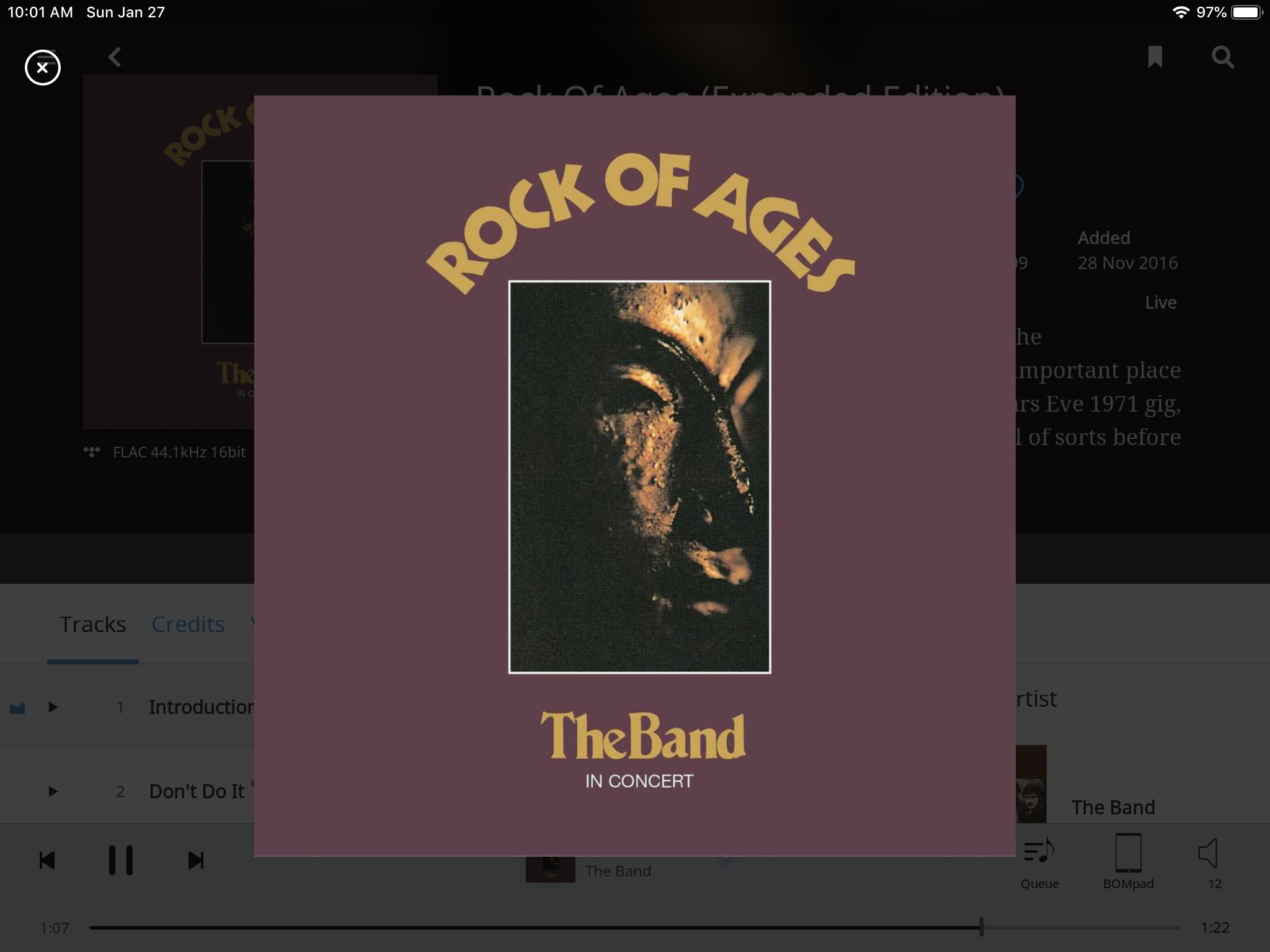
I’m playing with the new functionnalities and i saw that in “Playing now” the picture of the artist is from time to time pixelizing from time to time (1920x1200 resolution) like in the screenshot below. I think it will be fixed in the coming weeks. Nothing important but worth to say.
I appreciate all the improvements, but my search on a NUC with ROCK now takes over five seconds. Before the update, they were almost instant.
2 Likes