It would be really nice if swiping left right on an iPad did this too.
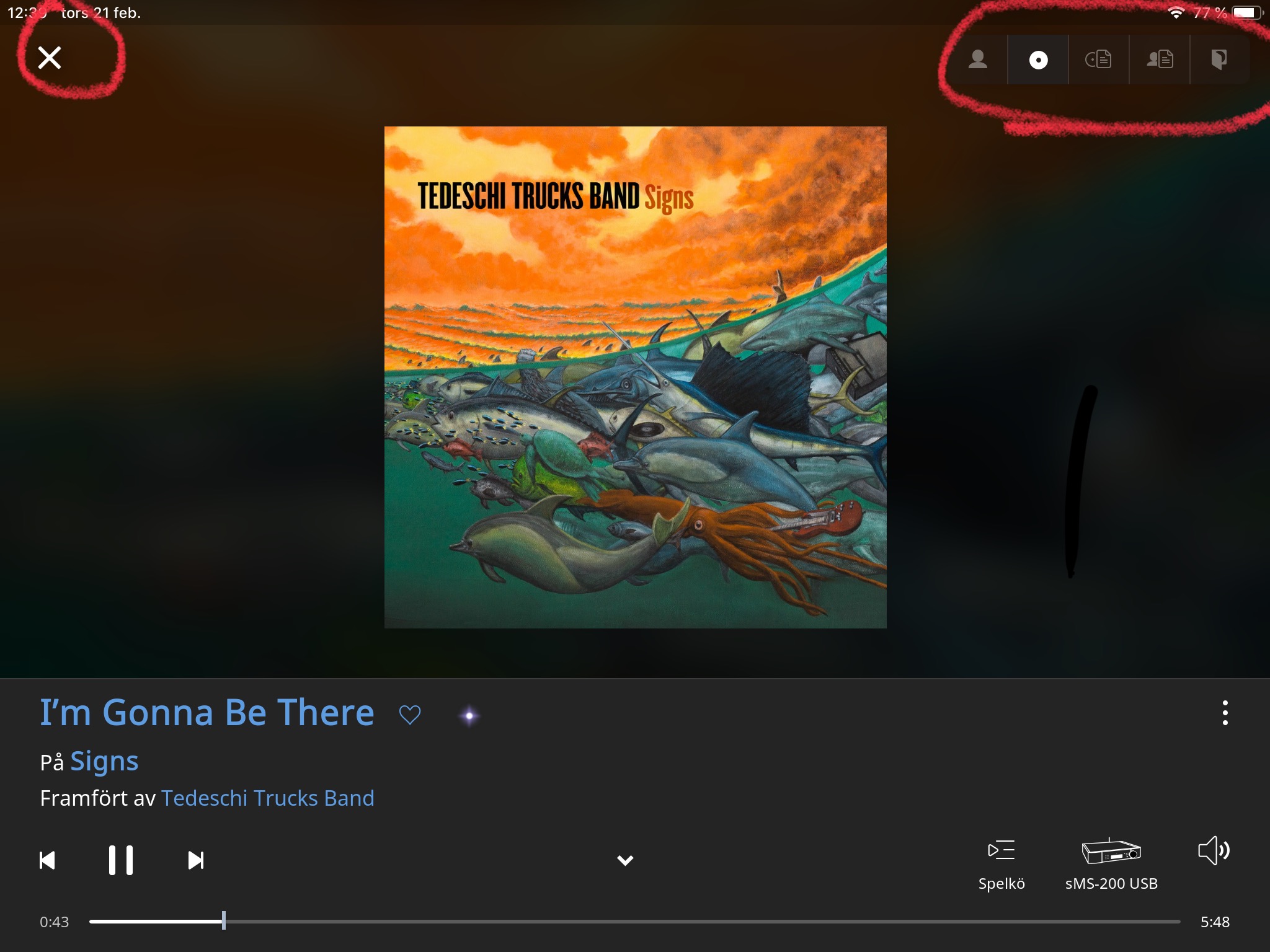
No change to the colour of the footer, at least not in the light theme. Even after more then a month I still find it very distracting And also pretty ugly, but that’s just personal preference. It does not change colour anymore in the now playing screen according to what was playing. That was something I really liked. Now it is just this ugly grey all the time.
I appreciate the change in color of the footer on the Now playing-screen.
Not so amused by the cluttering on top part though.
I prefer the swiping method to select screen or the discrete arrows in build 400.
A nice addition would be to allow the content automatically change between the selected options after a few seconds.
These are very minor gripes though… Feel free to spend developer time elsewhere, if needed.
2 Likes
Yes, that’s what they replaced the Now Playing screen with instead of going back to the one from 1.5. No, it’s not what I’m looking for.
Mhm. “x” must be the same size like album bar no right side, no different colour (ok, only darker for choosen option), mayby on the same side. Thats it for my ofc.
Thank you for this rather quick update/fix to the now playing screen, I feel so much better, though I still dearly regret the 1.5 look and feel, especially the fact that we could see the upcoming track directly on the upper right part of the screen.
But I guess an interface auverhaul has to sacrifice some things… I can’t blame you for that !
1 Like
I would like Up Next on the Now Playing screen as well.
7 Likes
Up next should be optional. I like surprises!
2 Likes
Also, clicking on artist Michael Jackson leads Roon to show albums by him as well as by Joe Jackson, Randy Jackson, Jackson Browne, and the Jackson 5, plus albums with “Jackson”’ in the title even if not Michael Jackson’s.
Those top right controls should be lowered. As it is now for desktop users there is too much mouse travel from those controls to the play controls in the bottom left, say to skip a track, to the bottom right (to answer the question why you skipped) and back up to the now playing controls.
7 Likes
Agreed. Keyboard arrows are a good mitigation though.
Yes, I have found that although the search function is improved in its capability, it is sluggish to use.
Maybe there needs to be database optimization or improved indexing to come, but I would like to see that improved.
1 Like
The lack of the swipe in the main ‘Now Playing’ screen should of been a Release blocker - given that the rest of the functionality, when used on a tablet or touch driven display, is fully swipe enabled means you have a complete change in UI interaction - that’s a no no.
I was so impressed with the Qobuz integration that it pulled in Albums purchased, from before (and not just recently) and then with this maintenance release, you take that away.
I think you pulled the handle on the release too early - fix the functionality but don’t deprecate something you have already delivered, that’s bad Product Management.
(26-years of managing enterprise software products in the B2B & Fintech space)
Conversely, I was glad they took away the Qobuz purchased albums, as these were already in my library and in the earlier release I saw them twice 
5 Likes
I second this! I LOVE the changes though. Love the album now playing screen. But do miss the “up next”. I’ve been using the keyboard shortcut “control s” to get around this. But would appreciate it to be an option.
2 Likes
Just want to say I love the new Album Art Mode on the now playing screen. I immediately looked for this option on the previous release and was bummed to not have it. Now, this looks fantastic. Love the big, beautiful size of the album cover. I find the artist photos to be sometimes awkward, and not my preferred ‘screensaver’ while I have music up and running. I love having the album cover up as the screen, replicating the vinyl / CD sitting on your shelf/desk. Thanks!
3 Likes
Thank you for responding to our feedback so quickly! Cover art, visibility and design of the waveform/progress bar, fix of the (circular) artist pics. Lots of bug fixes and work on display of artist photos.
Disheartened to see more changes that reversed the progress of the last release, IMO. I’m on Android and, in 1.6, had started living mostly in the now playing screen, treating it as the center of things. It now seems like an overlay that one must leave to do things. It is not that extreme, but feels that way. The upper left “X” is redundant and unattractive; the down arrow does the same thing. I prefer to have the hamburger as before. The swipe from left brings out the menu which helps though. However, I now need to leave now playing to do a search since the one click, upper right search button is gone.
Some things fixed, some things (IMO) broken. Overall better though, and I appreciate that we can suggest and gripe and devs seem to pay attention.
Perhaps it would be fruitful to post mock-ups ahead of release in the future and get all this feedback before committing to changes in a release rather that release and get feedback after. You would get the same praise and jeers, but any adjustments could be made prior to release.
Separately, here’s a suggestion for the external display… provide similar options, at least between photos and cover art* for the big external display. Sometimes the photos add to the experience, sometimes they are annoying. Ten minute track with an artist staring at me intensely is kind of creepy!
* An option for a blur from the cover would be nice as well (cover towards the left as it is with top half magnified blur of the cover). Pleasing, consistent with the cover, and non-intrusive.
How quickly we forget… The old “Now Playing” screen right up until the introduction of 1.6 also broke the expectation of having the expectation of having the hamburger, bookmark and search functions…
So, in fact, 1.6 is consistent with all that went before…
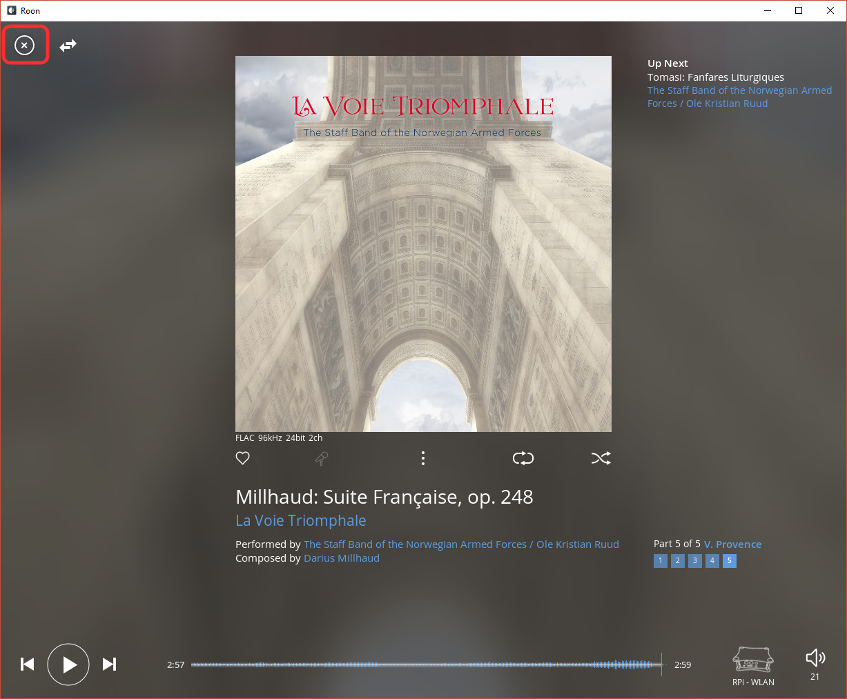
I do agree that the X is redundant, now that the down arrow icon is present.