I didn’t “forget”. I said: “Disheartened to see more changes that reversed the progress of the last release, IMO. I’m on Android and, in 1.6, had started living mostly in the now playing screen, treating it as the center of things.”
IMO, it was a nice step forward that this release took back.
James_I
(The truth is out there but not necessarily here)
1454
I think “Up Next” should not only be on the Now Playing page, but it should apply to whatever is up next, whether by shuffle, radio, or even in the Queue. Since the Queue is now a different page from Now Playing, it would be nice to see what’s coming, even if I put it there.\
I would be fine if this were optional. I understand that others don’t want the clutter of Up Next. I think the Roon team is slowly learning that user options are the only way to prevent (or stop!) the Roon Civil War.
I would like this as well. I would like it to be separately configurable for each web or chrome display. You see, I like my person-cave to be like a sports bar, multiple screens, different info. If each display could be separately configured for the content of choice, that would be very, very cool. I’d be popular again!
Overall I think the changes in build 401 are a great step forward. Thanks to the Roon team for listening (as they have done before when there have been responses to changes like this.) Unlike others I like the elimination of the arrows on the edges to move between the display options as it is now much easier to scroll up and down on the text of lyrics or reviews and bios. This is on an ipad which is my main remote. The location of the icons to switch between options works well on that too.
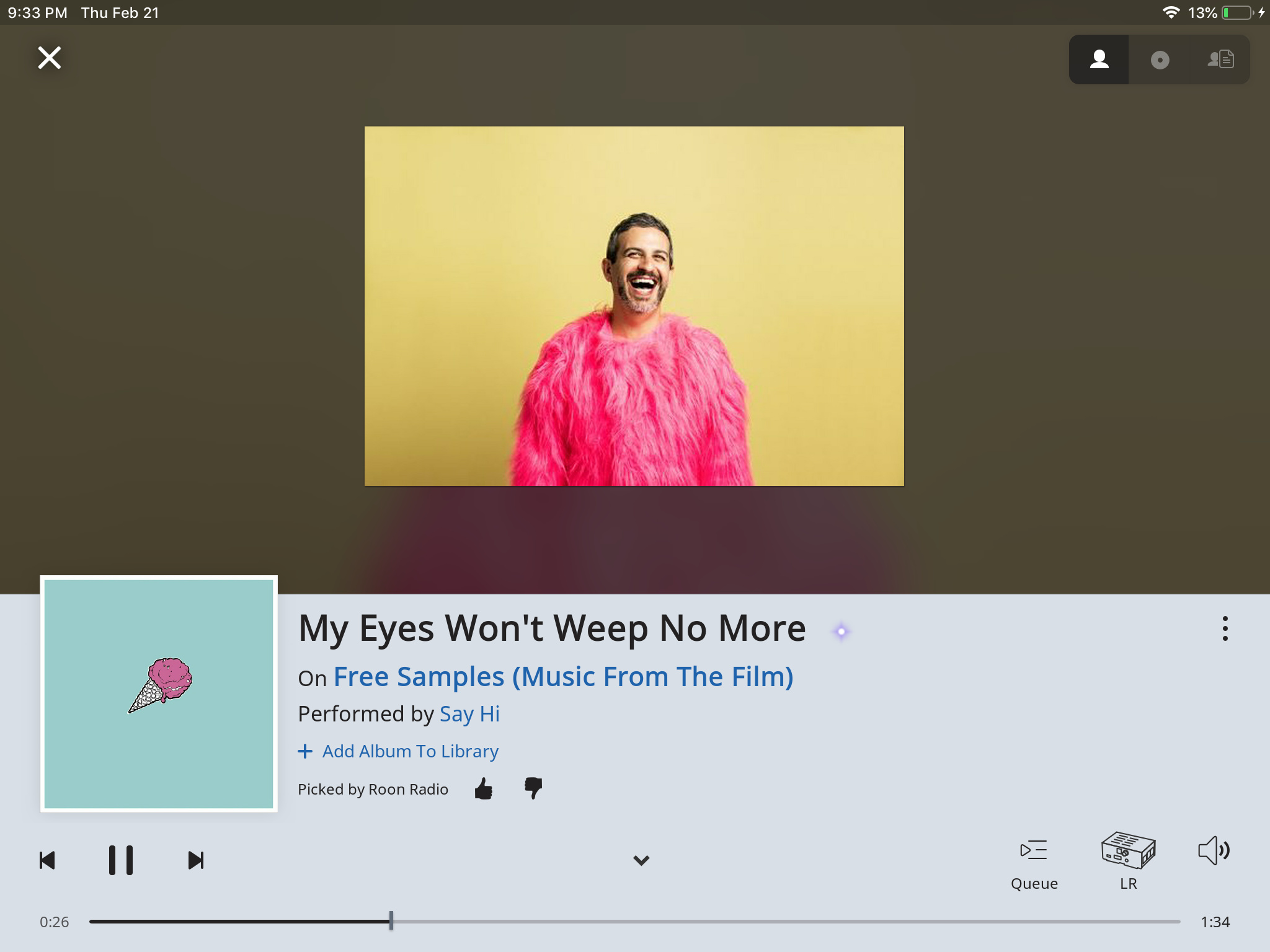
Artist images are getting better and often look great now as others have noted.
A couple of suggestions for improvement so far:
Following on the thoughts of the last few posts the X in the upper left, the down arrow and the queue icon all close the now playing screen and go to the queue screen. Three icons on the same screen to do the same thing is unnecessary and some clutter can be removed here.
The album art is still a bit small for my taste. It seems it could start higher on the screen and be a little larger whilst still maintaining a reasonable border with the top. Unless of course it is anticipated that there will be more icons on the top line in the future (but could they not go on more than one line and use the space to the side better?) Furthermore the album art gets smaller in radio mode due to the addition of add to library options and roon radio thumbs icons to the lower information border. Why not eliminate the unnecessary down arrow and put these icons in the area between the play/advance buttons and the queue. Might look a bit crowded with actions along there but keeps the one line for actions and the area above for information and allows and the art work to be a constant size.
I think the X at the top left of the Now Playing screen is handy. If I want to go to the Album Browser, Playlists, Settings, etc, I need to close the Now Playing screen. With the X at the top left, I click it and I’m right there to click the “hamburger” menu icon.
You can also click the “v” at the center bottom of the panel to do the same thing. You can also access the fly in menu from the left, swiping on touch screens anyway. Not sure about accessing that way on computer. The latter method is now the only way to get to the menu from now playing with one action instead of two.
Yes, but my point was that people complain about having to navigate all over the screen to access stuff, but if you want to access the menu at the top left of the screen, it’s convenient to have the X there, to close the Now Playing screen and open the hamburger menu.
Just saw the colour of the footer in the dark theme has changed to a far less distracting one. Can you please change the colour of the footer in the light theme as well. It’s so ugly and so distracting. My one and only wish for this update was the change of the footer colour.
Latest update looking very nice, thank you Roon. Any chance of reinstating internet radio logos on the now playing screen though? There used to be an ‘album art’ type logo over the blurred logo background; not there any more…:
Seems to be some UI change for change sake in the last few dot releases.
For example, including a hyperlink active on hover underline on the active zone. The queue icon is different and the scrubbing. Not a big deal but this is a temptation to which all teams can fall victim.
My only real grip about these last two releases is how they’ve undone manual cover art choices. If a user has gone to the effort to add/change cover art, I think this should be retained during a new release.
I agree, I think proficient computer users forget that not everybody understands little down arrows and so on - the nice big ‘x’ is logical and noticeable. My friend loves Roon and is a brand new user, but his computer skills are minimal, he just doesn’t seem able to remember things like three dots mean you can get at an extra stuff menu, right clicks do special things on tracks and such (two finger clicks on a Mac). After 30 years plus training new computer users I have realised they don’t do what we IT folk do, they don’t click everything to see what it does, they are way to scared they might break something or end up somewhere they can’t find a way back from. The more the average computer interface offers logical real world objectifications the better in my book, not everyone is familiar with the current programming trends.
Agreed I think the X is good but given the queue icon also does the same thing I would get rid of the down arrow “v” at the bottom of the screen this is going to confuse many people.
No, I don’t agree. It is more consistent to press there to get to the Now Playing and when in Now Playing screen to press at the same location on the’v’ to get out of the Now Playing screen back to where you were before. The queue icon goes to queue and is only the same when you were in queue before.
This album came up through Roon Radio. It’s not one I know, but the default art, instead of stretched and pixelated, is now appearing as a small thumbnail (I’m not sure which is worse). I wonder if Artist banners need some sort of lower threshold where if the banner doesn’t meet a certain pixel count, it isn’t displayed at all. This may very well be an outlier, but thought it might be helpful to post it here.
The new update is well done. While I realize that not everyone had their personal requests addressed, I believe the Roon team has addressed 90% of the major issues, and certainly has covered all of my major concerns. Specifically, lyrics work really well. And thanks for returning the album art, and for setting the tag in Roon Radio so that it goes away in 30 seconds.
I primarily use Roon on a 70" TV in a home theater and on 2 iPads. It looks very good on a TV, and the lettering on the bottom is a perfect size to be read at a distance.
If I was a new subscriber and not a reader of this forum, I would be perfectly content with Roon in its current form.
So, with that said, I agree with several of the opinions expressed above, specifically:
I agree. There is a large amount of blank space in the bottom white area, to the left of the three dots on the far right. Why not put those controls there, in the far right of the white area, and just to the left of the three dots? Then all mouse movement would be on the bottom 1/3 of the screen. This would be a real advantage in a home theater when using a wireless keyboard.
Agreed. A little larger would be nice.
Yes, it would be nice to have Up Next restored.
Finally, there are few glitches. Look up Mozart or Beethoven, and check out what the text does to the painting of Mozart’s or Beethoven’s head. The text running across the eyes of Mozart doesn’t look very good IMHO. Or the photo of Benjamin Britten with the same result.
On the other hand, the paintings of Tchaikovsky, Wagner and Haydn, and photo of Mahler, are still in a box, and look better as a result.
Why the inconsistent treatment? Why are some in a box and some aren’t?
Is this inconsistent treatment a deliberate design choice?
Or possibly not? This is similar to the prior bug, so I’m wondering if that is what we’re seeing, and it is a continuing bug, and not intentional?
Finally, with older photos from 50 years ago, it would be preferable if the enlargements were not quite so severe on the Now Playing page, as the results can get pretty fuzzy. On the other hand, many of the modern photos are really great, such as Ry Cooder in yellow sunglasses!
Overall though, a great release, that addressed almost all of my concerns. I can happily listen to music and enjoy it through Roon.
After reading „a number of refinements for the footer“ in Build 401s release notes, I was flabbergasted to find the colour of the footer in light theme unchanged. As many have predicted, I have become accustomed to it over the last weeks. But I’m quite sure that I will never like it. It still seems out of place, the grey is to my eyes too silvery, too cold, has too much blue, and does not fit in with the rest of the UI. Except for @Nyquist and me, no-one seems to care, and it seems like a deliberate choice of the Roon-Team. But does anyone really like the colour?