Forgot to state that I appreciate the return to the old style waveform. The team has listened to the users in this an many other respects. I thank you for this.
I can’t say I’ve ever noticed as I’m focused on the content above it.
Given that the playback controlls and the waveform-display are in that area, I tend to look at it quite often 
I am impressed with the rapid adjustments made to the latest build. Many of the issues with 1.6 are fixed for me. I use Roon in many form factors, including a 55" TV, big monitor in portrait mode, ipad, surface windows 10, and iphone. The balance is now good, and in some of these form factors excellent. Really appreciate the fact I can now control the now playing better than ever with a remote control (I use a handle dongle called a FLIRC that traps remote controls signals and converts into keyboard commands - super neat) so i can now use my Harmony remote to switch through the various screen on now playing all sitting from a distance from the display and not needing to reach for my phone to control - nice. So big thank you!
2 Likes
Thanks for bringing back album art and the old waveform view, much appreciated!
I haven’t shared my view on the initial 1.6 launch yet but overall I think it is a great improvement. In particular the Qobuz integration and the Radio function are excellent. Thanks for keeping the development work going!
Now, when are we going to get improved box-set handling?
3 Likes
2 posts were split to a new topic: Booklet/liner notes on now playing
I saw this behavior on a different album cover. It may be there is a size threshold that has to be crossed before the image is stretched. But I don’t think the right answer is not to expand the image at all - it looked like a tiny tile in the middle of the screen. Maybe it’s a bug. I’ve only seen it once and probably could fix it by finding a larger album image. No big deal, but I do think it may be a minor bug.
1 Like
I’m getting use to it, but wouldn’t say I like the color either.
I asked a related question in this thread about pictures/sizes
1 Like
Any word on fixing the speed issue? 1.5 was still much faster.
1 Like
I like the latest update with the full height waveform having returned and the now playing screen showing album covers as was the case in the past. Nice one!
I like it. Everything has just the right level of contrast now.
Nope, it is symmetrical, The waveform is just a graphical representation of the amplitude of the music. If you looked at the music in a music editor, there would actually be two waveforms, one for the left channel and one for the right channel. Roon sums these into a mono representation of the amplitude of the track playing.
The reason any waveform representing music is symmetrical is because music consists of oscillations of positive and negative-going sound pressure. When this sound pressure is converted to voltage in a microphone, it creates an alternating current which can be drawn as positive and negative voltage. The oscillations are symmetrical about 0 Volts.
Here is a test signal I made -
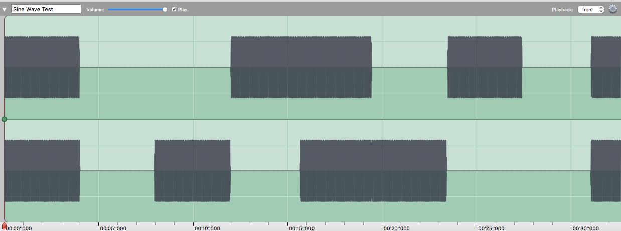
It’s a basic sine wave on both channels, then none, then right, then left, then both… you get the picture…![]()
Zoomed in it looks like this -
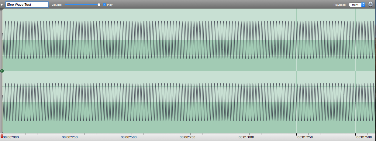
As you can see … Two waveforms, each symmetrical either side of 0.
If I combine them into a mono signal, they look like this…

You can see… where there are both channels, the amplitude is full height, when there’s only one channel, the amplitude is half height, but still symmetrical…!
Now look what it looks like in Roon…
Just the same as my Mono version…
Hope that clears it up!! ![]()
5 Likes
Ah, experimental evidence! Wonderful! Thanks.
1 Like
Excuse my stupidity but how do I access Album Art Mode?
Sorry, ignore this. I’ve found it.
Please center all that clutter under the cover art…
I like the new button locations. They looked funny/odd/weird under artist photos before.
6 Likes
P.s. don’t like how the bottom panel enlarges to accommodate the ‘add to library’ and thumbs up/down lines when playing radio. It reduces the available area for photo/album cover.
Then if you click add to library, it resizes causing a flashing/jarring refresh. Why not just change the text to ‘added’ and leave the line and don’t resize.
Also why not move those two elements over to the right into the unused/wasted space and not have to enlarge/resize the lower panel at all.
2 Likes
How about placing the hamburgermenu directly on the Now playing screen?
Less annoying perhaps…
2 Likes
I agree.
And I also would really love search on the now playing screen. I use search quite frequently and one less click is always welcome.
3 Likes