Dear Roon,
I’m looking at my “new” Roon and, aesthetics aside, here are some basic questions that could be addressed quite easily. Not mentioning missing or altered functionality here - just easy to implement visual tweaks to make it more useable.
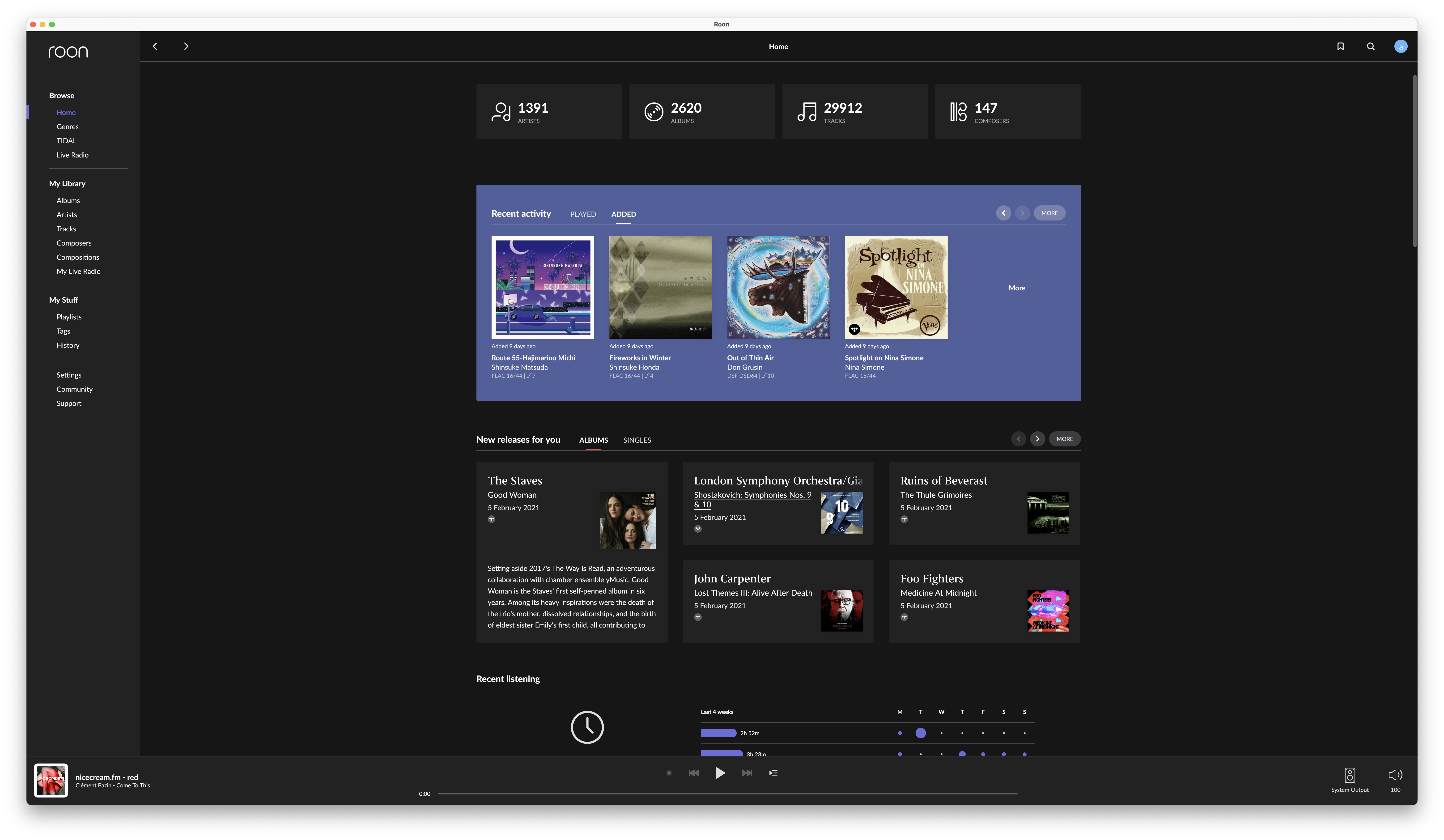
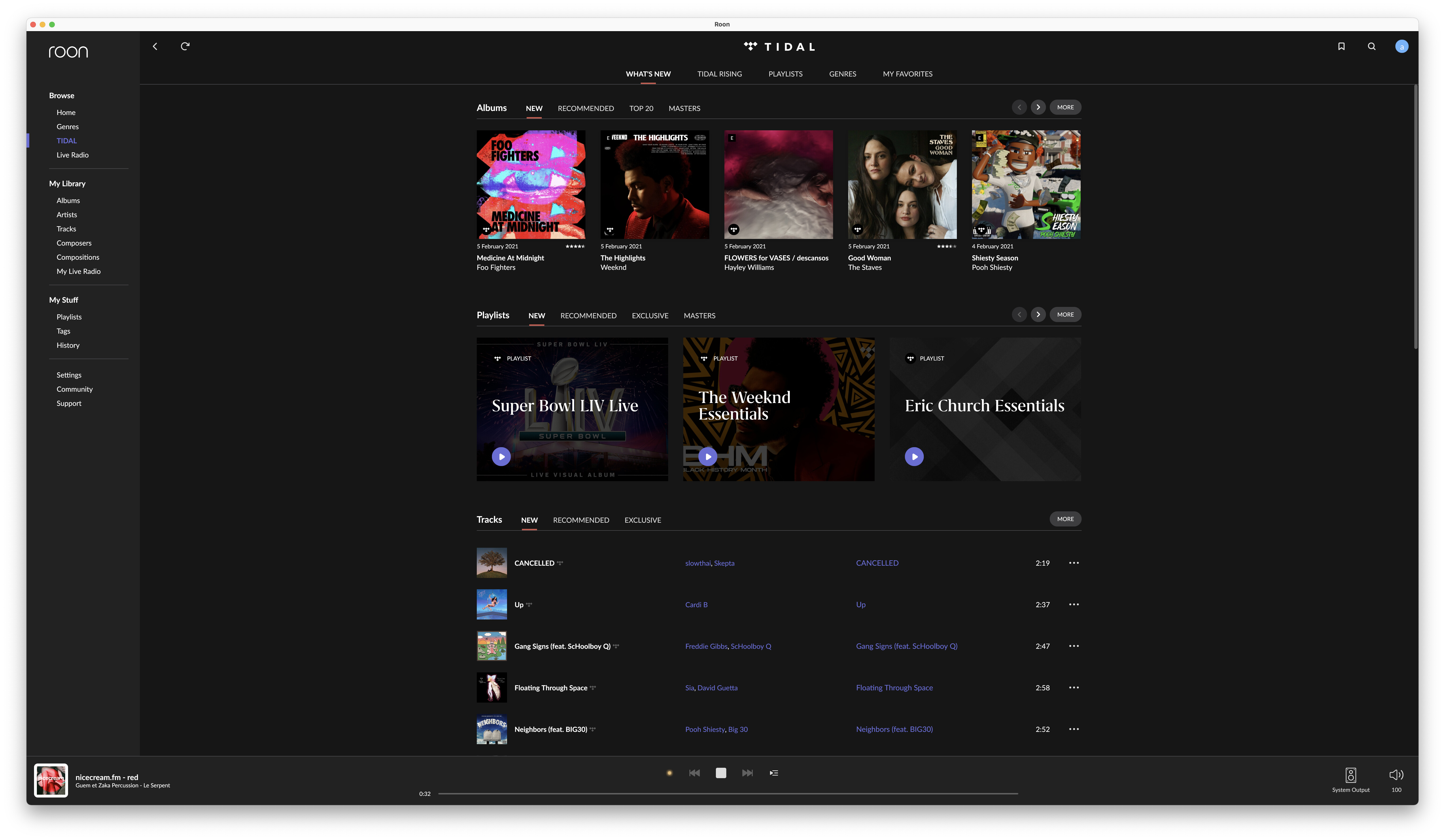
- What’s up with all this wasted empty space?
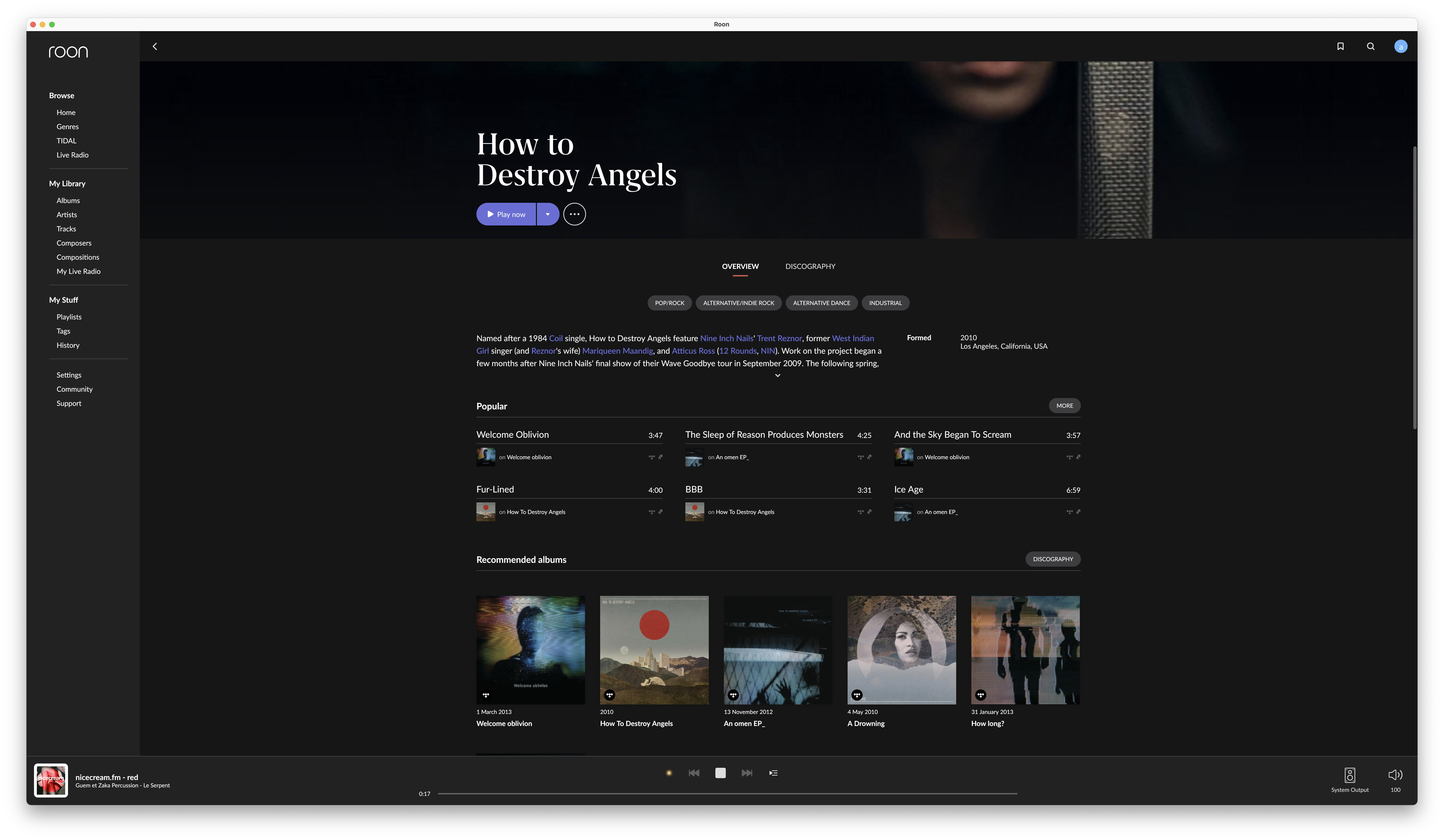
- Absolutely no indication of what’s clickable (against any basic respect for UX) - probably my biggest issue!
- Why do I have to now constantly click “Show more…” when there’s so much empty space. E.g. Just show all or more albums from the get-go - so much useless interaction
- Mobile first does not mean making large screen experiences worse. Roon used to pride themselves with its beauty on large screens
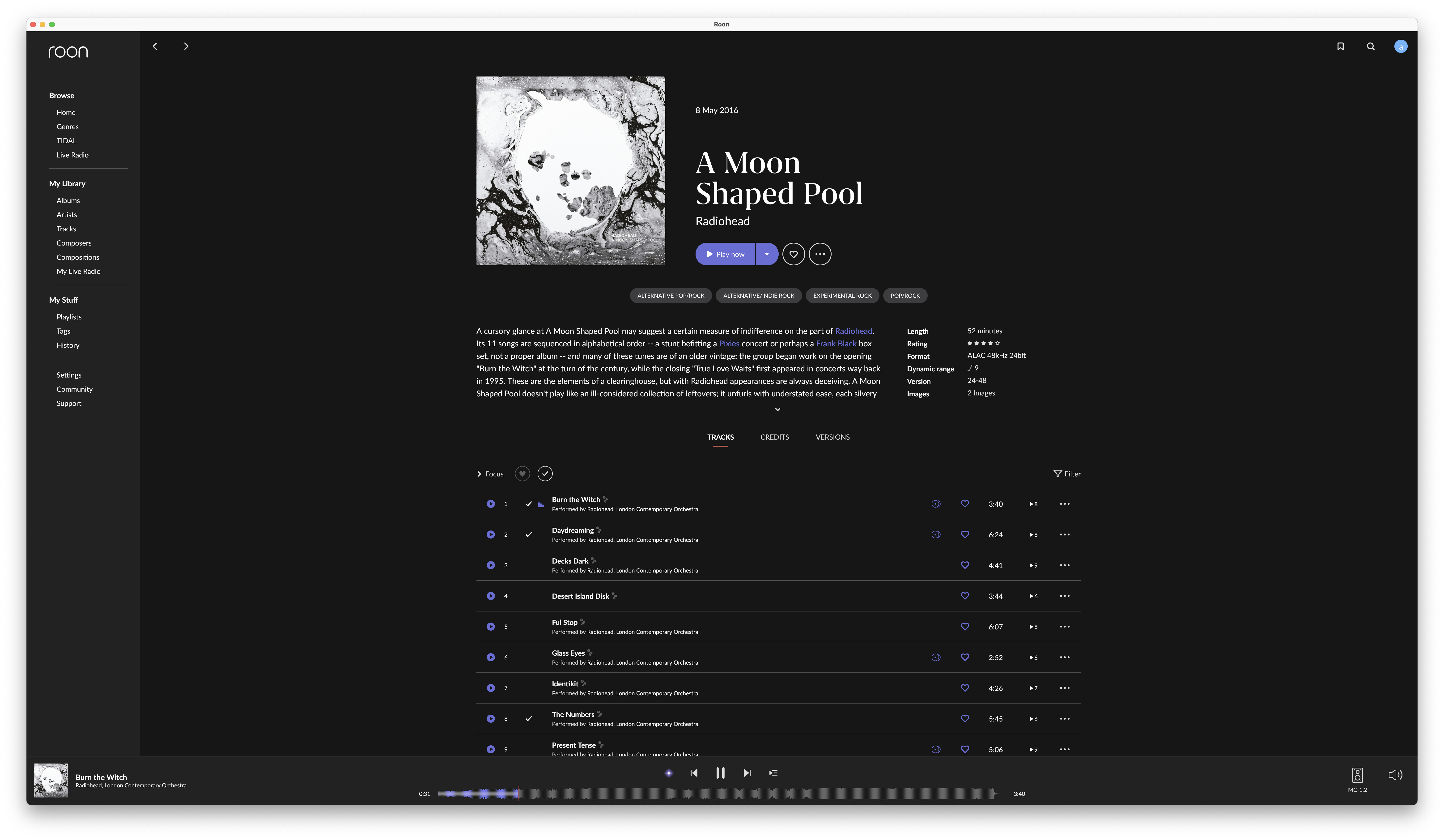
- The fonts are way too small
- Play bar also has soo much wasted space. A pity for waveform. Again: no indication as to what’s clickable (big issue in Live Radio mode, where you have to click a few times to see whether there is a link or not)
- “HOME” view is slow to load and sometimes fail to load completely anything below “recent activity”.