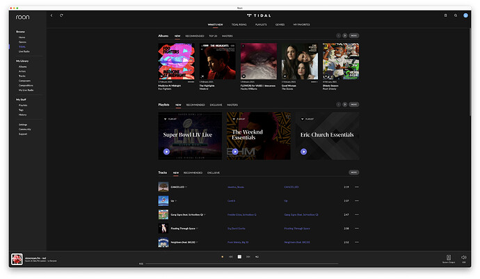
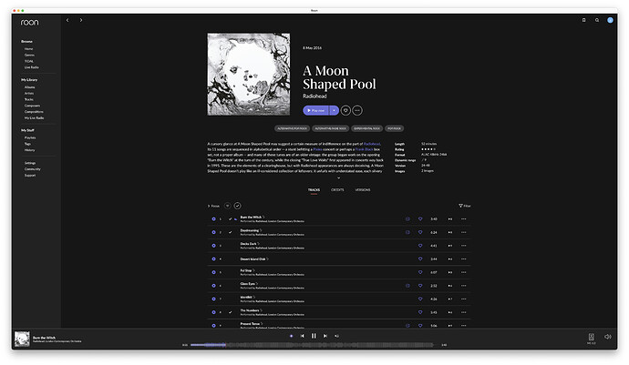
Roon 1.8 (Build 748/756/763/764) Feedback

General feedback after a couple of hours of usage.

General:

  • has something been done to the audio transcoding or DSP? It seems different than before. Much less detail and punch. Seems very “metallic” sounding. I know it’s subjective but somehow it seemed different - not for the better.
  • The new app icon is nice

MacOS client on 13" 2014 MacBook Pro:

  • purple color scheme is ugly
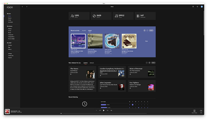
  • a lot of wasted screen estate on oversized frames. When starting on the main page I only see few stats and the “Recently activity” section with only 5 albums. I don’t want to scroll or tab to Tidal to get access to more music when entering Roon right away
  • worthless statistics in the top section with number of artists, albums, tracks and composers - seriously who cares?
  • worthless usage statistics in “Recent listening” and “What have you been…” Again - who cares? If I was creating a direct marketing campaign targeting myself it would matter but I largely know what I listen to. All this could conveniently be removed and placed as a menu item under “My stuff” like the History
  • still not possible to sort menu bar items according to my own desire
  • why is playlists listed in the “My stuff” and not in “My library”?
  • still not possible to sort playlists as per Date modified and Date added like albums can

Android client on Galaxy S10:

Comments like for the mac client but also

  • not possible to get the menu bar by swiping from the left edge of the screen anymore

Sorry for being so direct but somehow I was really hoping for something else based on the hype with almost daily mails and count downs.

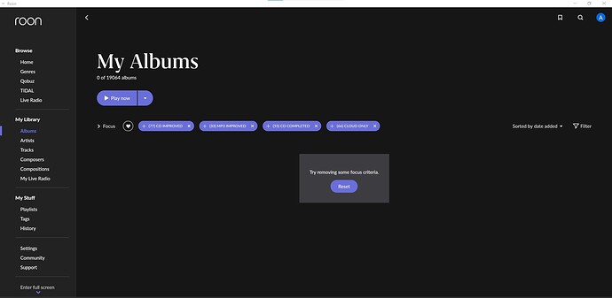
1 Like

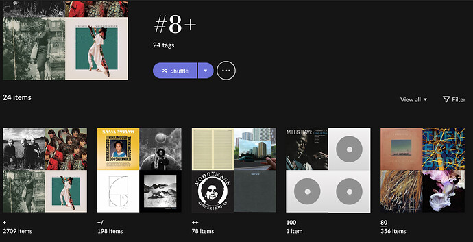
If you click the Tags view under “My Stuff” in the main menu, then drill into a Tag to view the albums underneath it, do you not get the option after you highlighted the album(s) with a right-click?

For such a large aesthetic overhaul that is expected, and they can bring these things back with future updates. Very few people here are giving credit for how hard it is to pull of such a large scale revamp. You may think it wasn’t needed but I disagree. The previous version was cluttered and cramped. So many things have been improved. Eg. Classical browsing and focus. Reading this thread is like sitting in a consumer focus group; a bunch of people trying to tell the creator how to do their job. Just you try.

2 Likes

Because Focus lost it’s “or”-operation some of my bookmarks don’t work anymore.

3 Likes

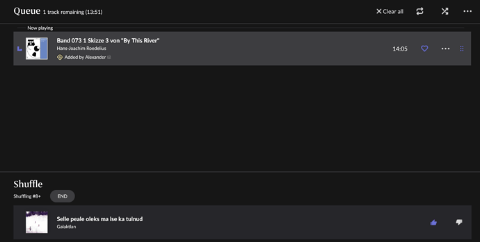
Same issue here. Shuffle over 20k titles only renders titles from interprets starting with A to C into queue. I don’t know if that was a problem before.

Czy ta opcja dziala tez dla etykiet ?

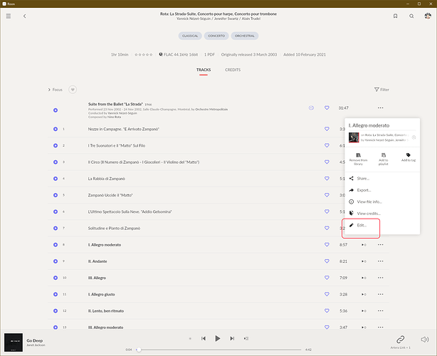
But how do you get to it with no scroll? I’m seeing it in a number of places. Not just this pop-up. It’s like a whole scrolling function used by many or at least several components is just gone.

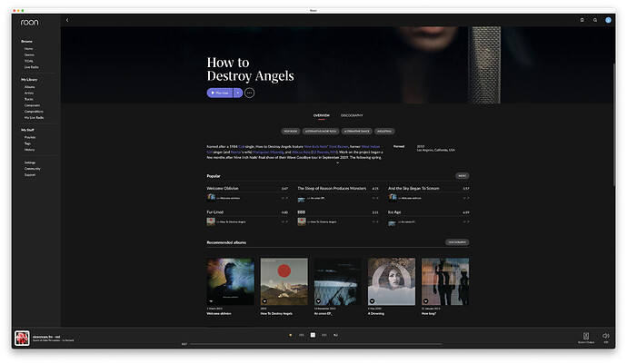
Very odd - it’s present for me on this album:

I’m stumped.

The roon icon in the winodows bar is virtually invisible. Please move the track asterisk to its place on the right :slight_smile:

1 Like

On a big Win10 screen yes, but not on an Android phone. Perhaps I miss something …

I found One, Individual case in the classic album where appears in the bottom section „Similar Albums”

I would like to see a random/shuffled view in “Albums” when I’m trying to decide what to listen to. They could easily just take the first 5000 from that “sort”.

Am I missing something, can I not easily adjust tags on albums anymore? There use to be easy to use check boxes and those are gone?

4 Likes

Same for me. For some reason it’s worse on my Mac that it is on my iPhone. The iPhone is a couple of seconds at most, on the Mac it’s more like 10-15 seconds.

Wow…works like a charm and looks like a trendy paper magazine…the fun went funnier…I’ll continue with the yearly subscription…you’re worth every penny!

(ROCK core on NUC 8i3 played with 3 androids (Samsung S7+, S6 and Note9) and distributed through HDMI to Marantz SR 8012 and JBL 240 Ti).

2 Likes

Not if you Bookmark it, and use the Bookmark.
So, I have create a bookmark from the following Focus

First, all allbums I add to my Library, I give them a ‘New’ tag, except when the content is not avalble yet for a ‘streamed’ album. Those get a Prerelease’ tag instead (as they will not automatically update in Roon when content becomes streamable/downloadable)

This means that NEW and PRERELEASE tags should have no overlap in my case.
If I just Focus on Tags New & Prerelease, I have 0 albums as result.

So I focus Tags Not New & Not Prerelease .
I then select all Albums, and created a tag TestOR, and applied it to the complete selection.

Then I focus on tag TestOR and inverse it, which leaves me about 100 albums.

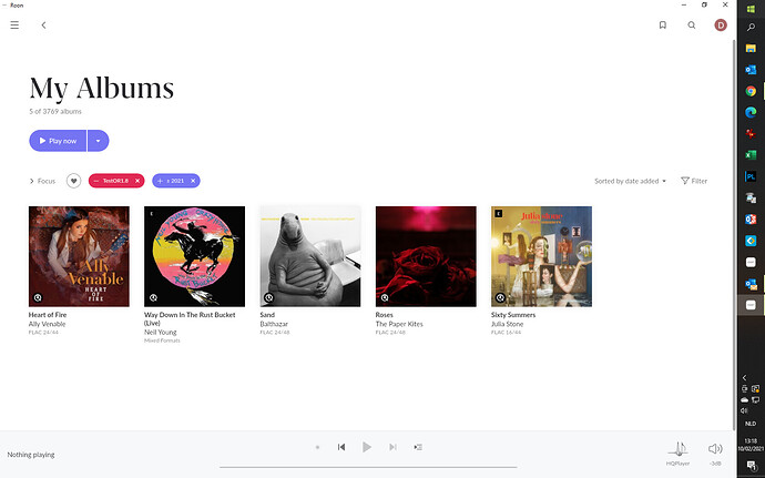
I combine this now with Release Year 2021, which results in 5 albums.
For this view I created a bookmark 1.8-NewReleases2021.

Resetting everything again,resulting in my 3769 albums.

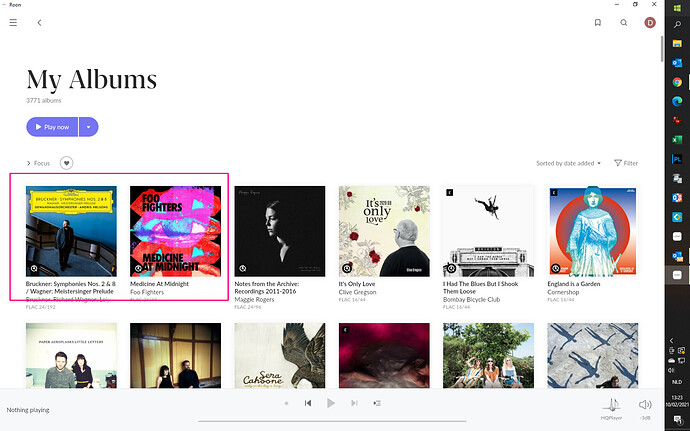
Now I add 1 new album (Foofighters) and add a tag New to it. Add another album (Bruckner) and add tag Prerelease to it.
Now I have 3771 albums in My Library.

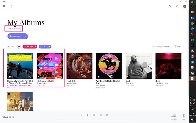
Now I apply my Bookmark 1.8-NewReleases2021, resulting in 7 albums.

However, there is a big issue.
ALLalbums, except the initial 5 ands the 2 new, have now the tag TestOR applied.

If I want to kee this strategy to work, I need to leave that tag allocated, and if I want to remove for an album the New or Prerelease tag, I need to replace it by the TestOR tag.

So in the best case this is a temporary workaround, not a final solution

Dirk

As a matter of interest, what devices do you use for your control app? Maybe your view of the graphical design of version 1.8 is coloured by your use of control device.

You may be a designer, but that doesn’t make your view any more or any less valid than that of anyone else. Of course, you are entitled to your opinion. However I personally dislike the typography, the colour palette, the spacing and the treatment of artistry (in particular the use of circles to crop photographs and artwork).

I also feel that as a vocal supporter of Roon and its design in the years I have used it, I am entitled to voice my disappointment with the backward direction of the UI and its visual appearance and appeal, however ‘sad’ that might seem to you.

5 Likes

Ok, I think I’ve found temporary solution to live with it right now! Actually we still can make tags consisting of tags and use it instead of bookmarks. I’ve tried it and it works for My Albums page. Like that:

Moreover if we activate shuffle from Tags page it works like before and not just these ridiculous 5000 tracks.

1 Like

Dear Roon,

I’m looking at my “new” Roon and, aesthetics aside, here are some basic questions that could be addressed quite easily. Not mentioning missing or altered functionality here - just easy to implement visual tweaks to make it more useable.

  • What’s up with all this wasted empty space?
  • Absolutely no indication of what’s clickable (against any basic respect for UX) - probably my biggest issue!
  • Why do I have to now constantly click “Show more…” when there’s so much empty space. E.g. Just show all or more albums from the get-go - so much useless interaction
  • Mobile first does not mean making large screen experiences worse. Roon used to pride themselves with its beauty on large screens
  • The fonts are way too small
  • Play bar also has soo much wasted space. A pity for waveform. Again: no indication as to what’s clickable (big issue in Live Radio mode, where you have to click a few times to see whether there is a link or not)
  • “HOME” view is slow to load and sometimes fail to load completely anything below “recent activity”.
16 Likes