Looks like crap in Mac OS too. I just pasted the old icon onto the new app icon. Looks all pretty and nostalgic now.
Please please, bring back the easy-to-use checkboxes when tagging to make it easy to adjust tags on the fly. That, coupled with the removal of being able to see what song tags are applied when looking at an album, has proven to be a large step backwards for me in terms of usability.
5 Likes
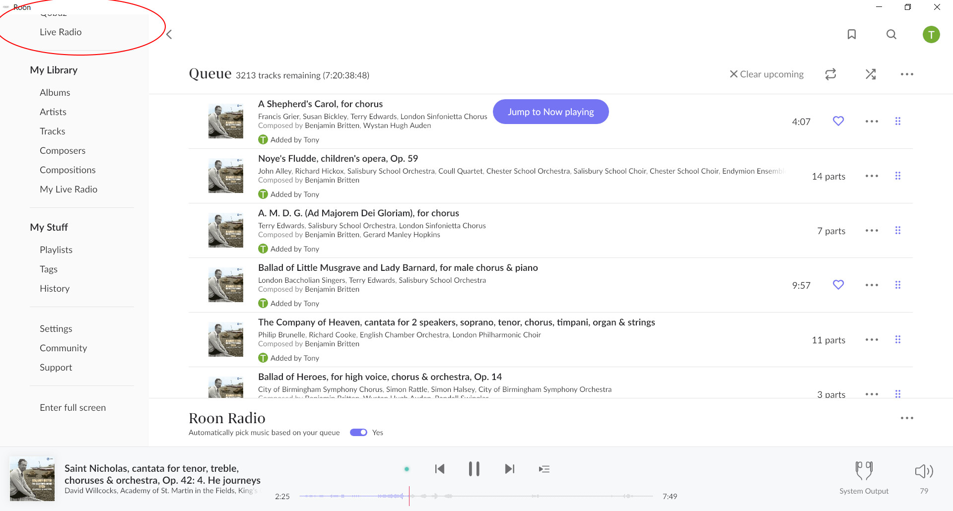
Yes, I do, but that’s a Queue, not a Playlist.
Is there a way to make it show just what’s in you library without having to go to focus every damn time I search through albums?
Can we fire someone? Please?
1 Like
What device are you using? You seem to have a vertical display and both the tracks and the pop up are “longer”. I am using a horizontal lap top with a much more restricted view both of the tracks and the pop up. I am seeing these effects all over the place. For example I have the same problem with the main side menu. Several of the options, top left, are not visible on my horizontal laptop screen and there is no obvious way of accessing them. No scroll bar.
I have a feeling this is related to the vertical implementation. Even if it is fixed TBH, vertical scrolling not really working for me on all screens. For example the main album view would be easier with paging rather than scrolling (and many more albums needed in each page view as well).
@Greg_Hammond Ah, I see what you mean, it’s there on the iPad app, on the iPhone you have to click the three dots on the right of the track and the artwork is shown, I guess the smaller screen imposes limitations.
Crashing on iOS. In album view, when I scroll down then back to the top, the app crashes every time.
Yes, I know it’s available by clicking the three dots. But 1.7 didn’t work that way. Why lose that functionality? It’s a graphical piece of information that is much more useful in the list.
I love it, I’m in the UK and using MacBook Pro and iOS on iphone and iPad and I’ve had no issues.
FWIW I think it looks slicker and more modern.
You’re never going to please everyone but overall it’s a thumbs up from me.
4 Likes
Not an issue for me, different not better or worse, we all just need time to get used to it while the genuine bugs get sorted.
1 Like
- too much wasted space on top of every “page”
- some elements are now too small and/or hidden among other stuff (… Star Ratings?)
- I strongly miss the right column with all albums by same author(s) in my library

- badges on albums covers are/might be hard to see
- “In Library” badge is… awful/unintelligible

- … links are not highligted?
 are you serious?
- overall… UI is closer looking to “competitors”
 (eg. Qobuz app. remember when, a few years ago, they answered to Roon integration requests by saying: we are developing our own app “à la Roon”? well… I feel v1.8 took inspiration from Qobuz, sorry!)
3 Likes
I couldn’t agree more!
The visual experience has definitely been made significantly worse on large screens. It appears that focus for Roon and its commissioned designers has been very largely on portrait mode for users with mobile phones or small tablets at the expense of others.
Surely this issue can be addressed very quickly.
5 Likes
Roon 1.8 is an INSULT to ultrawide monitor users, PLEASE FIX
![]()
Wow so dont you test this on ultrawides?? I imagine it looks fine on a 4:3 or 16:9
Ultrawide is now in main view pathetic - the UI of the track playing at bottom is compressed to middle of screen, and just waste of space at sides.
Please give consideration to ultrawide 3440x1440 in this case users and use the available screen space.
I dont expect Roon updates to make me want to go back a version because of UI, but there it is you have made me want to downgrade.
4 Likes
Misfunction with my Bluesound products
Roon 1.8 works in general, but:
Misfunction with my Bluesound products (2x Node 2 in different rooms). Stream stops, audio output sounds like a detuned radio. I did not have any problems with these for a long time while using roon.
My workaround is a sad one: I just have to use the simple Bluesound GUI to hear music on my endpoints.
btw: No topics with the other outputs (Chromecast devices) yet.
@Roon team: please take a look at the bluesound settings in 1.8 (anything different to 1.7 ?)
Thanks in advance, Rolf
→ Update: I did a Restart of both Roon Rock and Bluesound Node (s) and finally it works.
Nice new design, fresh.
Please solve the bugs in the Roon remotes in IOS: iPad and iPhone. The app breaks down on iPad when selecting settings. On the iPhone (12) the app breaks down when selecting settings - extensions.
Why is the number of albums different?
Browse / home screen 3779 albums.
My library / 3465 albums.
A shot in the dark… Do you have scaling on for your display?
Unfortunately it’s not good on 16x9 screens either! - for the same reasons you state.
1 Like
Thats the the theme of the day. Have you looked at the new compositions page? 60% of the screen just totally empty…
Who again did the beta testing ??..
2 Likes
Hello
Great update! No problems so far on iPad and MacBook. I prefer this look over 1.7. For me it is much clearer and easier to navigate.
Ulrich
1 Like
Roon 1.8.00748, iPad Pro, iPadOS 14.4, German System:
- Tap on Settings → App crashes
- Tap on volume control - DSP - Headroom management → App crashes
- Tap on volume control - DSP - Crossfeed → App crashes
- Tap on History (first time since update) → App crashes
- Tap on History (subsequent times): History gets displayed, try to scroll down → App crashes
1 Like