Bottom line from TechHive article: “Roon is worth every cent.”
Indeed.
Bottom line from TechHive article: “Roon is worth every cent.”
Indeed.
Same here, complained already just when 1.8 was out, but is this really a feature request? It’s rather a revert to what many (most) users wish. At least those that moved the switch in 1.7 to see more covers. A no-brainer that they did it because they wanted to see more albums. Can be that Roon saw it is only a insignificant number of users that used this feature. So, they decided to gemogelt it. Personally, I do not think this was the reason. It has more to do with all the text that is under the album picture and needs to have a font size for the over 50 customers (majority of Roon user) to be able to read. But still, my wish would be to allow choice and please Roon bring back this magic switch I used in 1.7 to see more of my albums on the screen!
It turns out the album is available in both MQA 24/88,2 and red book.
Updated post:
fyi i upgraded to 764 patch and Roon no longer starts up… I should have stayed with previous patch level no issues.
I like the new look of Roon and how the bugs of the new interface are quickly fixed. There was only one critical problem for me - screen twitching when viewing information about the album and the artist. Hopefully this will also be quickly fixed in the new version of Roon.
I AGREE 100% with this observation. Mudhoney is more important than the qualifier - “in their prime”
Hi everyone!
Personally, I have waited quite a while to post my feedback here. Reception in the Community has been quite emotional, to say the least. From my personal point of view, 1.8 brought some changes, but nothing really fundamental - this is a good thing, but at the same time in some points a little disappointing (see unfulfilled feature requests). All in all I can live with it, but I could have waited another 6-10 months for it. Roon still does many (for me the most relevant) things extremely well, thank you for that!
What I want to say to Roon Labs: Nobody (of us customers) was pressuring you into a definitive release date. Roon is a product with de-facto “forced” updates (this time especially due to IOS/Android App-incompatibility to an outdated Core). As customer I expect such a release to be properly tested. Clearly, this hasn’t been done in a sufficient enough manner (crashes on popular and well-defined platforms like IOS must not happen). I assume this is (like for most modern Software Development Projects) a result of an “Agile” project management style. “Agile” lives off proper oversight and dies from lack thereof… If you can’t (or won’t) significantly improve your approach towards testing, please consider as an alternative to offer a Beta Test phase, where every user can take part. Letting the user opt in or out of Beta Testing gives more confidence to all sides and you get broader test case scenarios then you currently seem to have or utilize. I would imagine such a Beta Test phase to be temporary and only to be applied when “major” changes (like the one from 1.7 to 1.8) are immanent. To more “geeky” users the Beta would appeal in order to preview latest changes, while more “conservative” users don’t get bothered with numerous (forced) bug-fix-patch-disaster-recovery-releases (e.g. 756,763,764,…?).
Not leaving without criticism:
 etc.)
etc.)This indeed.
I’m not taking issue with this but I think it misses something. Agile depends on a fast feedback cycle between a product owner (some kind of user testing group) and the dev team. Also quick release (or at least feature development) cycles.
finally had to reinstall 1.8 764 altogether and it works fine now.
Whilst I broadly agree with much of your post, I have to disagree with your opinion of Roon Radio.
I find Roon Radio to be a wonderful feature, and one that I use for a significant amount of my listening time. I may just be lucky, but it works wonderfully well for me!
Thanks for this … and I will be patient in waiting for a proper software solution. I’ll give the “shuffle” tag a try, but I have a fairly large collection so we’ll see how that works.
GP
Not sure this has been reported, but I find that a single mouse click no longer works on the U/I. Everything on the U/I now requires a double click to act. Although it is an easy work around, just double click, it was way better the old way.
I asked Roon but no answer, maybe someone of you knows this:
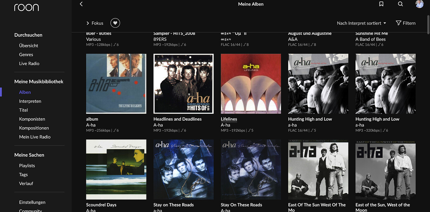
In the Album view, I can only see 5 albums per row now, is there a setting to change to more lets say 8 or 10? Thx, Armin
Since I am old but not blind  I could deal with more, but of course font has to be adapted accordingly, maybe too tricky?
I’m afraid this must be something on your end not related to Roon. In any case, I do not see this behavior on any of my devices nor on friends’ devices.
not exactly: must be a “strong/firm/conscious” (single) click
I often need to click again because I didn’t click firmly enough the first time
Decided to take some time before feeding back on 1.8 – initial reactions can sometimes be misleading, particularly when there are significant changes. So, after a couple of weeks, my overall feeling is that I welcome the change – but agree with others about things like ‘Hi Mike’ in large font, choices of font size and – although I appreciate the rationale behind reducing clutter – some screens could usefully show (maybe optionally in settings) some additional information (eg. recording dates for albums).
The main test for me has been whether or not the change leads to more browsing and discovery of new albums and artists and my experience so far suggests that is happening. Probably a combination of (a) ‘New releases for you’ being high up on the home screen and (b) Discography. What’s also interesting is that my partner – who rarely bothered using 1.7 or earlier – has started using to find new music that interests her.
I also like the way that ‘New releases for you’ is different for each user – that might have been the case before 1.8 but I never noticed it to be so.
So, reactions in 3 groups – a couple of bugs, suggested improvements, and ideas for additional features.
Bugs
There’s something odd going on in Discography in terms of matching local library albums to Tidal versions. What I think should happen is that, if the same album exists in local library and on Tidal, then both the library and Tidal icons are shown (if switched on in settings). Most of the time this works but I’ve got quite a few occurrences of two different problems.
First problem is when discography shows both local and Tidal versions. If – on the local version – I do ‘Edit → Identify Album’ and then select the metadata that is already being used (i.e. don’t make any changes) and click on Save then when I go back to discography things are now correct – just one album showing with both local and Tidal icons.
Second problem is for cases where I have a local version showing in ‘Overview’ but, in Discography, the same album is only showing the Tidal icon. Again, if I do the Edit … Identify steps on the local version then Discography shows one album with both local and Tidal versions.
In a large collection it’s a lot of work to do this manually so I’m hoping that it can be resolved with a tweak to the matching algorithm.
There’s also a bug (which existed before 1.8) in how album / artists / track counts are shown if some albums are hidden. I posted about that here.
Improvements
My preference is to have the sidebar switched off but this means that to get, for example, to the home screen you have to do 2 clicks – one to bring up the sidebar and one to select home. There’s plenty of space at the top of the screen to add some icons – here’s an example (I’m sure that the Roon team could design better icons) showing what it might look like with icons for Home, Albums and Artists. Ideally, make this configurable in settings so that users could have icons for their most common selections in this area of the screen.
Scaling – Albums / Artists etc – scales to full screen on large monitor – but browsing (Home, Genres etc) doesn’t – and also things accessed from there (eg. New Releases for you, Tidal …) don’t scale fully – beyond a certain window size there are large amount of space each side – so if you look at Artist Discography you get a picture at the top which scales full screen, but the info below only uses about 60% of the available space.
The are some elements of the home screen that I would like to be able to switch off or move lower down the list – particularly ‘What you’ve been listening to’. I really don’t need to know the time listened to an balance of genres.
Feature Requests
I like the move to vertical scrolling (but agree with others that going back to the top of album list in large library is intensely frustrating). Vertical scrolling his could enable – at last – box sets to show titles of individual albums so that, if the folder name for Disc 3 was ‘CD 3 (Live at Plumpton)’ then the drop down list would show ‘Disc 3 – Live at Plumpton’ instead of just ‘Disc 3’.
Use Recording Start and/or End Date for sorting albums. This has long been an issue. I had hoped to see it resolved in 1.8 but it’s still there. The problem is with date sorting for live albums where it is usually the case that the release date and original release date (if it’s a reissue) are later than the recording date. This means that albums ordered by date do not show up in the right place. The only way to ‘fix’ it currently is to edit ‘Original Release Date’ to be the date of recording. Means that information (Original Release Date) is lost. How about the option of specifying order of preference for dates in settings so that users could choose the order eg. Recording End Date, Original Release Date, Release Date? If any of these were null (no data) then they would just be ignored – it’s an easy SQL statement and the data is there to do it.
Can we have bookmarks linked to users like is done with Tags so that each user would see (a) their own bookmarks and (b) any shared (global) bookmarks?
Also, would be good to see things in settings being able to be different for each user e.g. what to show on albums, bookmarks (particularly if Hide was made to work properly across the whole library). I have 3 users set up (me, my partner and one called Admin). In normal use (using iPad) I prefer not to see album format but when doing admin (using Mac Mini and large screen) I find it useful to be able to see as much information as possible when in the albums screen. Would be helpful if this could be done by just changing user rather than going into settings.
That’s it for now!
How can a group of programmers keep screwing up every new release that Roon comes out with?1.8 is useless to me. I posted a week ago the problems like unable to hide albums but also as irritating, is the sort order of each album under an artist. They are presented in a random order whereas I have the global settings to display by original release date.
Before 1.8, everything was working just fine. I’ve been in IT for over 42 years as a developer and manager over developers and others and no company would put up with this type of new release dysfunction every time an upgrade occurs.