I feel the same way, I hope it will be fixed. The desktop version can no longer make any settings.
After a full day of enjoyably using a Win10 PC with 1.8 I sat down after dinner and started using my Android phone. Unfortunately, this is where the enjoyment ended.
-
The strobing Roon icon hasn’t been fixed.
-
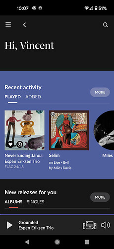
The Home screen needs love. There’s a mix of fonts, round images for artists, and square for Genres.
-
“Recent listening”, “What you’ve been listening to” are huge and aren’t an option. Can’t they be moved under the Hamburger? This is supposed to be a Remote, not an analytical tool.
-
Live Radio - I rarely use Live Radio. Can’t this be either optional or at least let us move it down the home screen?
-
Maybe it’s all the years of being married to an artist, or it’s just my aversion to Periwinkle, either way, the top of the Home screen needs to be reworked:
I really do appreciate the effort involved in making this update happen, I run a Dev Team myself. I find that we need to switch out a portion of our Beta testers on a regular basis. I don’t know if Team Roon has adopted this philosophy, if not I suggest you consider it.
Regards,
Vince
“Recommendations” on Album-View is missing and it crashes all the time on different devices when i want to go into settings.
Hi,
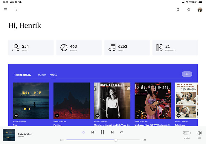
Great update! But using almost half of my screen telling me my name and how many albums I have is maybe not the best UX choice.
Two issues.
The biggest is typography. In Light Mode some of the text is too light & small without enough contrast to display well for all viewers/monitors. I am having to squint and push my face on the screen to see some text. I suspect that part of this is a Mac vs Windows issue. Mac’s tend to display text thicker and with sharper aliasing than Windows, and it probably looks a lot better on a Mac, and was designed on one. Please make it easier to see on larger screens where the text is smaller, with better legibility. In Dark mode the text is a lot stronger and I can use it.
The color choices for the new interface seem very strong for something that is supposed to put the music first. I’d sure like to see a set of themes we can choose from including some toned down ones.
Also, why does the Nature genres show two large human heads instead of a nice nature scene? Lol
Nah, just tells you that you need to buy a sh*tload more albums 
This is really critical. It needs to be restored immediately.
I am trying it for 15 minutes and I love everything about this update : the graphic orientation (much relaxing), the ergonomic (didn’t like the older one), the performance (much much better), the algorithm mojo (much pertinent) and for classical music, it’s day and night.
For me, it’s a true success. Congrats ! I wasn’t sure I wanted to renew my suscription, with this update keeping Roon is much easier decision to make.
Ps. Is it possible to get a « plus button » for the suggestions (it only displays 18 albums) ?
Biggest issue for me it is that is very slow in loading the data. If I go to an artist and scroll down it takes forever to load the next set. Also some time shows “in their prime” sometime not, totally random.
Same here. iPad on IOS 14.4!! Crashes when hitting the settings…
All working fine on my iPhone though, which is on 14.4 as well.
Overall I really like 1.8, good job I’d say.
My main concern is I notice a lot of Roon ‘working icon’ delays as I navigate around. Initially I thought this was just caching, but then I return to an artist or home page etc it consistently seems to reappear…often for 10-20seconds per page. It makes navigation feel a little sluggish. Is this usual? Roon is running on a 4.2Ghz i7 Mac with 40GB RAM so should be fine, network connect also good. Any suggestions would be appreciated.
My second observation is that the new Focus stuff is great but Id still like more of it. For example the ‘New Recommendations for You’ page or the ‘Recommendations’ within a genre would be really nice if they also included the focus option so that the list could be trimmed down as we like. Its much better than it used to be and I love being able to focus within Tidal.
Please read my post again. Thanks.
Haven’t had a chance to use much, but connection from Android Phone Remote to dedicated Linux core server is WAYYYYYY faster. That was my biggest complaint, but it appears to be fixed. Awesome job!
V1.7 remote app would disconnect from my 1.7 Linux core (2x xeon quad core, 192GB RAM, wired gigabit network. Server is dedicated to roon. Yes, I know it’s overkill) when using other apps for more than a few minutes. It would take 10-20 seconds to reconnect when going back in the app. Doesn’t sound like a big deal, but it got old very quick. Very pleased to see the connection is either retained, or the reconnect time is minimized.
Yes. This is sluggish as hell. This update is more like spotifying Roon. I guess the path is to reach a larger audience rather than be an enthusiast based software.
I like the fresh look, the performance improvement, the portrait mode on iPad and the massively improved Focus functionality (that alone for me is worth the upgrade!)… here are a few things I would like to see improved:
-
When I select multiple focus criteria, I must cancel each one of them to get back to a non-focus view, in the past there was a “reset focus” button that made this easier… should be an easy fix
-
The track list in an album view used to display the custom tags I assigned to individual tracks, now that is not showing anymore
-
I used custom Tags a lot, and in the previous roon version the tag selection box was good in that it used to remember the last used tags and keep them at the top of the list, making it easy to quickly edit a bunch of track related tags… now that is not working anymore.
-
When I click on a track, I cannot see which Tags are assigned to the track
-
I would love to see some font options for the “Overview” section of the Album or Artist, I love reading those overviews, but they are often very condensed, not easy to read and with no option to change font size for easier reading
Argh - can’t select any other endpoints it is stuck on bedroom speakers only
And now Windows 10 is excellent. Slick. Fast. Responsive. MacOs is buggy, slow and constantly updated with 2gb+ patches.
Looks and feels great! This 1.8 version is a great update. A little annoyance (haven’t tested it on my Mac) on my Android is that you can not remove tags from an album.
Also the software is very slow. A playing album doesn’t show on my Android after reopening Roon.
Another thing I don’t like is that if you search for ‘Miles Davis’, you’ll get all his albums. There is no way to show the albums that you put into your albums anymore. Please fix this!


