Thanks, but I am having my issue despite enabling that option in settings.
Yep, fully agree. The star ratings were useful and now the sort by popularity(?) has no meaning for me. Another FAIL.
In album view, only twelve albums in a 55 inch display?
Is there any way to change album size?
5 Likes
It even says it is “shuffling 5000” - it looks like it lifts the first 5000 into the queue then shuffles. I guess its a RAM conservation feature not properly thought through.
If you click the Library symbol, it will turn purple and white, and then the Discography shows just the compositions in your Library. Is this not happening for you?
I like the new look&feel, but the portrait mode on iPad is an absolute godsend! So is the consistent vertical scrolling.Thanks for fixing that. 
I believe that Aron summed it up nicely - basically 1.8 has destroyed the UI/UX elegance that had been built up over many releases culminating in 1.7.
Roon really needs to fix the main issues fast, top of list being to allow more album covers on the screen and to bring back horizontal scrolling. Also please elevate the discover screen back to the top menu rather than buried 3/4 of the page down the home screen.
I fear that Roon have been listening to the very vocal minority rather than thinking what is best for the product and the much quieter majority of users who have appreciated the advances Roon have made over the years and actually found 1.7 to a very good and stable product.
6 Likes
Whilst I’m a fan of Valence and really appreciate the “New Releases for You” feature, I honestly don’t feel it’s a step in the right direction for Valence suggestions to be so prominent that they actually replace the full body of data that we may be looking for.
eg…Where we used to see an artists full discography on a specific album page or the artist page itself, with 1.8 we now get “Popular” tracks prominantly displayed. We then have to scroll down through “Recommended albums”, then click “Discography” to actually get to the meat of the thing (and furthermore, they’re missing the star ratings…aggh).
No offense to other roon users, but I couldn’t give a rats arse what tracks and albums you’re listening to  . I’d like recommendations for albums based on MY listening, in a part of the interface that doesn’t replace a core set of data like a discography.
2 Likes
Its a small detail, but it sums up the UI for me.
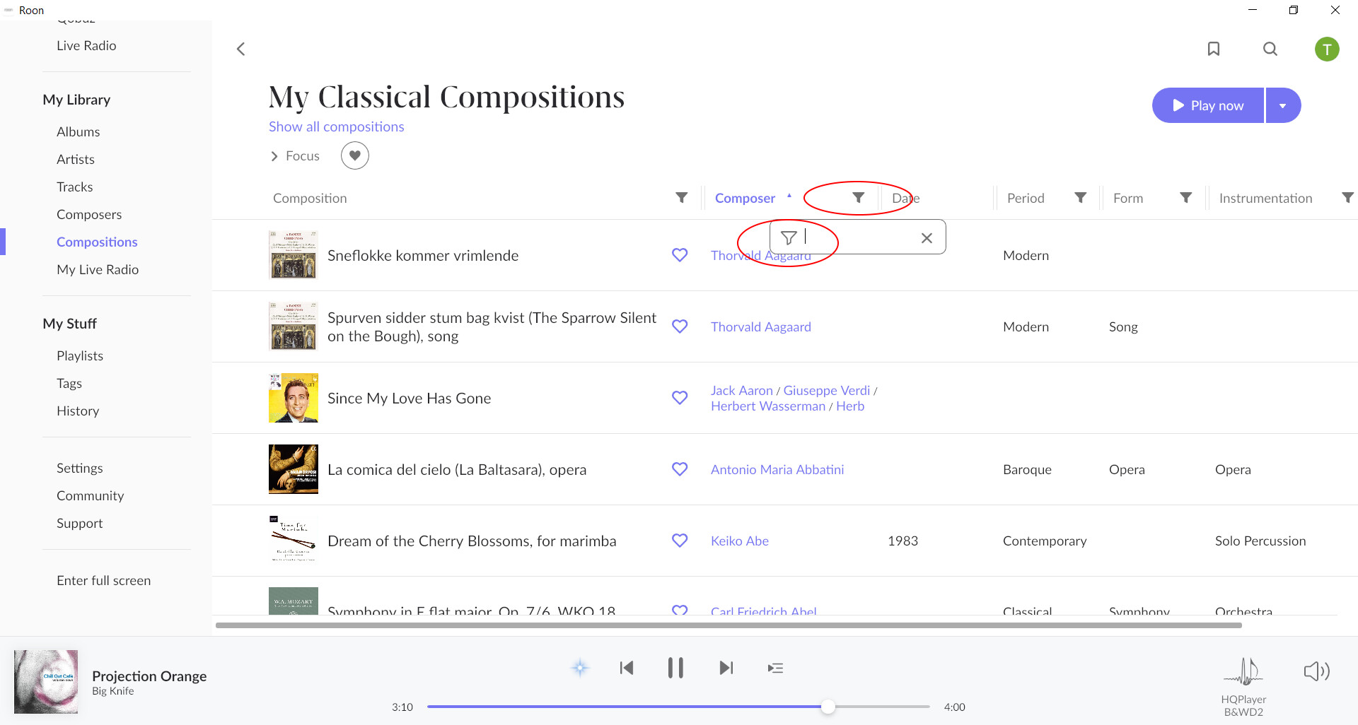
Why one funnel cut to the left and the other to the right? Why one line and the other block? Why one point size and then a different point size?
2 Likes
Maybe you have found it already, but is a setting you can turn on.
It’s ok to choose 5000 tracks, but it must be random tracks from all my 95000 tracks. This must be an error, chose only tracks starting with A etc. The same error when you shuffle Albums. 
1 Like
The artist names are not visible in the playlists in the windows version of Roon 1.8 , on the Android tablet and the Ipad this is OK.
What can be done about it ?
Yes, you’re right. Just saw it. Grrr.
No it’s not. Not on latest iOS on iPhone 12 or iPad mini or latest OS on 2013 MacBookpro. Roon is on a Mac Mini with latest OS.
I have to say I don’t like the new Credits page much, take up so much space, although I am pleased you can now see as track credits rather than all lumped together as a release credit. However I much preferred the design in 1.7 when displayed as list, and then if you are interested in someone you can click on the link and see their image then, you could also swap between order by role and order by name, this seems to have gone. Also whilst I would prefer the images were not shown at all if they are to be displayed would be better if they were in square boxes, the images in circles don’t seem to fit with the overall design at all.
Also, is it possible to display performer credits inline with each track on the Tracks page, I only seem to get composers ?
1 Like
Absolutely stellar update. Love the new look and UX!! And it’s zippy. Congrats.
Cheers.
Agreed. See above “workaround”.
2 Likes
Also when I select an artist, sometimes it shows a page with the large background artist image
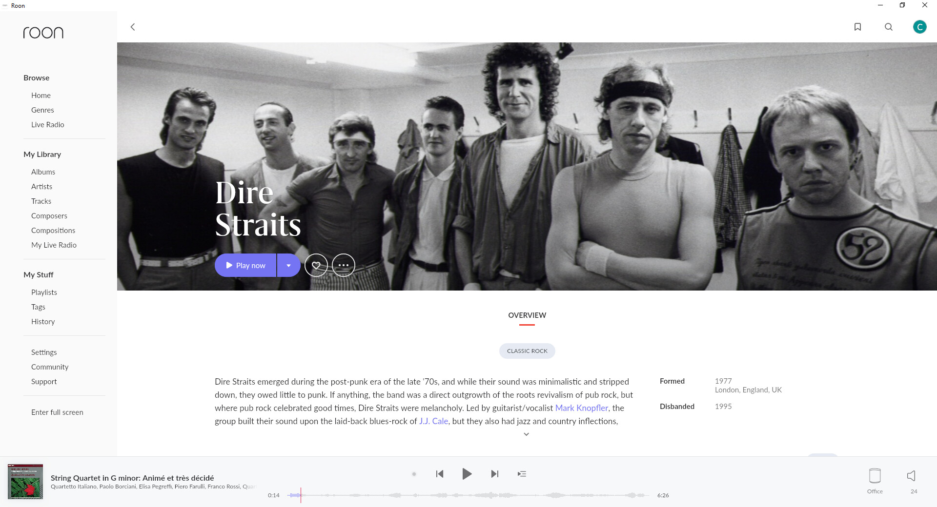
but sometimes you see that for a millisecond and then it displays an artist page with the artist image in a small circle (which looks much worse).
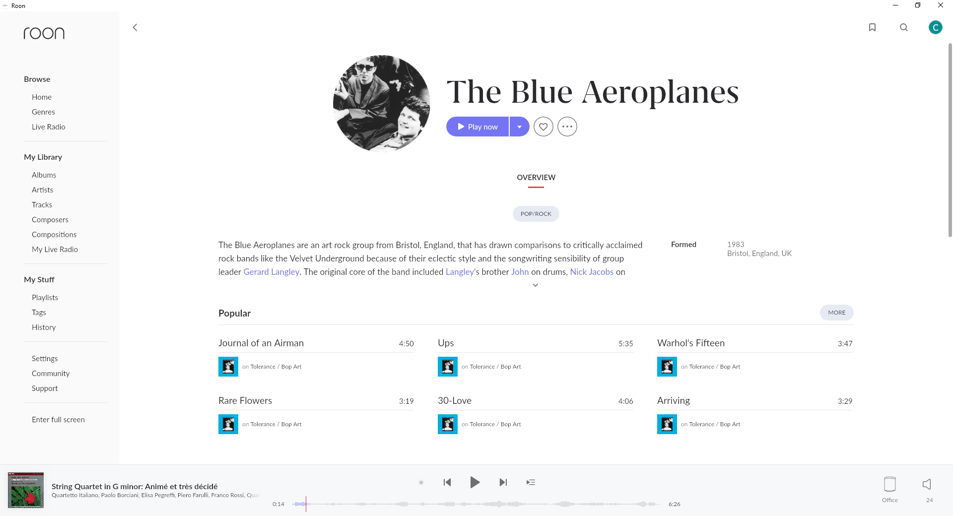
Can anyone explain what decides the difference please.
The scary thing here is that you may even be correct. And we already known that Roon Team won’t comment on this.