I can’t even get it to launch today. Goes to 180% CPU and beach balls(on Mac).
John, I hope this never happens to either of us, but, I suppose the silver lining here is that should either of us have to deal with dementia, at least Roon is there to remind us of our names. 
Questionable design choice is the nice way of putting it.
3 Likes
I discovered that the function exists - sometimes.
Under all the tracks there is a list with recommended albums. - Very nice!
Maybe it is just loading very slowly sometimes, because it comes and goes.
I just lost it for 10 minutes again.
at least there was a very wise choice: NOT releasing v1.8 right before Christmas! 

kidding 
… almost 
2 Likes
Some suggestions for Roon 1.8
I became very used to the last version, and I know it will time to get used to the new one. I don’t mind this if the improvements are worth it, especially to the searches. Roon is a player “radio” service but also a library organizer. I use it primarily for the latter and that is where I see problems with V. 1.8. Please note that for formatting issues, I am discussing how the interface looks/works on my MacBook Pro, which is what I use for organizing my music. Please pay special attention to #3 an #4 below: these are two changes I absolutely hate. Here are some suggestions:
- (1) Searching – Seems not to work as well as older version. When I search for an artist (magnifying glass, upper right), Roon is assuming I am looking for a composer. Example: Pierre Boulez was both a composer and a conductor. I own none of his compositions, but many works that he conducted. When I type in a search for him, nothing comes up. Similarly, Wilhelm Kempff was a famous pianist who wrote some of his own cadenzas. When I search for him, I get nothing he played except for those few cadenzas. The search should bring up both performances & compositions, not just the latter.
- (2) Left Side Bar – This is too big and should be optional. Put a clickable icon in upper left if you want to see it. If you did so, I could see at least one more column of albums.
- (3) Scrolling vs. Page Turning of Albums – The page turning before was much better than the scroll down now. I liked how if I entered an album name, it would reformat the entire page to start with my search item in the upper left. Also, I liked having the total albums always at the top of the page. Might I also suggest some sort of Kindle-like page number (e.g., page 314/2045). Scrolling works well for a few hundred albums, but when you have 10k+ pagination is much better.
- (4) Sizing & Number of Albums Shown—this is a real let down. Before, I could set the size of my window and see up to four rows of 11 columns of albums. Now the albums do not resize very much. At the most, I can see 2 full rows of seven columns 9 (and a partial third row). That is insufficient when one has 12,000+ titles!
- (5) Waveform/Progress Bar –Fuzzing out in gray the music that has already played is bad. I used the volume extremes and waveforms as a way to search backwards for a precise spot in a piece. Now I have to guess because you fuzzed it out and it looks the same. This was a pointless change.
- (6) File format, Total Time & Volume Range Info – This is harder to find and moves around. For a given album and if there is no review, it is more or less in the center of the screen and cramped together with other text. If there is a review, it is moved to right of center and stacked vertically. It made both visual and logical sense before when this info was always placed below the album art in upper left. I really need this to be in the same spot because often this is how I tell the difference between versions.
- (7) Unused space—there now seems to be more unused or seldom used space on the screen, especially in the lefthand side. Reduce the margin or let us actually use it.
- (8) Dark Version—I much prefer this, but now is much harder to read because popups just blend into the background. You need an outline or something.
- (9) Font—New rounded font is harder to read. I don’t like the mixture of serif (album titles) and san serif fonts. It looks messy.
- (10) Bottom Playbar—Is there a way to make this disappear unless you are playing something? While organizing my albums, it takes up too much space and is part of the reason I can only see two rows.
7 Likes
The numbering of tracks is an option in settings
To me Roon 1.8 is a major step forward - more like a version 2.0. The front end is now transparent and “convivial” to music lovers - in a meaning the term was coined by Ivan Illich in the 70s in his book “tools for conviviality”. Few of us may know this was the theoretical background to the hypertext revolution starting 20 years later in the form of the WWW.
Well, things are developing further and today we have all sorts of AI methods changing the structural “lexical-semanic” approach to the things stored in the computer world. As we all know music as such is much more than some more or less pleasant sound with some “bibliographic” reference like “creator”, “composer”, “artist”, “date of issue” etc. There have been many different efforts undertaken for the last 30 years to recognize and analyze music’s “deep structure” and its meaning to us recipients resp. consuments. That’s exactly what music is all about and that’s why we are into music.
You don’t have to be a fortune teller to find out that this is exactly what is not yet being addressed by Roon - and that this next evolutionary step will have to take place soon, because elements of this technology are already available to paying professional markets. Today these technologies are used to create connections between different musical items by simple attributes like mood, rhythm, bpm and they help to create automated playlists for different areas of application like radio stations, hotels, shopping malls etc.
Not that what an individual audio lover would long for, right? Yes, true, but the obvious next development step would be to match knowledge gained from deep musical analysis and knowledge of “musical taste” and the listener’s mood - not to select single “fitting” musical pieces but to create enriched “musical journeys”. This would be the difference between a playlist and a featured music program created by a professional musical editor…
I am sure the master minds at Roon will reach for this next evolutionary step. Maybe to come with Ver. 2.0
1 Like
Loving 1.8 so far but have one fairly major issue and that is that track playlist membership is no longer listed under the tracks. Has anyone else noticed that their Windows Laptop runs cooler when listening/running Roon 1.8 vs 1.7?
1 Like
Oh yeah, I forgot to mention that one. Incredibly annoying, and completely flabbergasting. Makes me wonder if the devs use Roon at all…
8 Likes
Just type a oder h etc and search automatically jumps there.
(2) Left Side Bar is optional. Check settings.
My feedback, FWIW. Install was fine on windows server, two windows clients, and an android tablet, no problems, no drama.
UI changes are fine. Some improvements, some things just different.
Still figuring out discovery features. Some new things, some moved things, but overall pretty nice. There are some that I likely won’t use, but plenty of others that I do or will.
Went through all the menus and settings, everything seems to work as expected. All my normal browsing, selecting and playing functions work to make sound come out of my speakers, except one (more on that in a minute).
I don’t play much classical, so can’t comment on those accommodations.
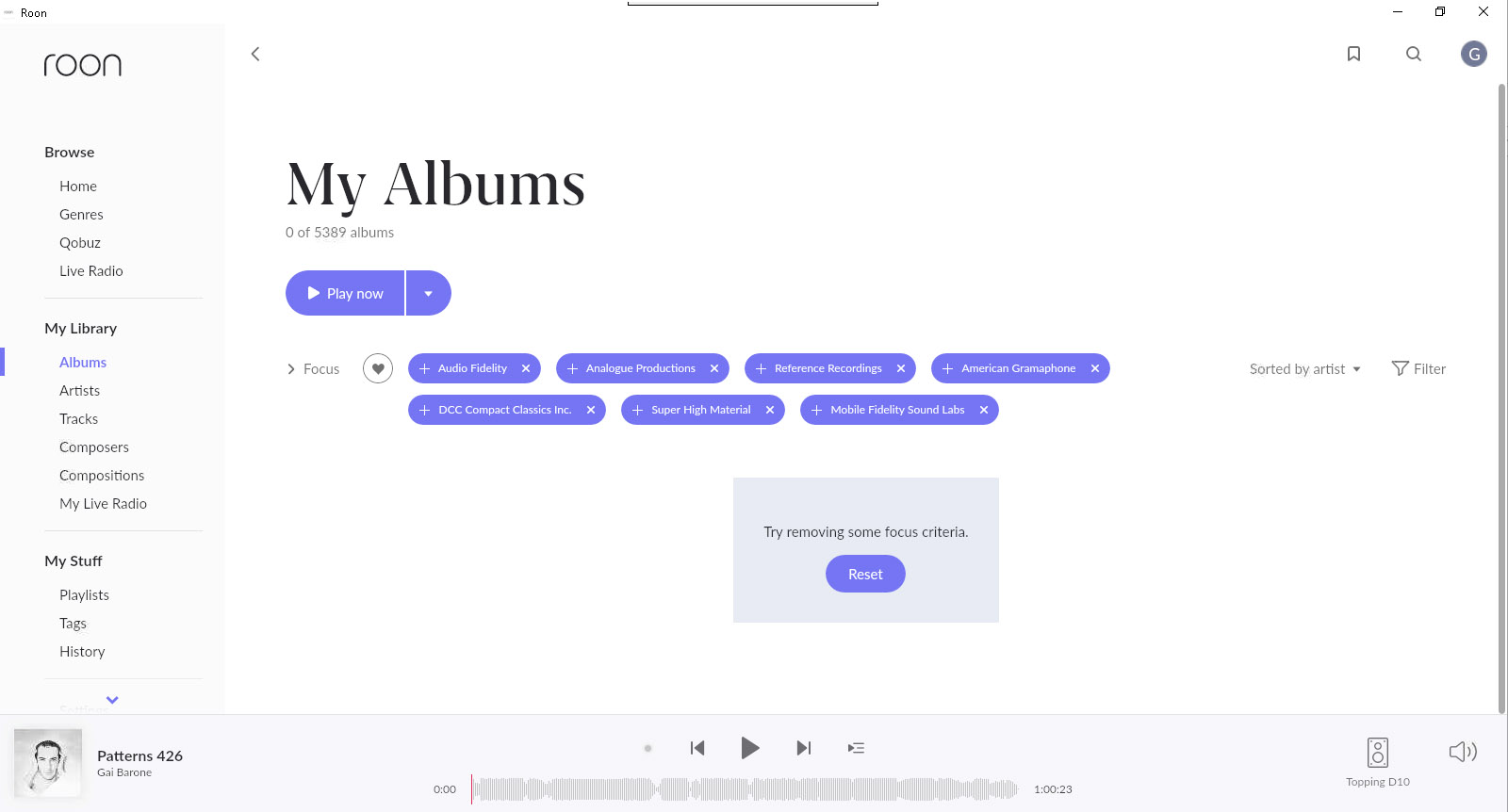
The new focus layout and accessibility is an improvement. But, and this is a huge but, changing criterea from “or” to “and” broke nearly all my bookmarks. This is a big deal for me because of how I use roon for casual listening. Hopefully this will be addressed in a maintenance release. Ideally it should be reverted to work like 1.7 until roon finishes that thought.
Roon radio seems improved in terms of relevant selections and variety. It ran a whole hour before getting stuck on tracks from the same handful of artists/albums. Skip, skip, skipping through them seemed to wake it from its stupor for a while.
So, overall it’s fine with me, just different. The broken bookmarks are my only real complaint.
P.S. Re. portrait mode on Android tablet, thank you, thank you, thank you!
2 Likes
The short version: they changed focus from something that works with OR to something that works with AND. So each term you add to focus reduces the number of items in the group, as it means a track has to belong to both groups in order to appear.
There are some clunky ways to get around it talked about here.
I’d suggest writing support and asking for the OR function to be brought back.
Actually- @alexander_bashlaev solution to the shuffle 5000 farce is far more elegant than the full library playlist I tried. Shuffle tags- genius! Thanks both- I dont feel like cancelling my sub now. Just mildly aggrieved rather than fuming!
2 Likes
That one you can change in the settings, in the first tab (General).
Lol it works. There is more album rows! Now put all menu you like to bookmarks and saved 3h from 8h for scrolling 
1 Like
@Jordan Have you tried using the Filter option, it does pretty much the same thing.

Could be just a me thing, but does anyone else find the purple on black (while using Dark theme) very hard to read? I like the Dark theme generally, but that part in particular is difficult to work with for me.
4 Likes
I have had the same thought about the Home page many times! I’d love to see something that draws more upon what makes Roon so useful for me - something along the lines of Discovery might be nice. Roon is sooo good at finding things in my library!