Roon 1.8 (Build 748/756/763/764) Feedback

I know I just wrote a big letter saying I wasn’t making a list, but, I’m noting things as I use it more, and, I’d rather try to be more constructive by putting it here than in the failure thread.

The vertical scrolling may be pretty cool for a twenty year old on Twitter, but, the horizontal scrolling was nice, as it felt like you were genuinely flipping through an album collection.

Roon, is this your subtle way of telling me I’ve aged out of your target demographic? :smiley:

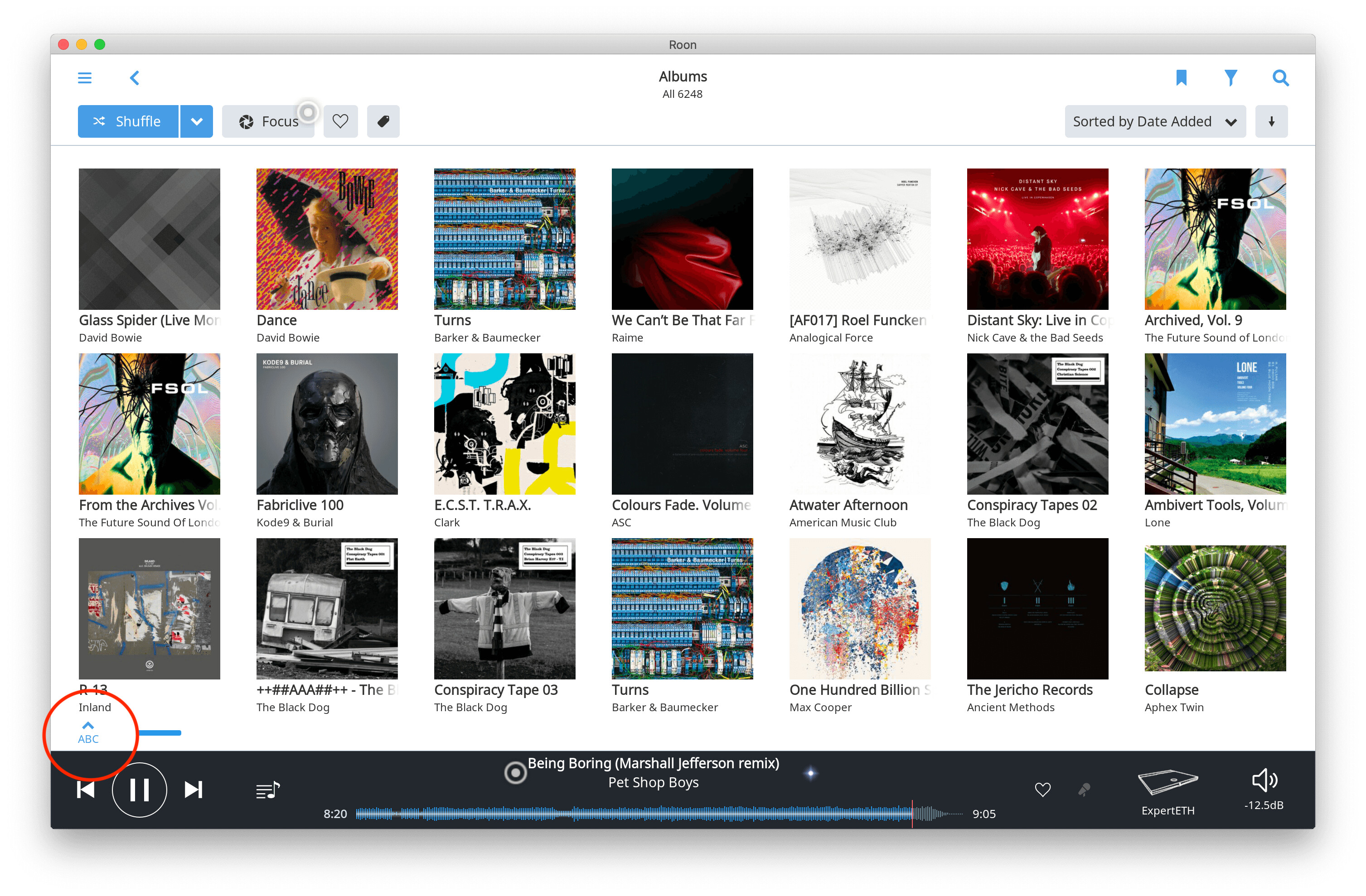
Also, missing the alphabet on bottom, as others have said.

One last thing, for now. I really don’t appreciate the new artist photos. The squares were large, focused on the artist, and popped off of the screen. This new circular approach? It apes most every other piece of popular software out there, while looking less like a “museum” (as supposedly intended), and more like the ancient knick-knack dishes on my Aunt’s shelf up on the wall which no one was ever allowed to eat out of. It’s way too precious.

I’m not a programmer or UX designer, but, the user-facing stuff should be KISS. You have software that caters to the music-lover, no? Artist, album, release year, album cover, and get out of the way.

Still far too many clicks to achieve what should be intuitive functionality, in my opinion.

5 Likes

Looking for help on another feature from 1.7 I cannot seem to find – which is seeing in the track list for the album you are playing any playlists the track has already been added to.

Helps with knowing, while playing (and without migrating to a search of any playlists) whether the track has yet to be added to any playlists, or whether it has already been “triaged” (considered for addition to any playlists).

Suspect I am just missing something…?

2 Likes

oh… and… can we, PLEASE, have some consistency about where stuff is?
look at “Length/Star Rating/File Kind/Date Added” in these two cases:

in the latter case one even has to expand the review to see all of it :rage:
:roll_eyes:

8 Likes

All perfect. Challenge resolved, internet radio is working great

Unimpressed so far but I rarely if ever use my own music collection, preferring the streaming services and they still work fine. Anyway, some things have moved around and a slightly different theme applied. I’m sure I’m missing some of the new features and I’ll update when I come across them but for me the launch would almost have gone unnoticed if it hadn’t been blasted all over the place.

Everything does work so far so that’s a good thing. I’ll update with “2nd” impressions later.

1 Like
  1. The iPad app has a bright, white splash screen when reloading the app - even in dark mode.
  2. The (sadly) now much smaller waveform is located right underneath the iOS home bar, resulting in accidental gestures.
4 Likes

“1. The iPad app has a bright, white splash screen when reloading the app - even in dark mode.”
→ same on the iPhone App.

Share is still completely useless. Seriously who share music via images? Kandinsky?
See the “sharing” thread on this forum.

Thanks Vincent! I though of the same too. I restarted Roon Core once before when this happened and didn’t help while my Roon Essential Core still saw all the Airplay and CCAs. I was going to power cycle the hardware but I thought I would restart Roon again just to see. The second restart fixed the issue.
I still don’t like seeing fewer contents on the screen. I control playback on tablets. The larger album arts and possibly larger fonts require me to scroll much more to see the contents. Compounding the issue is that scrolling has become more sluggish. I will reserve my opinions on other new functions as I have not had a chance to do that. The sluggishness does not help exploring things.
At work, when we modernized our products, our user experience experts insisted that everything be larger. The graphics became larger and more prominent. We BA’s as former users and as users advocates kept telling them to allow users to see more contents… We were brushed off consistently as the expert insisted they knew better. Guess what, one of the first and top user requests was to show more content given the screen real estate. So they navigate quickly with fewer scrolls and clicks.

1 Like

Well for me its much improved… I can use my IPad in both directions, the UI is neater and more easily read and I can even change the icons for each zone so I can choose without having to put my glasses on … great job.

2 Likes

Cyber terrorism? Kinda feels that way.

My initial reaction to the new version was negative. It appears that few is shared by more than a few other people. I rarely comment on the version to version improvements, unless there are specific problems that need attention. In this case, the problems are global.

I have an iPad pro 2020, running the lastest iOS version. The 1.8 app crashes OFTEN. It’s easy enough to keep running it again and again, but it’s an annoyance. Clearly the 1.8 app is BUGGY. Not ripe for prime time.

In terms of the core software, there is stuff missing in the new UI – stuff that I valued is gone. The search function in Roon is not returning complete Qobuz offerings – the search results are incomplete (some Roon, but not all), particularly when listing the discography of an artist.

The use of screen real estate in the new UI is simply ridiculous. I’ve attached a screen shot of the opening screen. The blue background for recent additions is wierd and doesn’t serve any meaningful function. Why? If that has to be, make it user customizable so those of us who don’t like it can make it disappear.

The font size of the home page banner is so large, it obscures the important information in an opening screen. This is what I find most irritating. RE-DO the layout to present more information in the opening screen. I do not need a greeting “HI Julian”. Really? Give me a break.

Also missing are the “new” banners on the album icons. I liked that feature. Why is that gone?

There were problems with the install. I had to fiddle with rebooting the core, etc. to get it to show all that it has. Based on my experience this far, I’d say this version is a work-in-progress, and I wouldn’t even give the honor of being labeled a “beta” version. Grossly premature to impose this on a user base that was generally NOT asking for changes in the UI layout.

Even though I have a lifetime license, this version is so bad that I will shift to my Jriver server until it gets straightened out. True, I will miss the Qobuz integration, but at least I will know where things are, and there won’t be a need for exploration and discovery.

I can’t stand to look at Roon anymore.

When the Roon user interface undergoes a MAJOR revision, it would have been wise for the developers to offer the OPTION of keeping the old UI. To have this bomb drop on us suddenly is ill thought.!

New Roon Opening Screen|690x386

11 Likes

Bad Design, very Slow in comparison to 1.7, crashes in settings.
I need 30 seconds and more until the music starts. 2 seconds in 1.7.
That is a terrible beta Version and i regret my Life long Account.
Good is more Information if you click on Mitwirkende.
Less Design is not fresh or Modern. It is only poor quality.
The real Problems in identifying CDS are not solved and
The speed problems are unacceptable

I shuffle my entire library 98% of the time when using roon. If this 5000 track limitation is permanent I too will have to find another option. Definite dealbreaker for me and was the very reason I signed up for a subscription. I’ve never used JRiver but will look into it if they permanently remove entire library shuffling.

2 Likes

Thanks, that works. But it’s a real pain in the ass way of doing things.
It really would be better if the brought the option of the OR back.

Overall I think it’s an improvement on most fronts, but I have two issues that really put me off, both to do with the home page (on both mobile and desktop):

  • PLEASE can I get rid of the giant “Hello, John” line at the top? It’s a complete waste of space and, after a while, very annoying to keep looking at. What on earth is it even for??
  • going one step further, can the home page be customized? I have no interest in how long I’ve been listening to things and would much prefer to see “Recent Artists” after “Recent Activity”, for example.
7 Likes

1.8 is nice overall, but please bring back the incredibly useful A-Z quick index jump in Album and Artist views! (see attached picture).

This was a essential feature in operating Roon without a keyboard. Having to scroll through pages of hundreds/thousands of artists or albums to get to the one you want really makes the experience much more cumbersome!

Is it not possible for some reason to have the A-Z quick index jump in v1.8?

11 Likes

Jriver is clunky and frustrating on Mac but it’s a one time license fee and it sounds as good as Roon to me. Also, the Jriver River remote for IOS works great. I have had constant problems with Roon even before the update trying to get it to run on my iPad. My sub is up in three weeks. Glad this came out before then.

What did they do to focus? For instance, I used to be able to select mulitiple labels, now I can only select 1. A bunch (most) of my bookmarks no longer work. In addition, when I bring up these broken bookmarks, it crashes with Windows app.

1 Like

This has been my experience better integration with Tidal for me.
Very pleased :slightly_smiling_face:

1 Like

Very disappointed. Many crushes on Win 10 core and on Android remote. Never experienced any crushes in last 2 years until now.
Many other small issues. Previous version was great, why ruining it?

1 Like