A post was merged into an existing topic: Settings not displaying properly or crashing on 1.8 [Ticket in - Workaround in thread]
It works great on my Android phone, but with my Chromebook running Android 9 the Roon app is missing the menu icon in the top left corner. Therefore, I am unable to access the menus. Very annoying.
Update went quite smooth and I am pretty positive about the new Roon.
Something that already caught me is that (on iOS) some click targets are not clear as interactive elements.
For example here:
Had to tap wildly on the screen to realize that multiple white text words (such as artist and record name) lead to different destinations. I know this now but what else am I missing out that are not clear.
2 Likes
I miss being able to see the star ratings when in album view. Please bring this back!
Otherwise, awesome. Thanks!
13 Likes
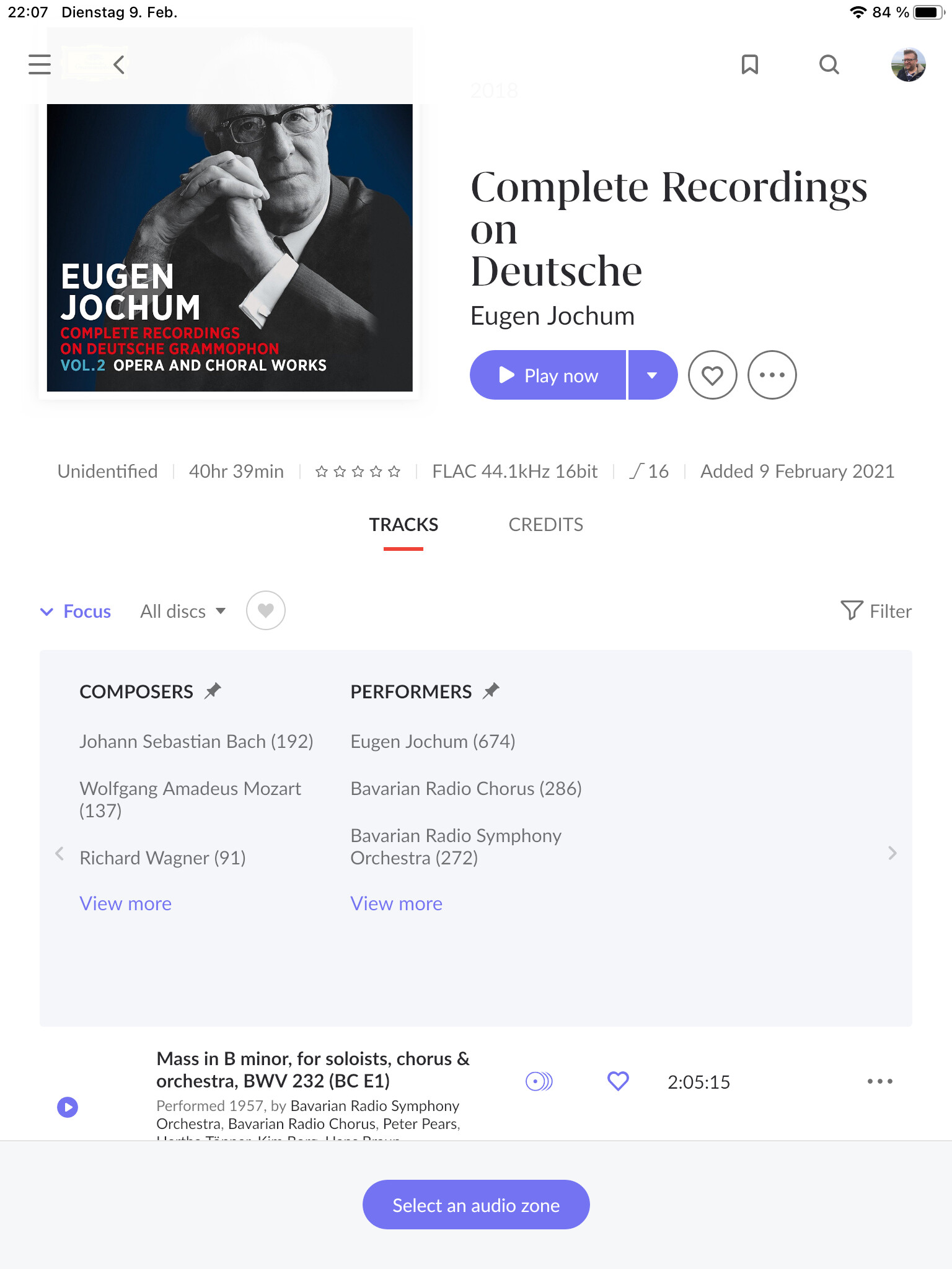
If Roon can’t identify the album(s), then you will need to provide your own filetags… This is nothing new, I think?
In the iOS (iPhone 12 Pro Max) app if I scroll in the list of My Albums and I select and album then go back, the view scrolls to the top. And I have to find where I were in my list. This is making the iOS app unusable for me. Settings - About crashes the app. Seems you guys need to iron out some bugs. Fixing the scoll position is top priority from my point of view.
2 Likes
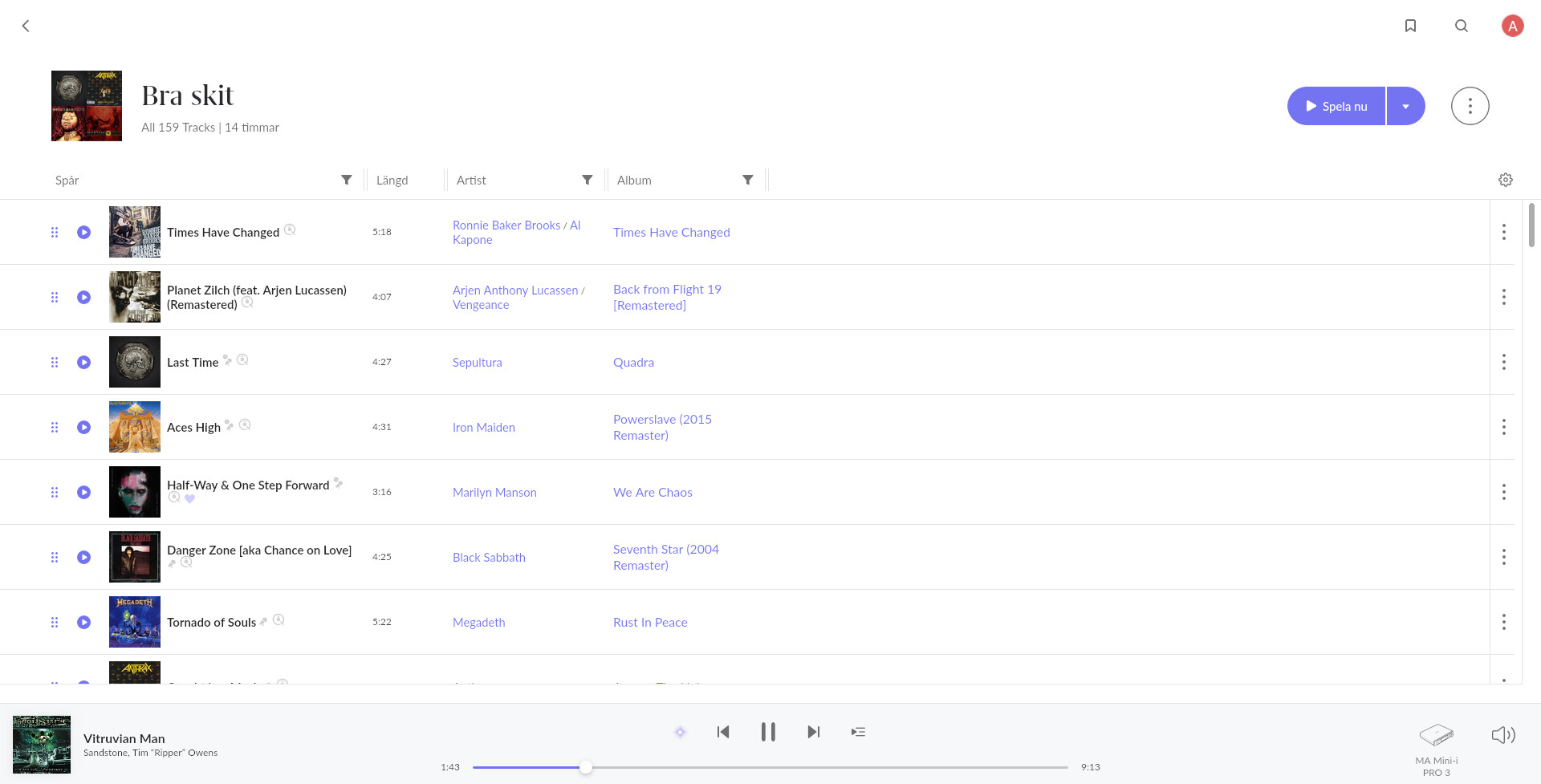
So many long outstanding requests, and the only two which seem to have made it into this release are vertical scrolling and portrait mode. Well, that’s something I suppose. All in all a bit meh from my perspective if I were to be brutally honest.
10 Likes
This 1.8 is an absolute disaster.
Every single UI/UX change is plain bad. First, everything is now huge. I have a 4K screen on PC and an IPad Pro 12.9” and the amount of data shown is now half of what is was (and it wasn’t enough to begin with). The continuous scrolling down instead of the paged side scrolling makes my entire present setup unusable, before I had 4-8 pages of easy to navigate collections, now I have one big mess. And no, the focus function does not help, if I new what I wanted to listen to to I would just search for that, I want to see all the options within a collection and choose from those. Many of the existing functions such as the indented, structured song titles with rich metadata, such as tags, playlists are gone, we only have long lists of song titles which are just blending together. My eyes are completely wrecked from the amount of mindless scrolling, and also the scrolling is abysmally bad, slow and juddery on iPad. On windows 10 (Ryzen 5950x w/ 3080) the UI is even slower, the last time I saw something like this in the early 90s on an XT. Clicks executed with half a second lags, screen loading in half a minute.
The very reason why I don’t use the Tidal and Qobuz apps because those have the same unusable UI solutions. I want the old UI back. I have paid hundreds of euros for a lifetime access for that UI, not this joke.
Also, now tags work differently (both in focus and bookmarks): you cannot add two tags to a search or bookmark, you can only use them together as a logical AND or a logical NOT, but no OR (which was the default before). As the tags had been added to my albums with that functionality in mind, now I would have to retag some 2000 albums too.
Frankly, if anyone has an alternative software please recommend it, I don’t care about the 600 EUR I’ve paid, I want something that is usable.
23 Likes
Fixed Export in my case. Well done, thank you 
Missing the album ratings nothing else stands out yet, too early to say.
2 Likes
come on Geoff - do you believe I have my file tags not in order ![]() ?
?
All my files have WORK and PART tags. Roon also does properly link back to the composition if I click on the disc symbol.
Agreed – I really like seeing the rating while scrolling through albums. Please put back!
13 Likes
The same Problem
A post was merged into an existing topic: UI Display Artifacts in 1.8 [Team Investigating]
A post was merged into an existing topic: Make Focus an “OR” operation instead of “AND”
Roon really should have put some mention in the IOS app release notes that the new version will not connect at all to previous (1.7) core versions. And as Apple won’t let you restore the old version of an IOS app, you’re forced to upgrade the core to 1.8. This is very bad practice…
Updated flawlessly
Love the new look and features so far! Not one glitch. GREAT JOB!
Netgear Modem>Asus GT-11000AX Router>Trend Network
TEG-S80g Switch>Nucleus Plus. QNAP T-251>Netgear Powerline1200>Linn SelectDSM. All ethernet connected
Where is the promised Tidal Top Tracks?
From @mike in April 2020…
“ Yeah, we’re aware of this issue and unfortunately it hasn’t been addressed yet.
I can’t commit to a specific timeline yet, but I can tell you it will be fixed later this year.”
Another lie? Or have I missed it?
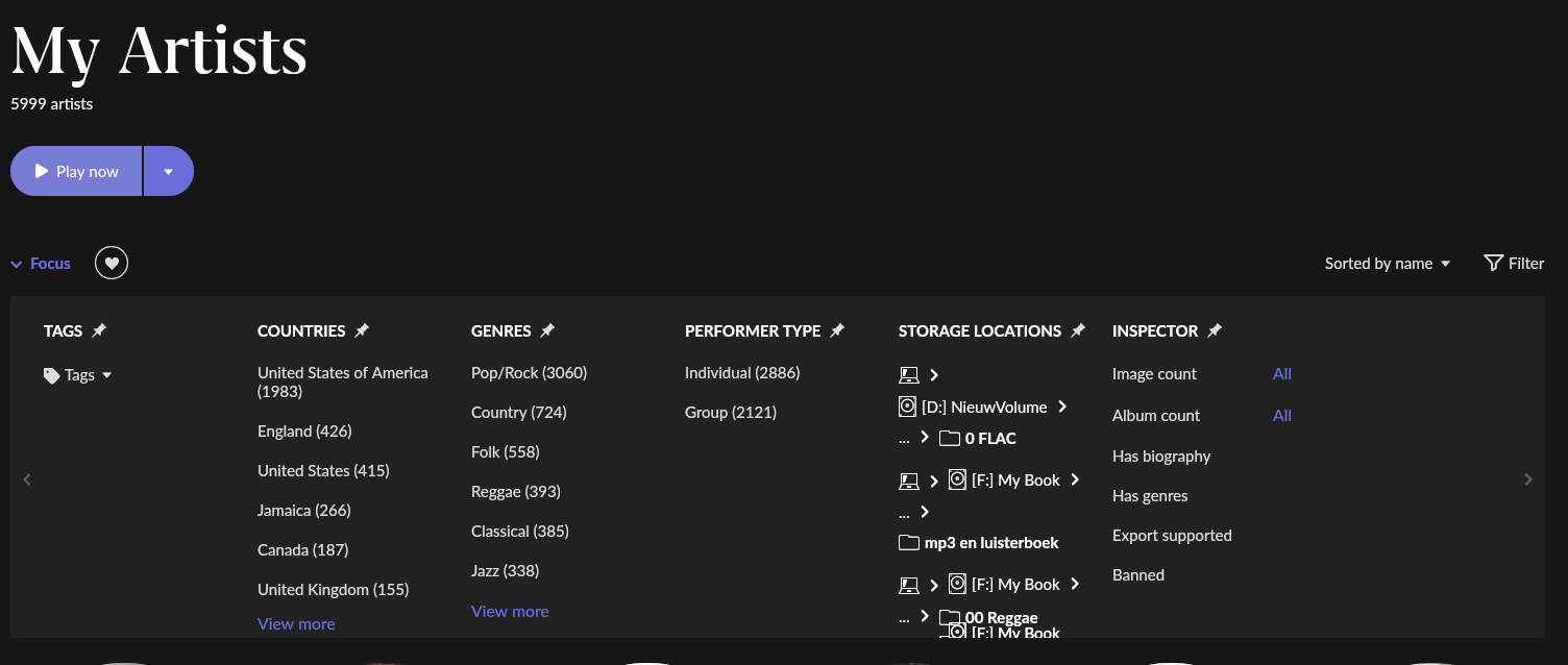
When I go to My Artists-Focus-Storage Locations I don’t see View more.
When I go to My Albums-Focus-Storage Locations I can see View more
See attachments

Went smooth so far for my pc setup, iPhone and iPad.
To be honest, not a fan of the new UI but understood it’s impossible for the change to please everyone. At least it’s better to provide options for end user to choose from, like the extend of waveform pattern during playback, scroll direction, etc.
Anyway, I appreciated all the efforts Roon team has devoted in this version. Guts and heart, you always need both to make a change!
1 Like